UNit 1
diagnostic practice
Daisy Campbell
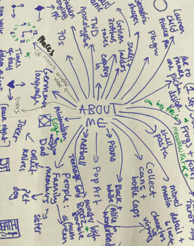
sUMMER TASK: eMPTY YOUR PEN
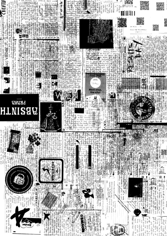
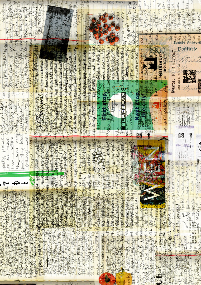
The pen I emptied was the pen I used fully by journaling my summer which involved interrailing around Europe.
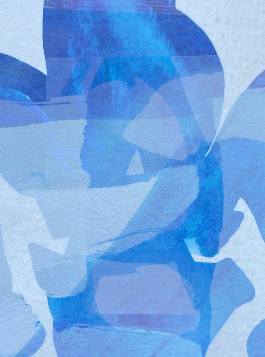
To collate the journal I scanned multiple of my favourite pages involving drawings and mementos and overlayed the images digitally to create a collage and I like how its static presentation contrasts how active a summer of travelling is. It is like the snapshotted end credits off my summer.
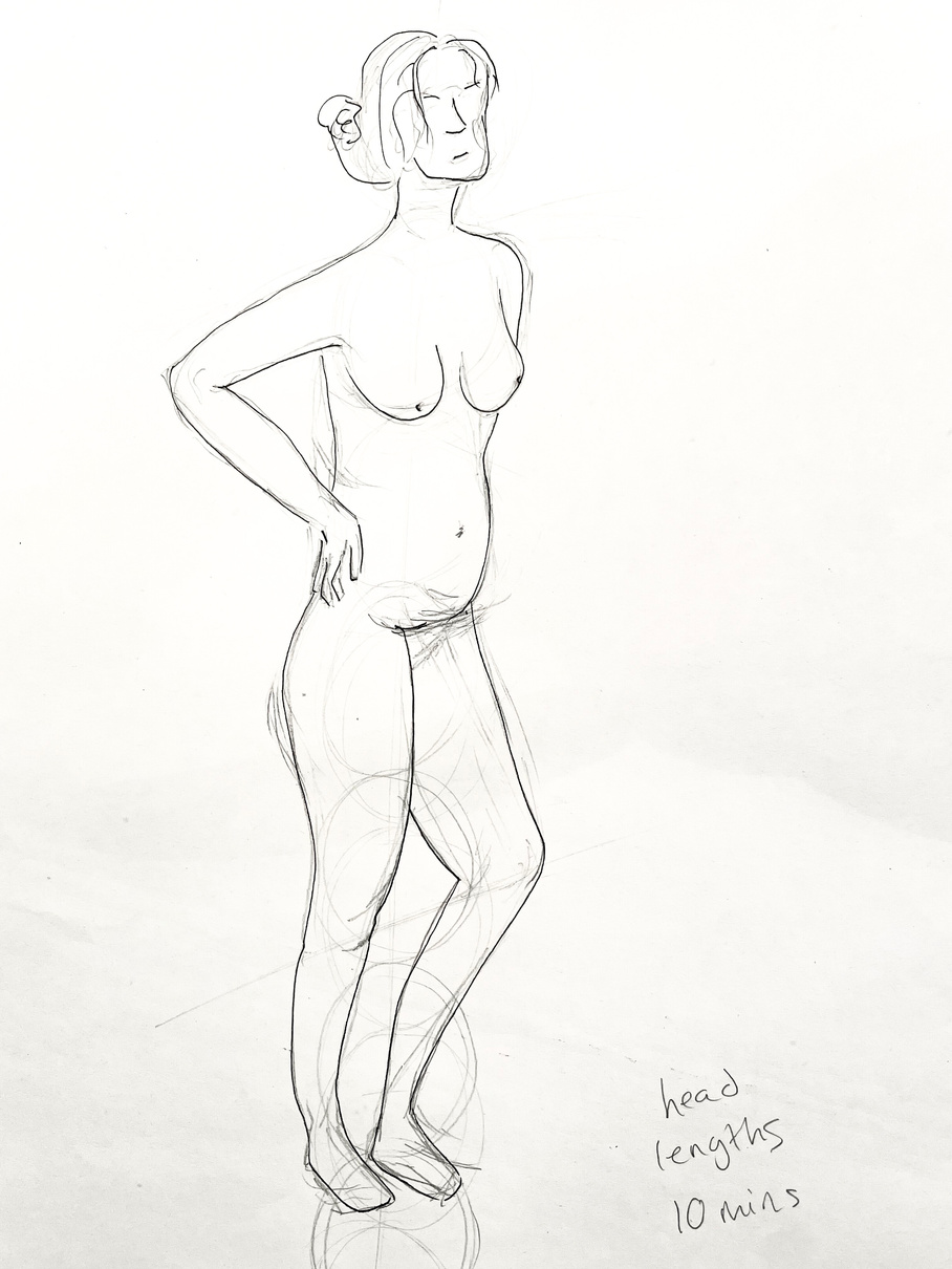
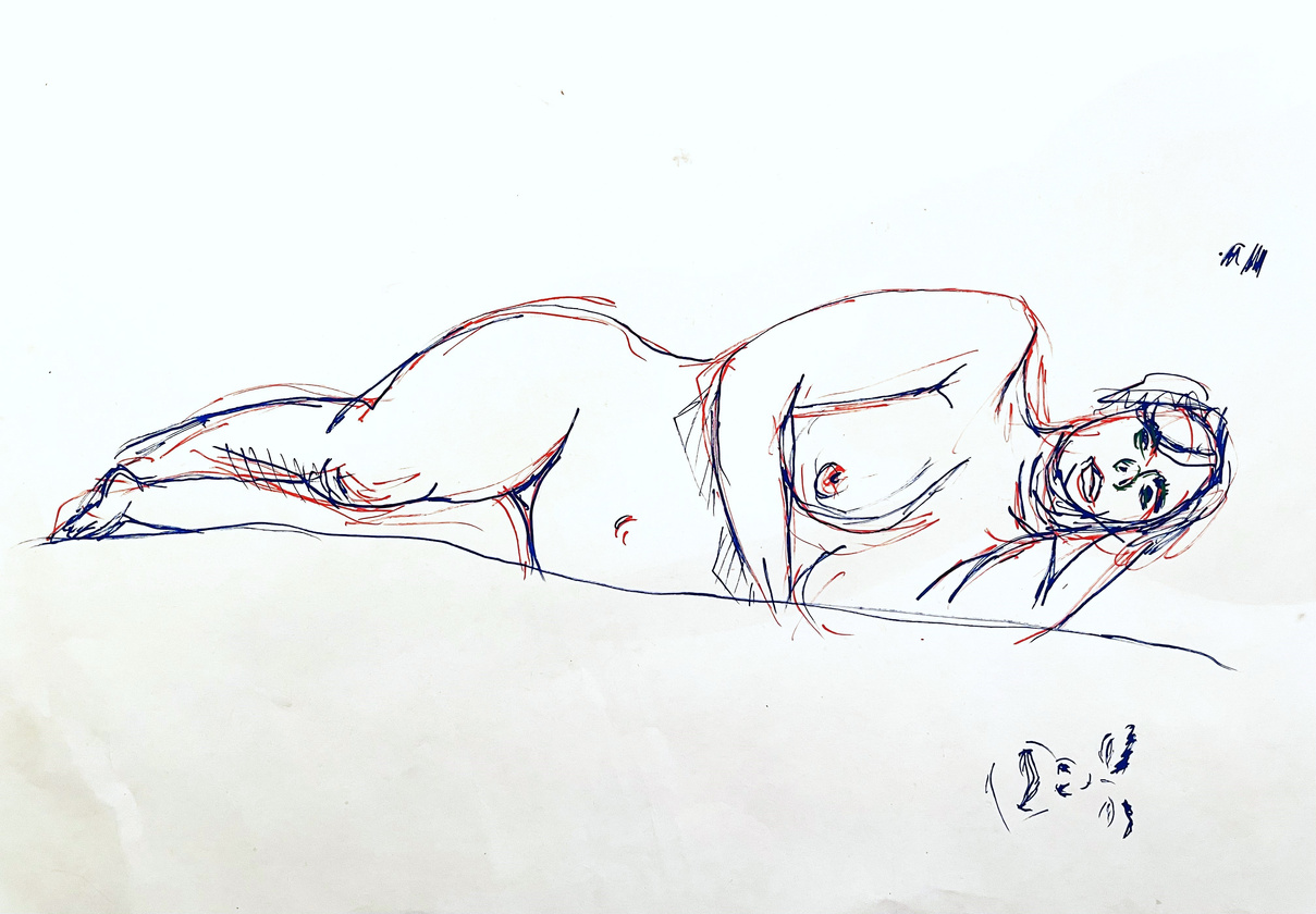
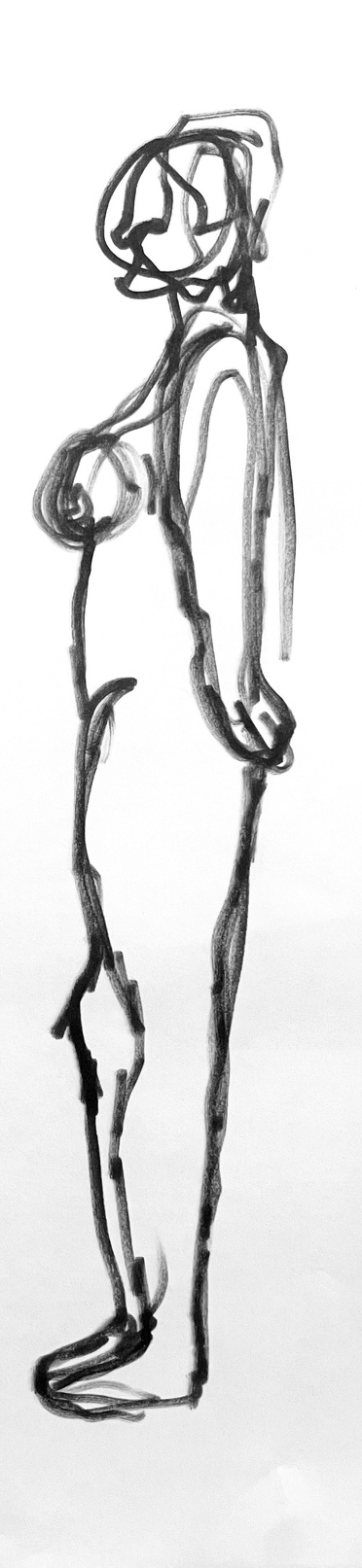
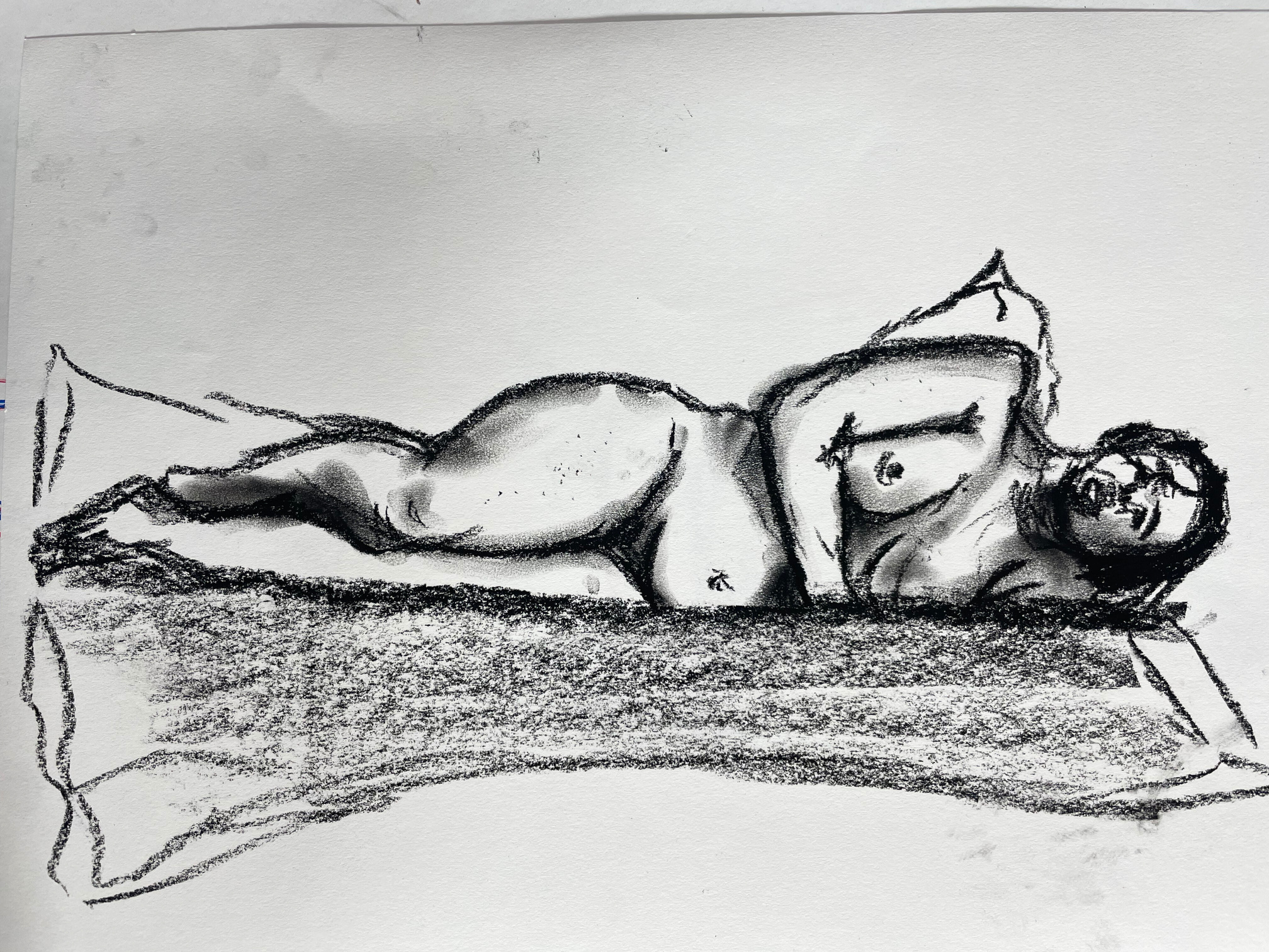
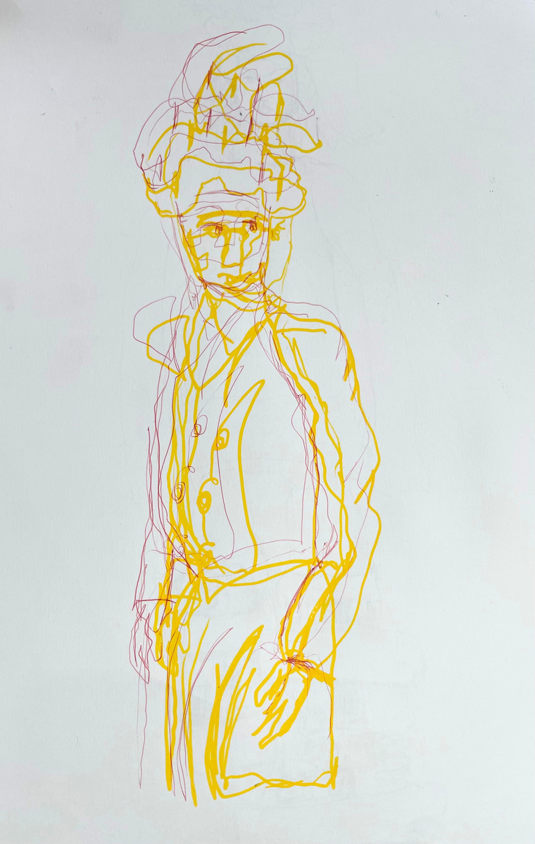
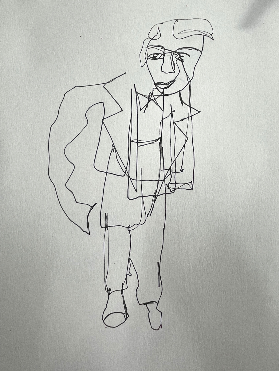
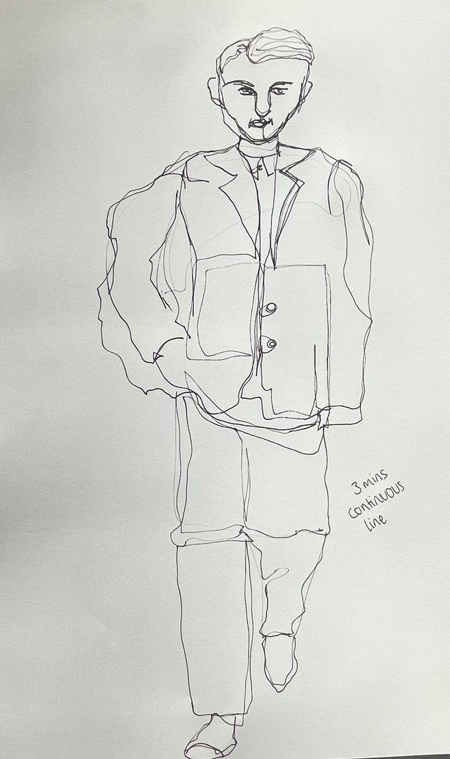
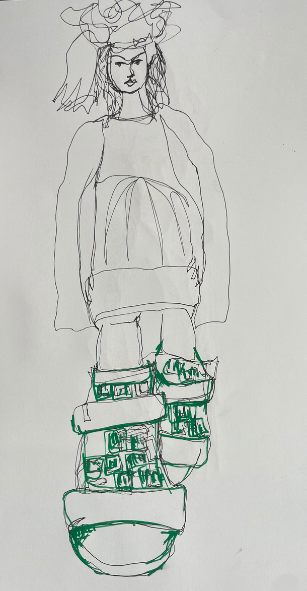
Life drawing
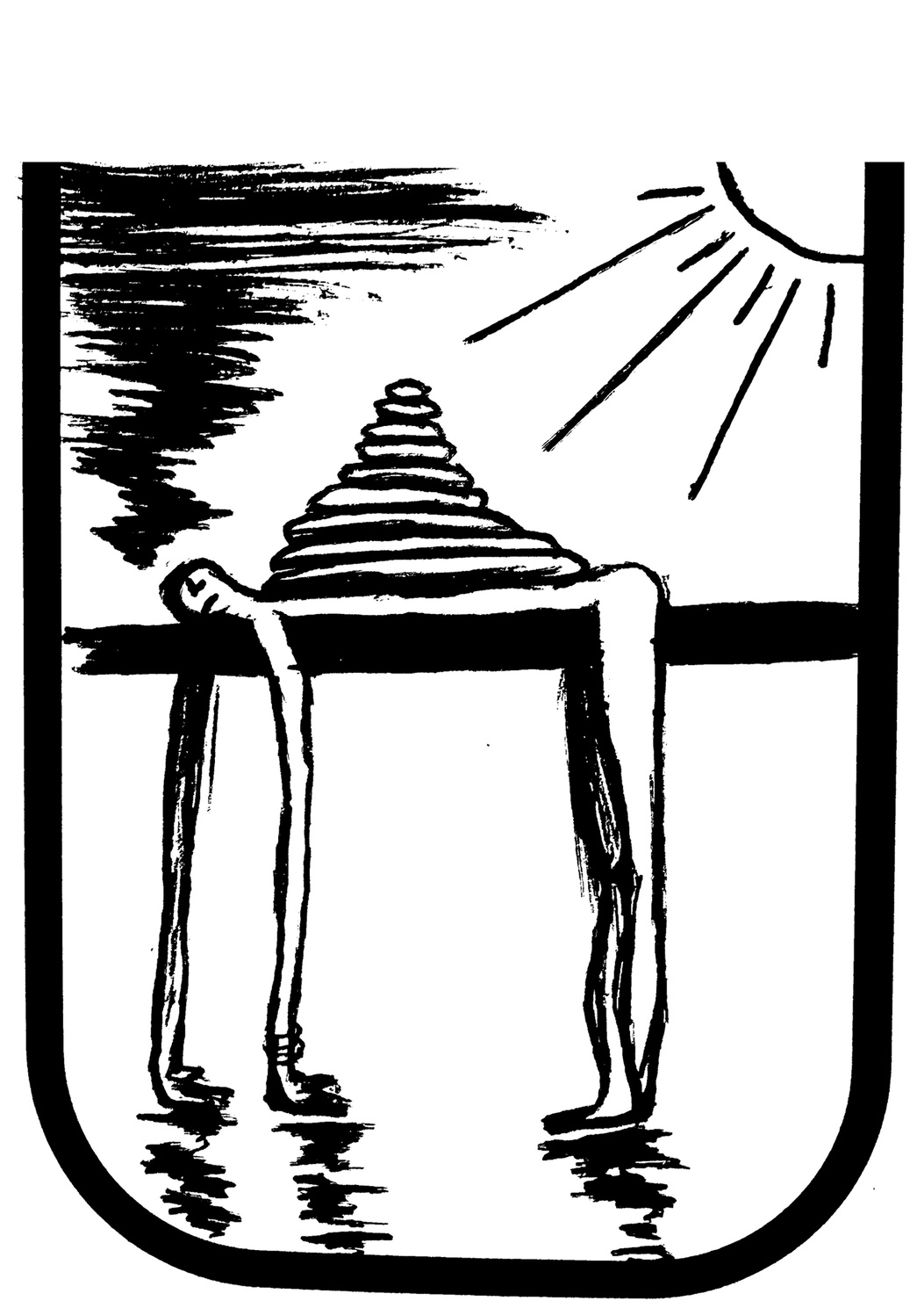
Head Lengths
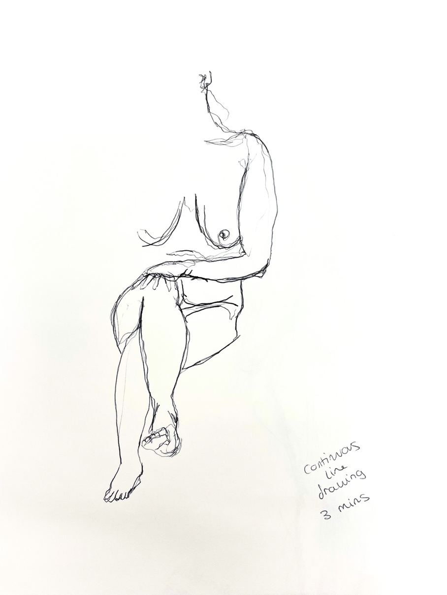
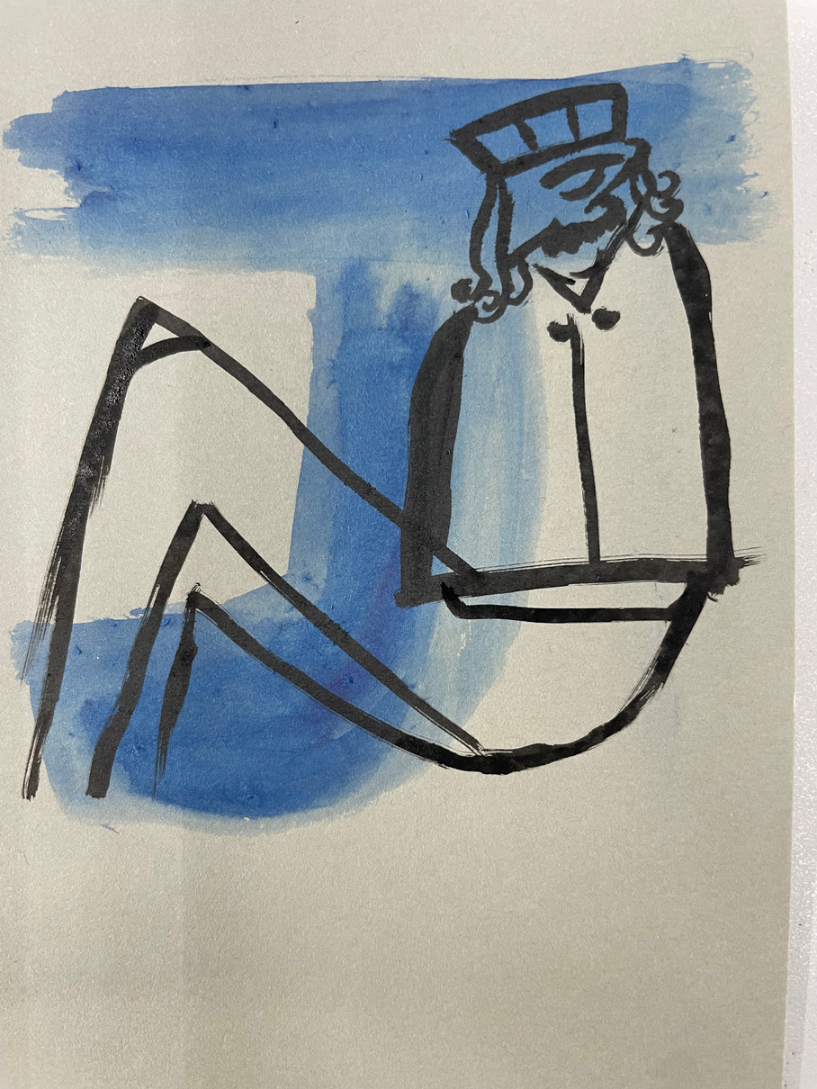
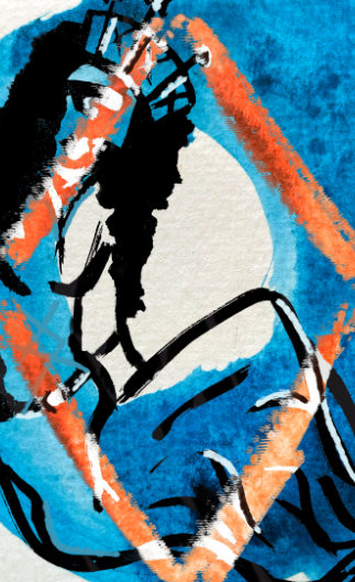
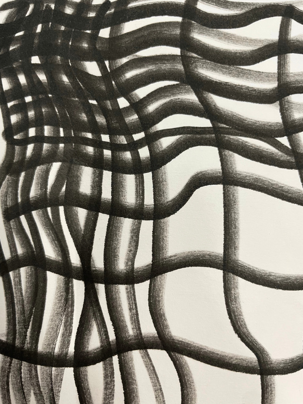
Continous line
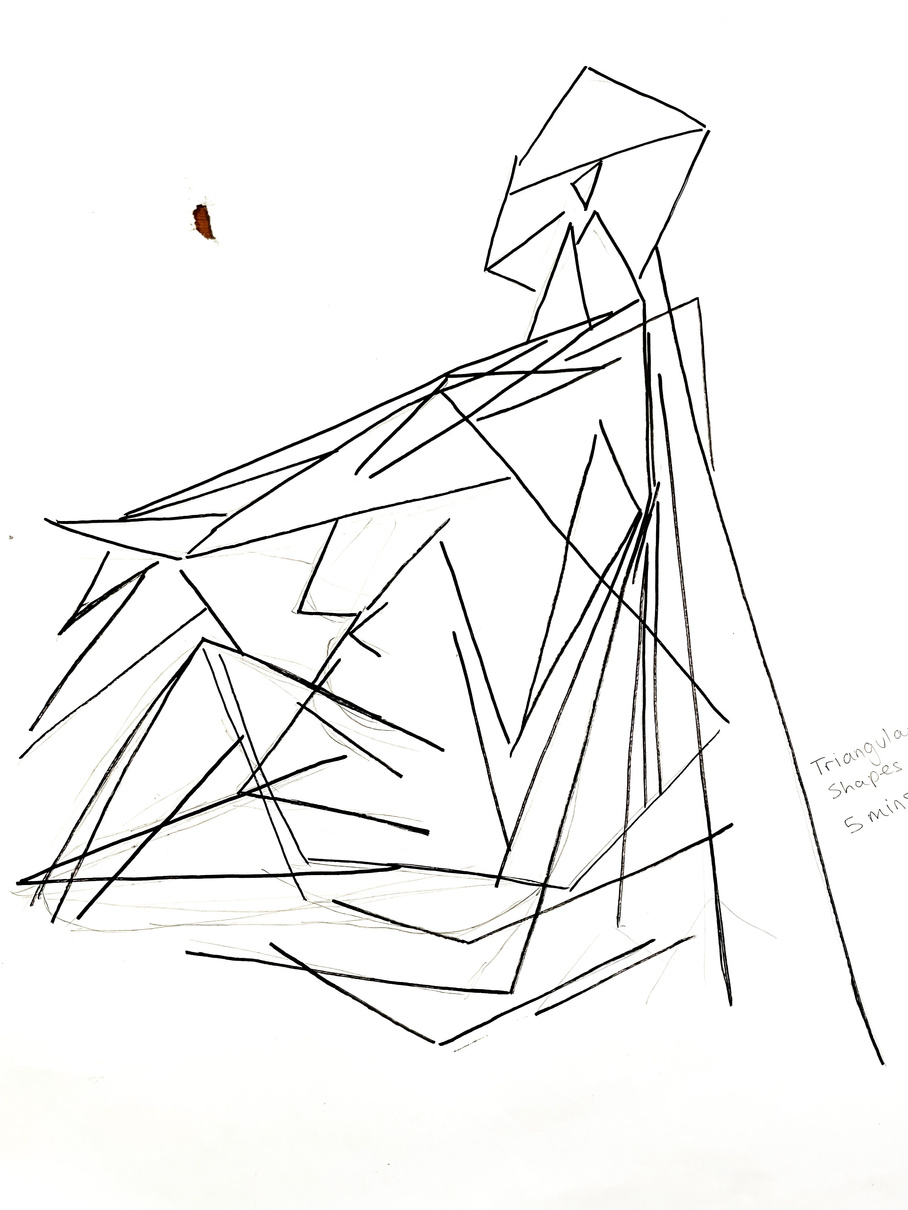
Triangular shapes
B
B
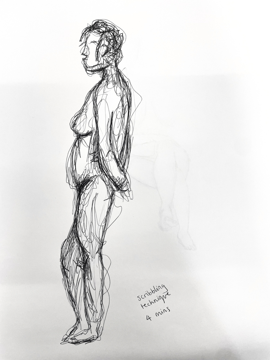
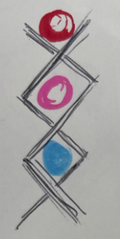
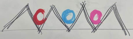
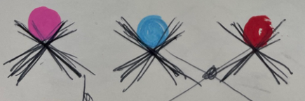
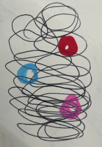
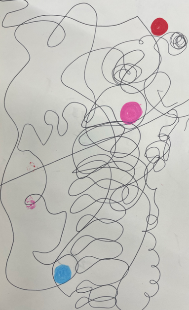
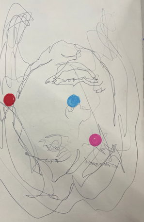
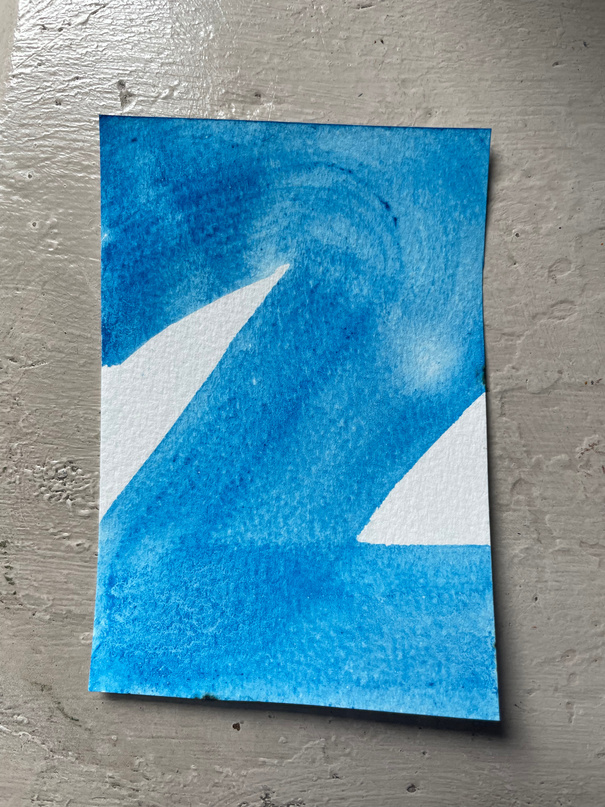
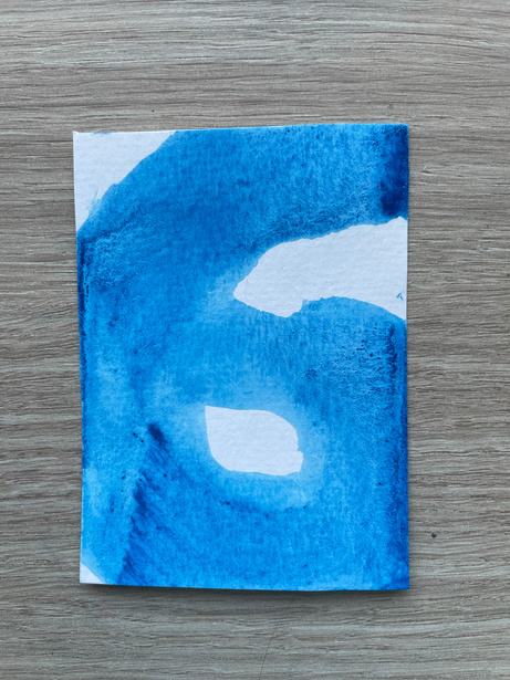
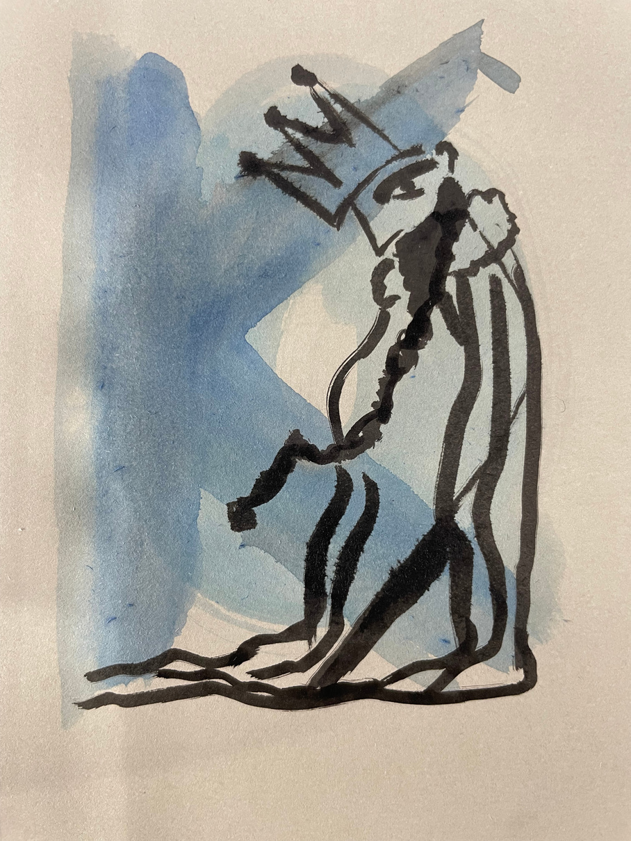
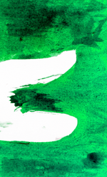
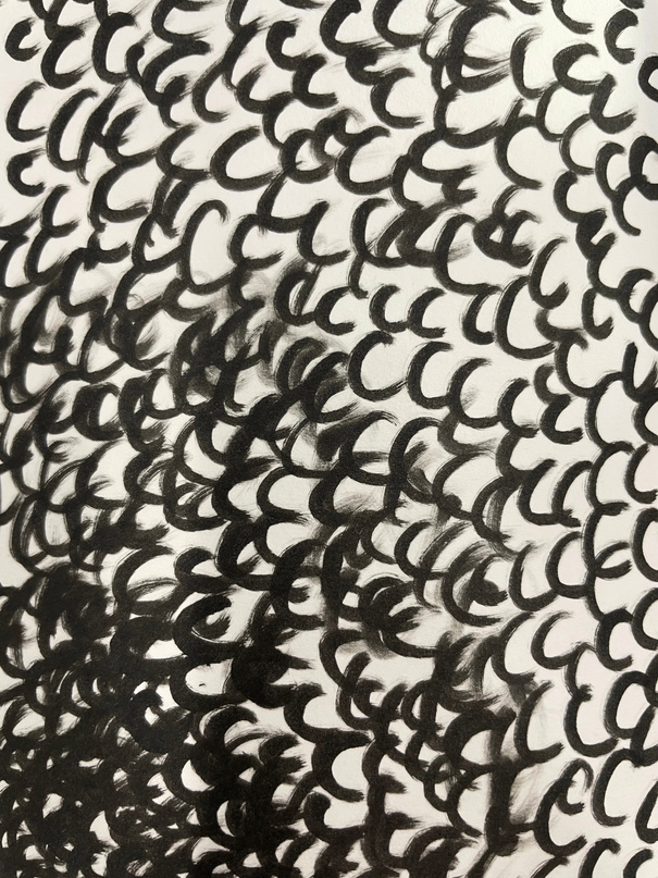
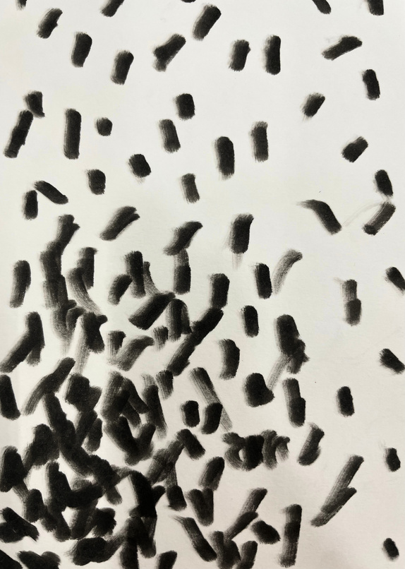
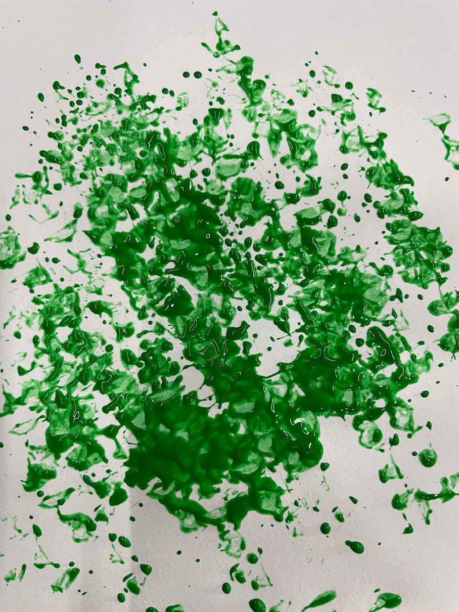
sCRIBBLING
Reflections:
What Went Well: I was able to experiment with completely new drawing techniques such as head lengths or scribbling without thinking too much about time or perfectionism. Life drawing for the first time definitely made me want to pursue it further in order to improve my anatomy and ability to draw with more focus on the subject than the paper.
For Next Time: Be more careful with perspective and focus on proportion.
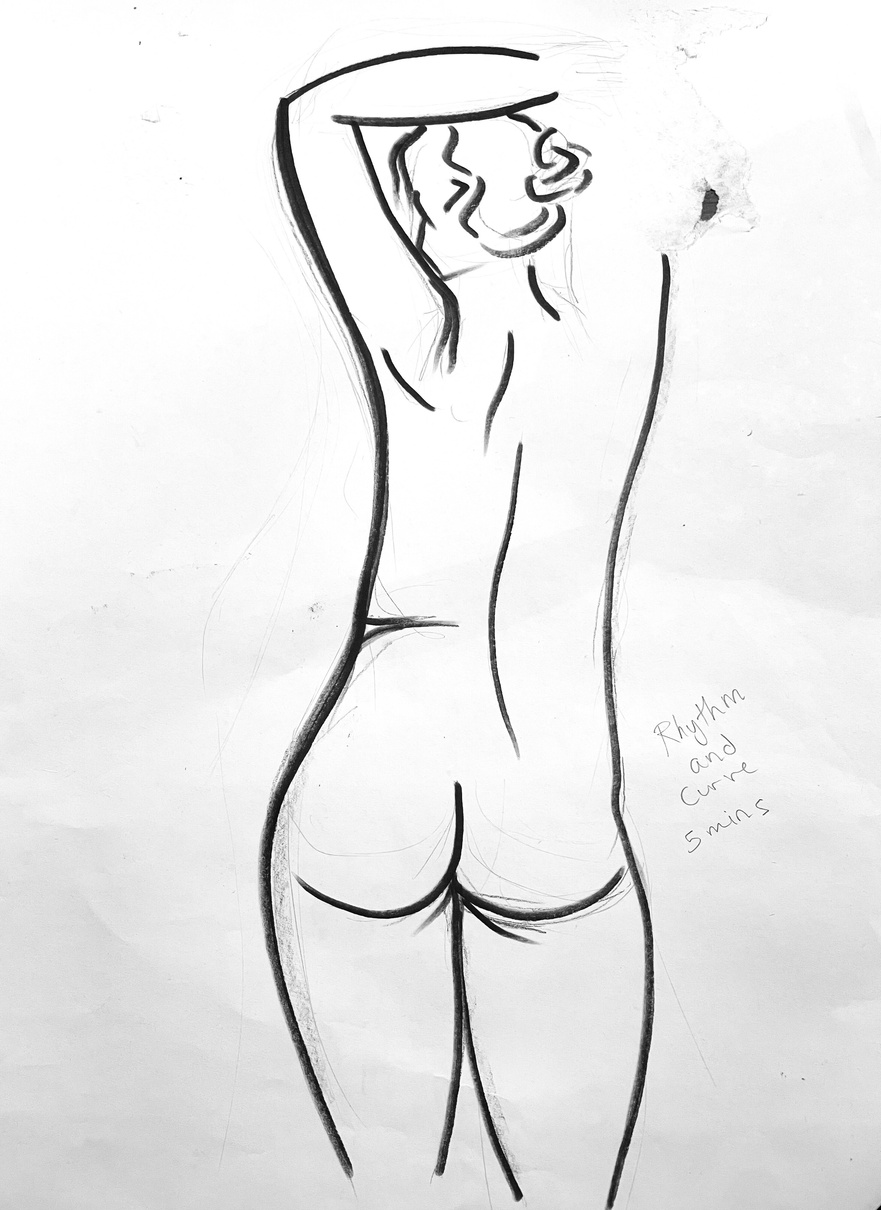
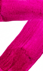
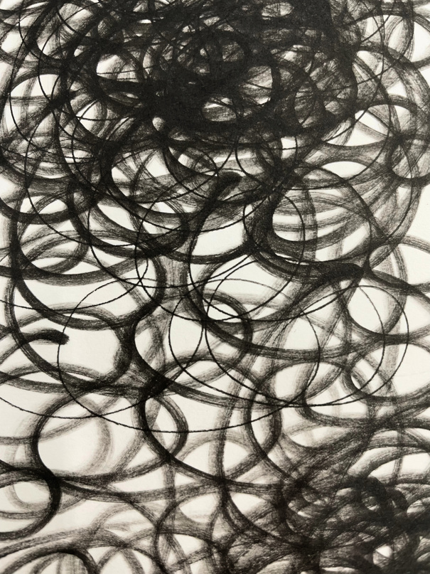
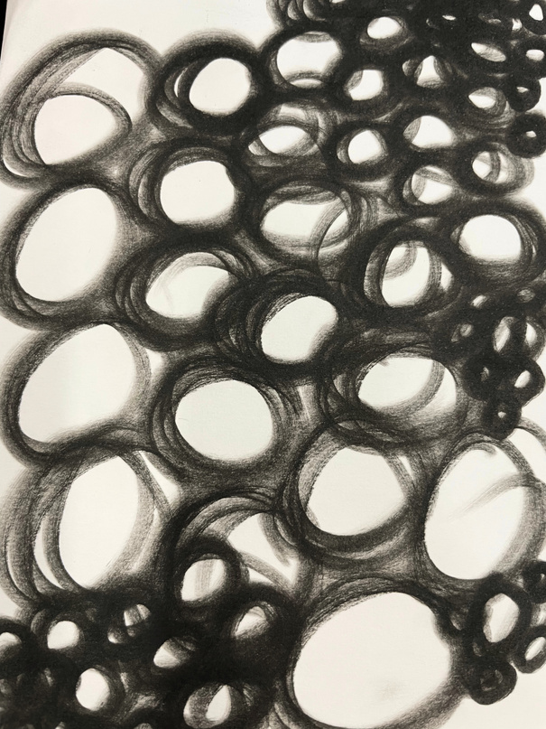
Rhythm and curve
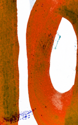
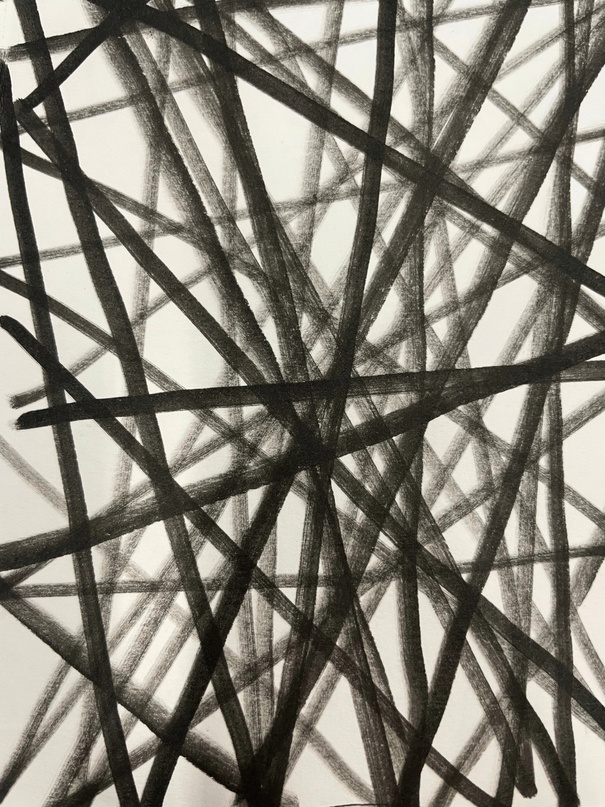
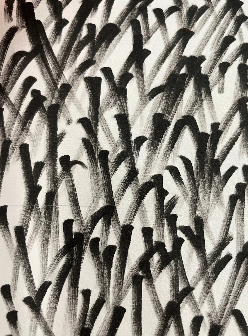
Freestyle
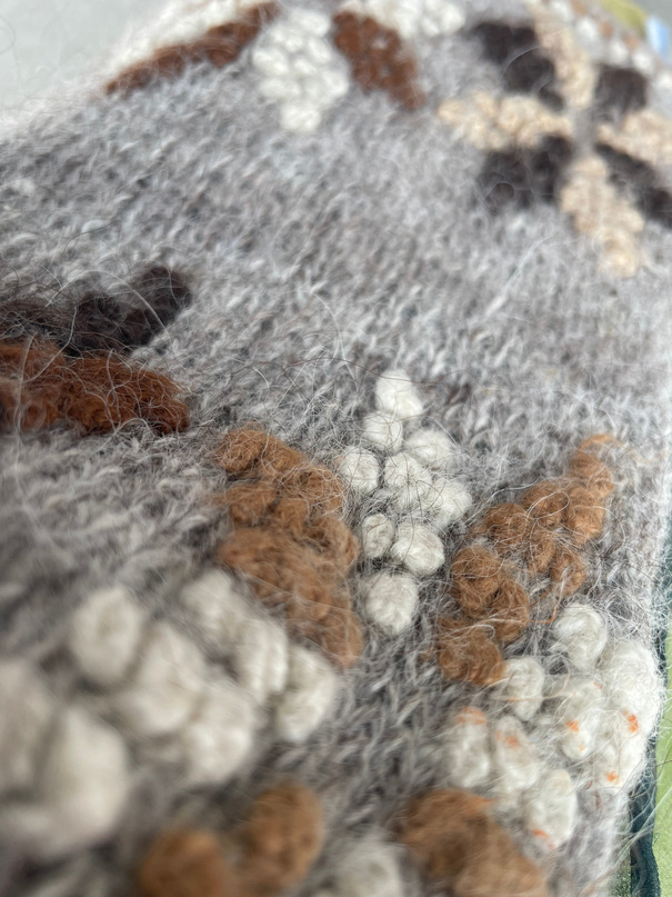
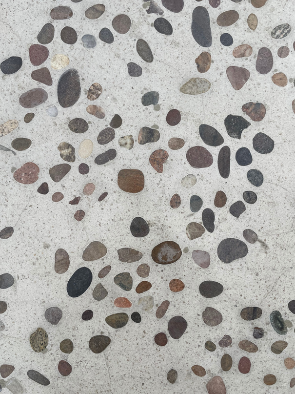
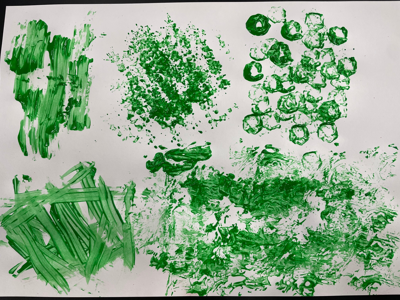
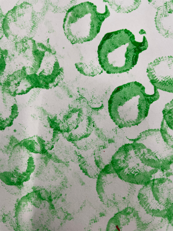
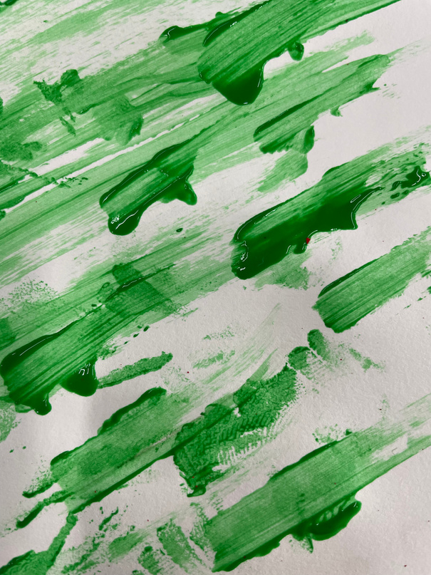
Material research
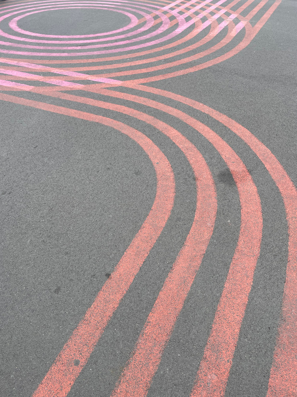
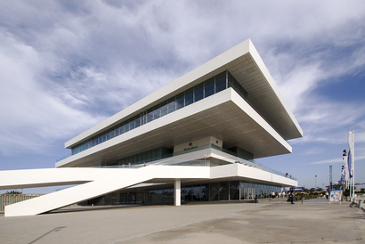
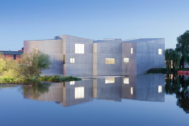
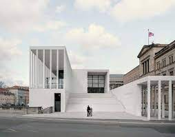
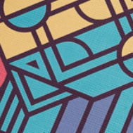
Organic, Façade, man-made
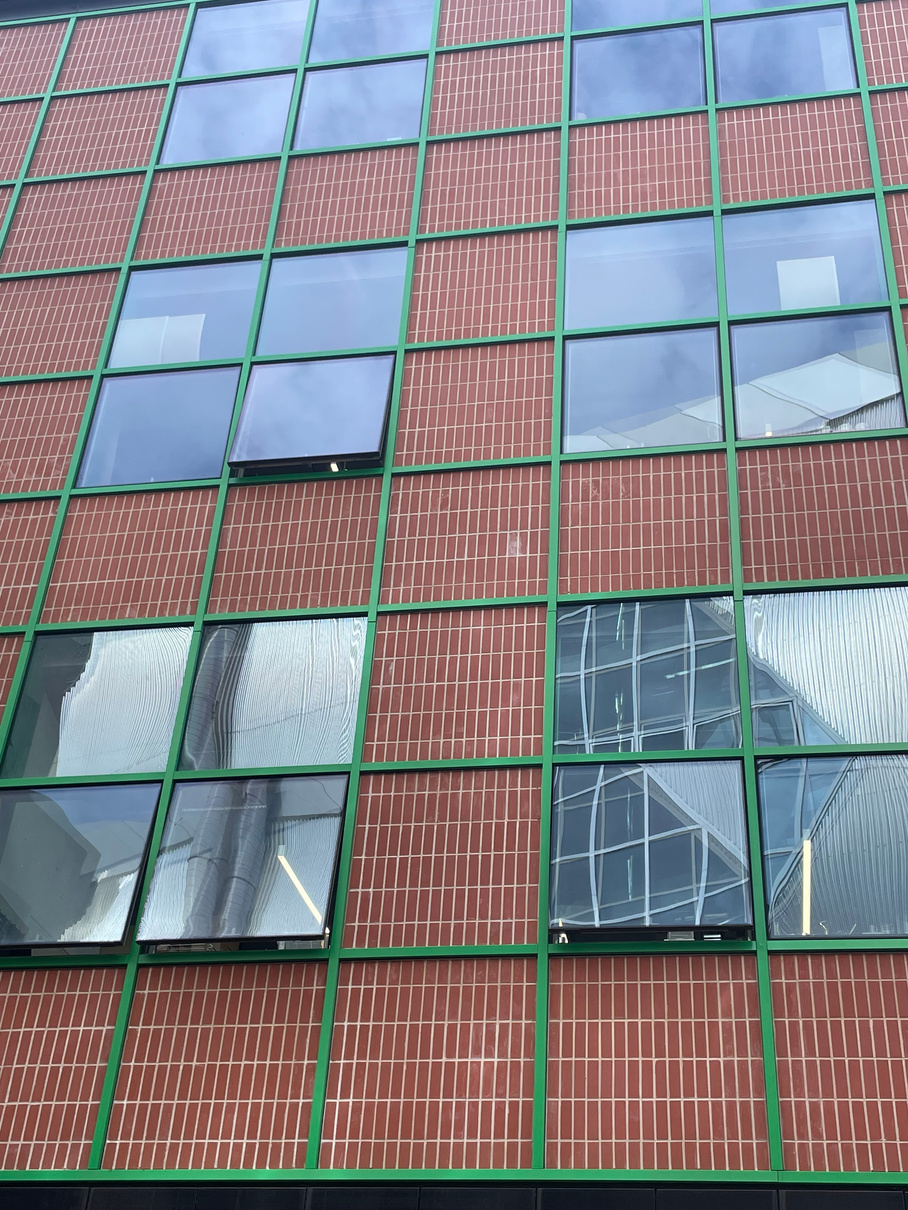
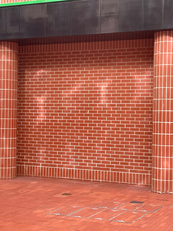
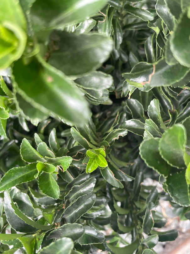
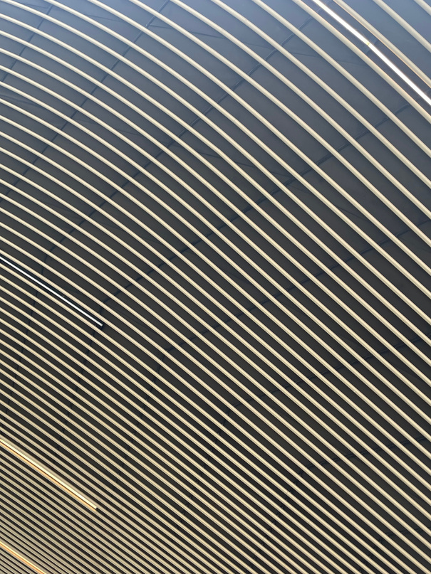
I was drawn to this building's unity and symmetry in its façade design since the way in which the simple square pattern is repeated and consistent with the windows is visually very pleasing and satisfying. The bricks themselves are interestingly positioned since they are upright rather than lying across and this gives the overall design a much more unnatural feel. The pop of green paint along the what I assume to be metal square outlines also add to the unnatural and so obviously man-made feel of the building.
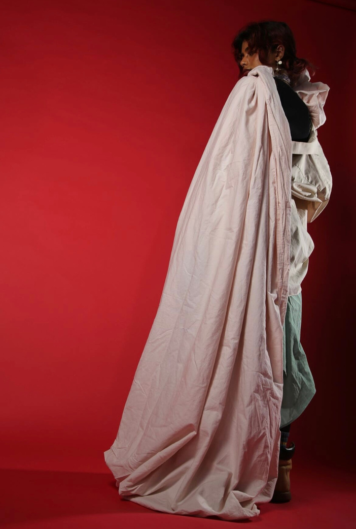
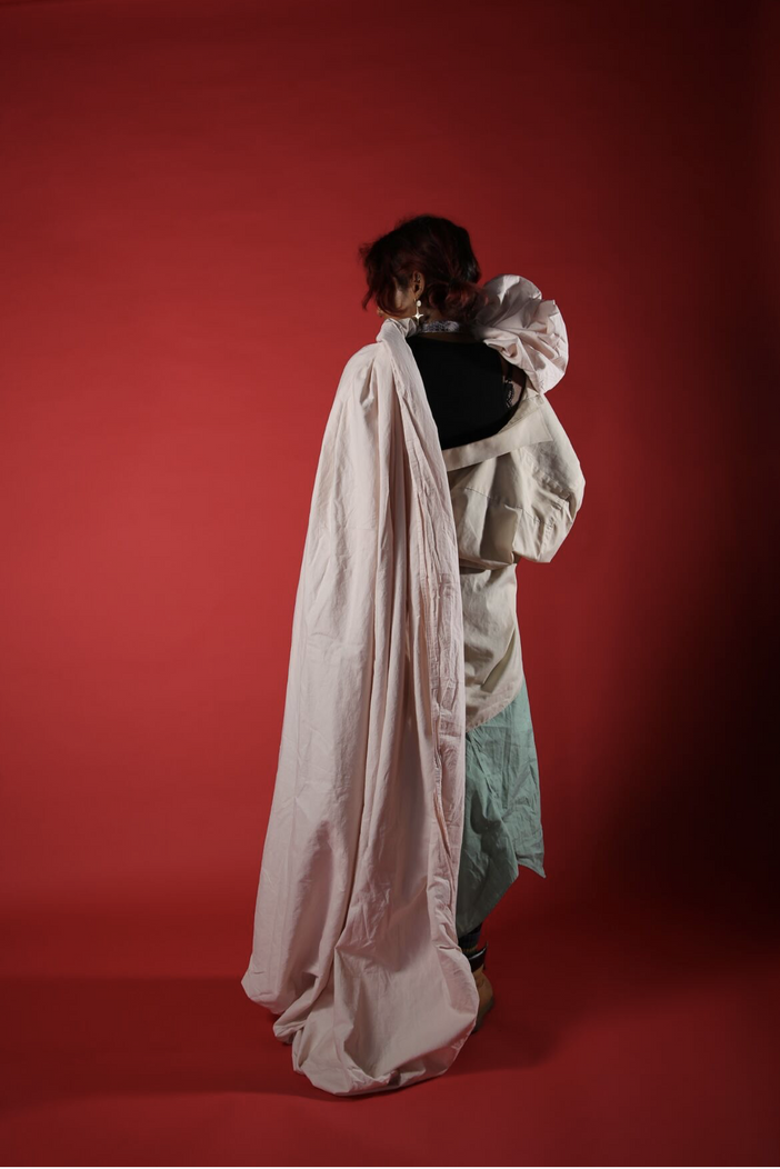
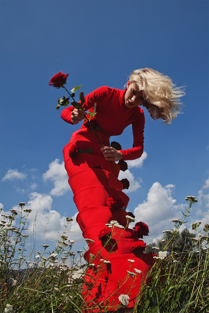
Photography and styling: “Alluring”
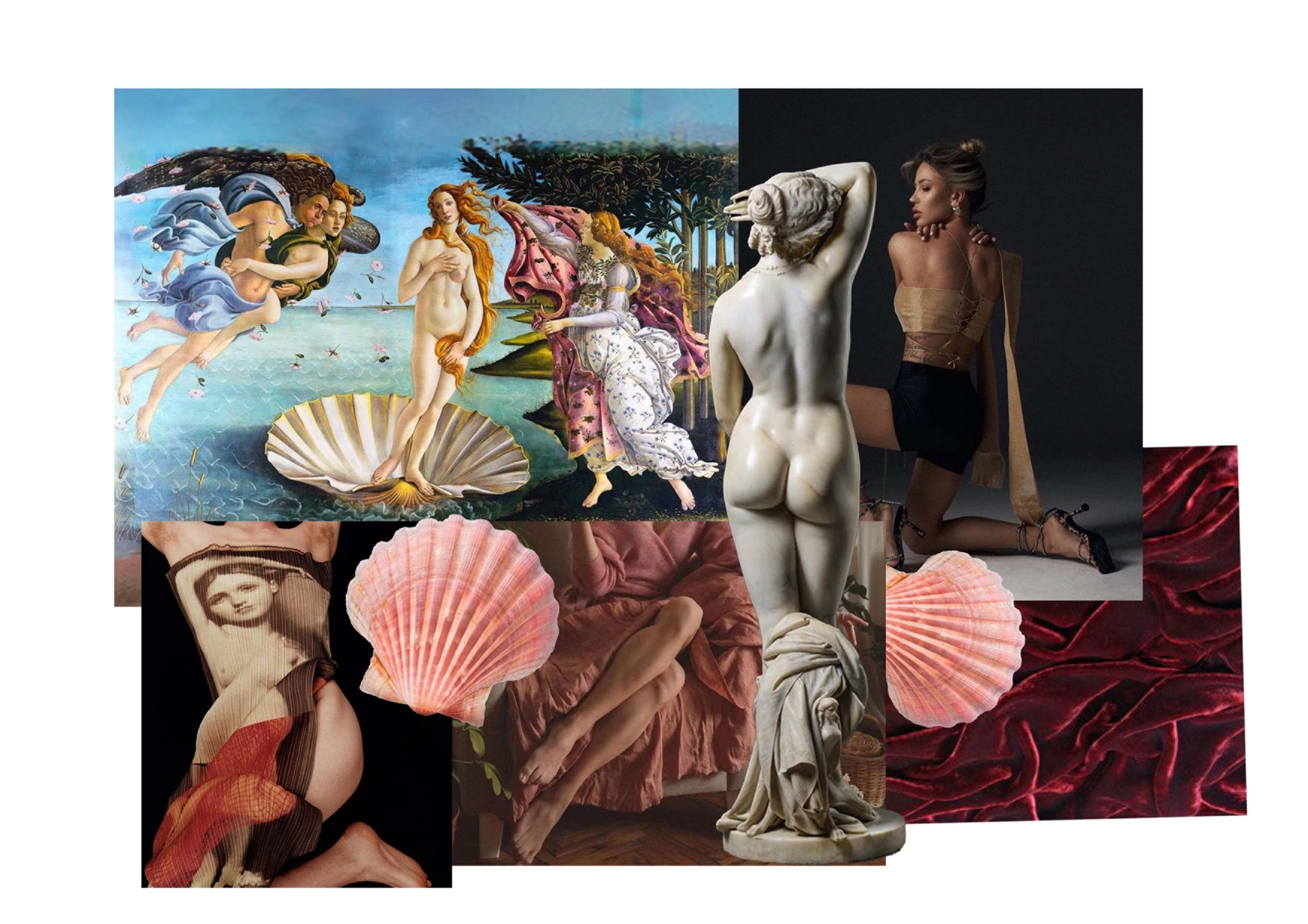
Styling the look- Alluring
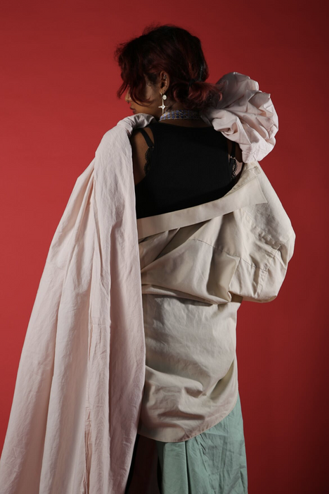
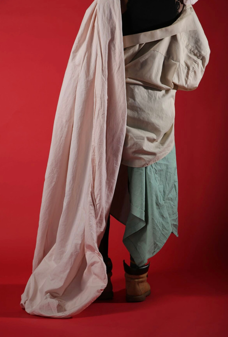
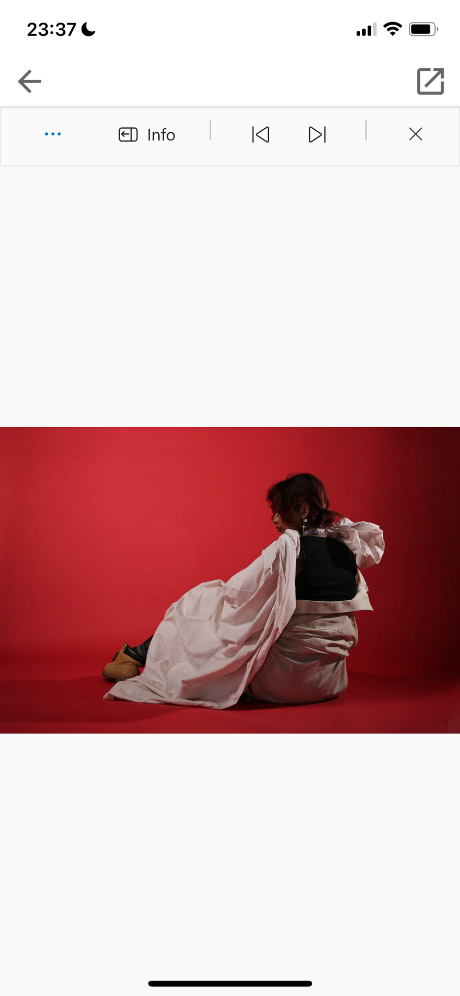
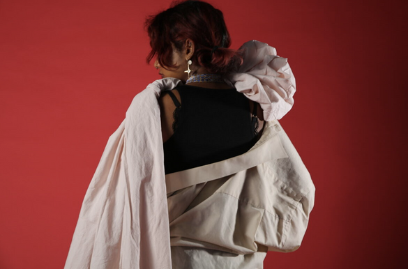
With the hanging off the shoulder shirt and loose shirt as a skirt look I wanted to create a casual and sensual feel which colour-palette wise also matched the subtle softness of the pink sheet. The green shirt also worked with the shell theme as sea-weed. I wasn’t sure which background to shoot on but I thought that white or blue would wash out the colours of the clothing and black would be too dark so I decided on red not only because it is a rich background to make the model pop against but also because red is classically a colour of desire and passion which conforms to the theme of alluring or seduction.
I wanted to generate soft feminine ruffles with the pink sheet which mimic the shape of a shell. The asymmetry of draping it around the shoulder worked with my plans to photograph from behind with an over- the- shoulder gaze. The shell shape really framed this look by balancing out the opposite facing direction of the face.
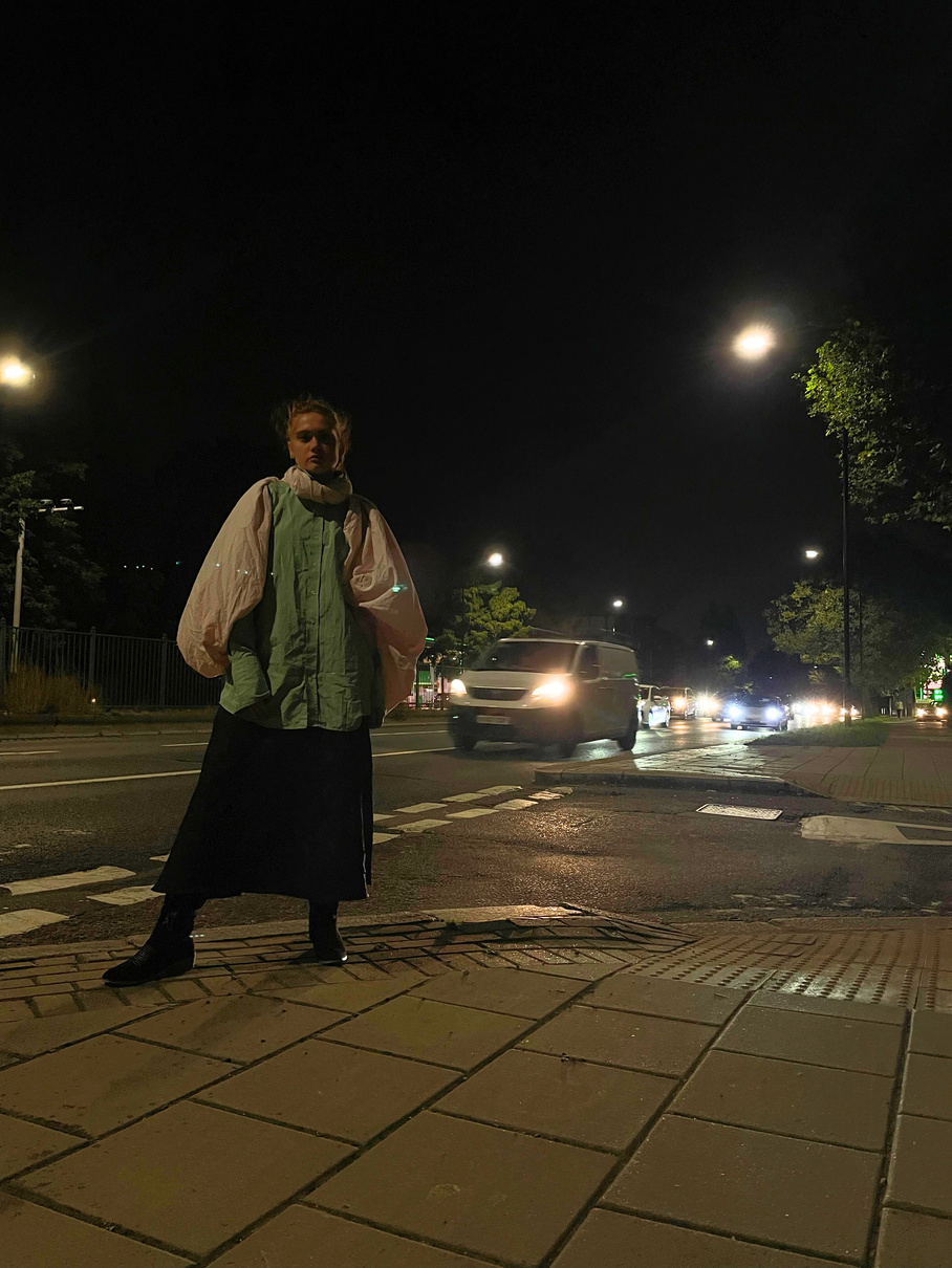
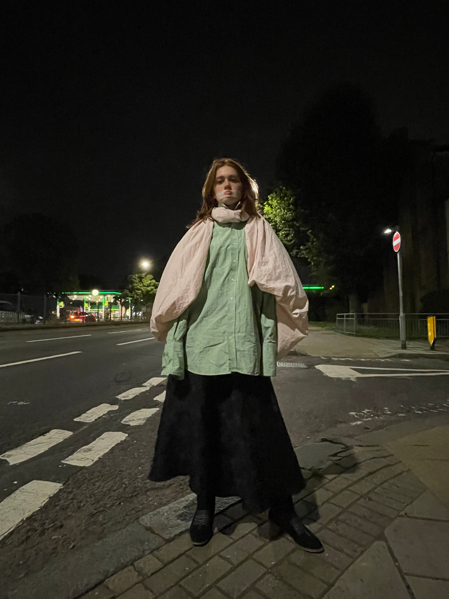
Home shoot “Loud”
Styling the look
My perception of loud was much more int he location of the shoot and the presence of the model rather than the clothing styled on them since I wasn’t particularly inspired by the materials I had to style with for this word too.
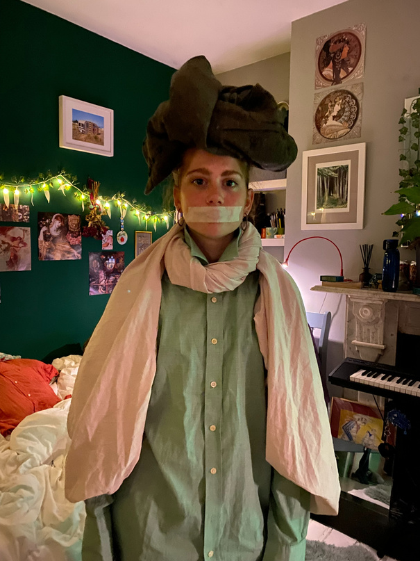
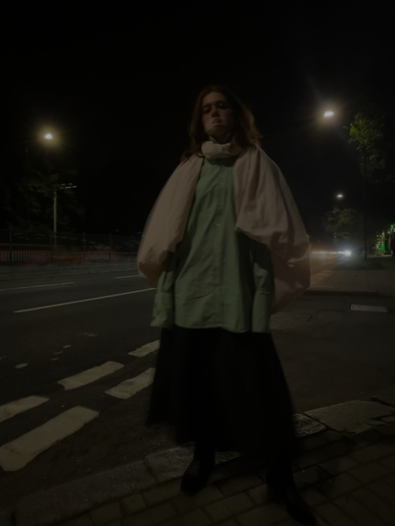
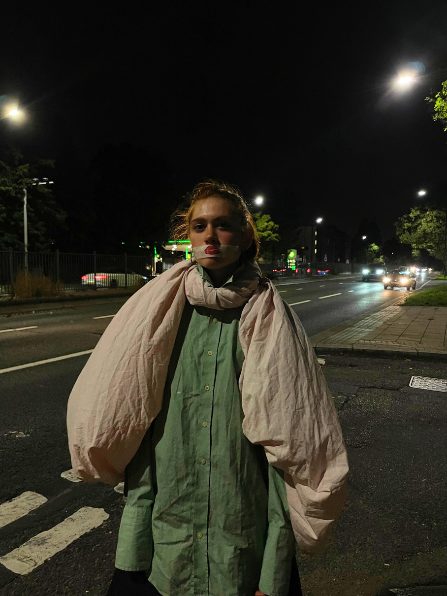
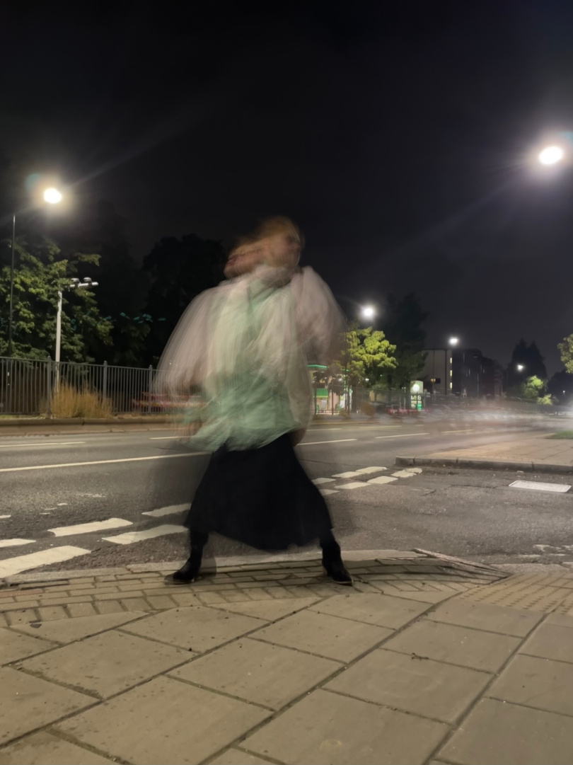
I wanted the lighting for this shoot to be primarily supported by the street and car lights but I did do a general brightness edit for most images since shooting raw at night was much to dark despite the images being nice and moody. While I wanted to experiment with closer shots the long shots had the more “loud” impression and captured more of the location so I lead with that style.
Variation
in visual
recording:
Final Photo Reflections:
What Went Well:
I am really happy with the mood of my alluring piece as well as certain details of the styling like the shoulder frill made out of the sheet. I think I captured the soft seductive vibe that I wanted through the colour palette and I think that the backwards facing pose of the model is also effective in conveying this subtle mood. I do not think my loud photoshoot is as impactful or actualised my concept as fully but I was still happy with my experimentation in styling and variation in camera angles.
For Next Time:
I would’ve liked to experiment far more with different shot depths and distances instead of just wide angle shots for the alluring shoot because this might have produced more dynamic images. I also could’ve styled a “louder” look for the loud shoot.
3D CREATIVE PRACTICE
3D CREATIVE PRACTICE: Bridge Building
RESEARCH;
Spanning STRUCTURES
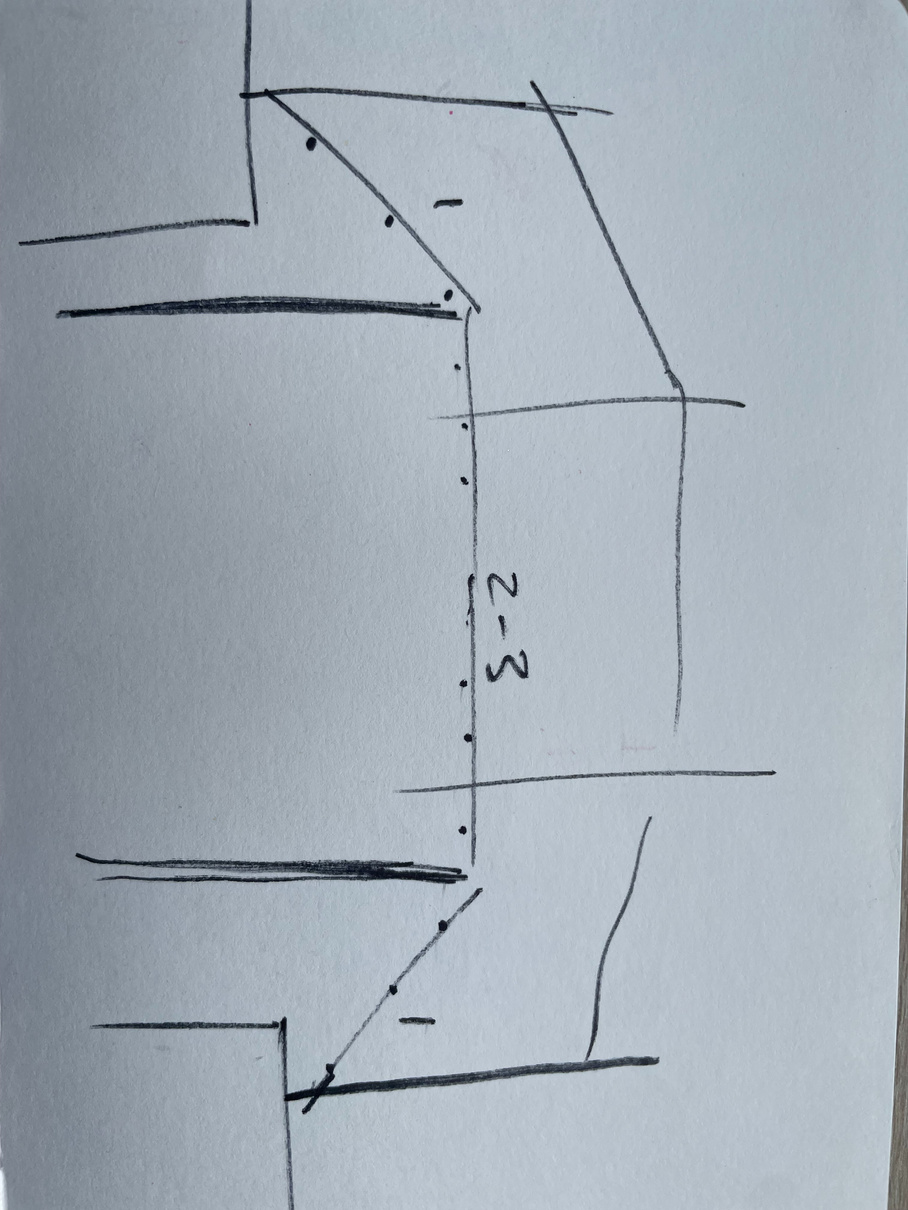
The brief; making a bridge that an electric car can drive over across two tables out of the limited materials of bamboo and cardboard with only two floor supports and a minimum height of around 1 meter at one point of the bridge to allow a “boat” to pass under.
I immediately thought of visually striking bridges like the harp-shaped Samuel Beckett bridge in Dublin because what initially inspired me with this brief was the freedom to create an aesthetically pleasing architectural design. To start the project we conducted primary research of suspension structures in the local area- which was a valuable way to get thinking about the types of form and shape that might make up our bridges and more about the logistics rather than aesthetics which I probably would’ve been too distracted by without considering this research. I was interested in looking at organic vs geometric shapes and the use of curves vs straight lines as well as how to balance aesthetic with practical function especially since the bridge needed to meet so many criteria.
dEVELOPMENT OF CREATIVE PRACTICE
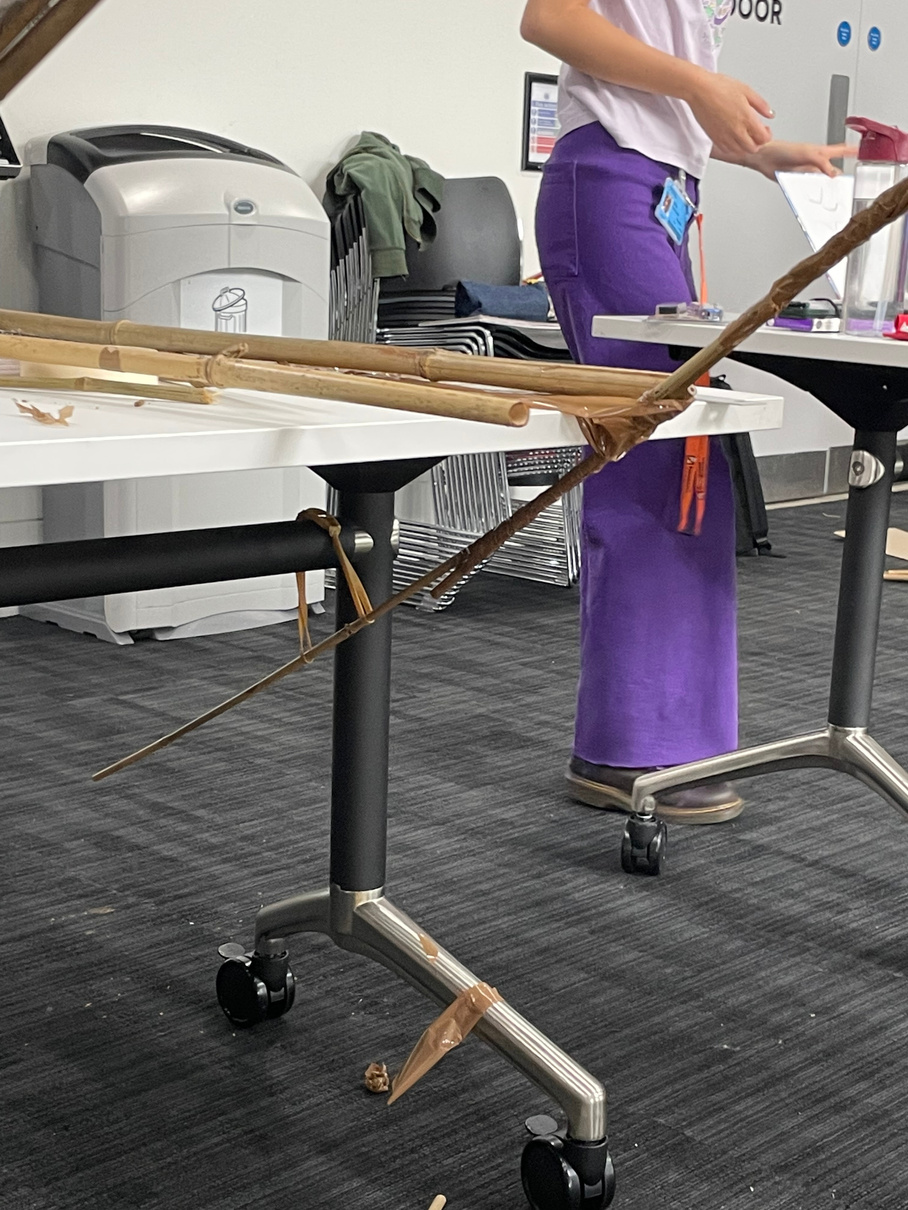
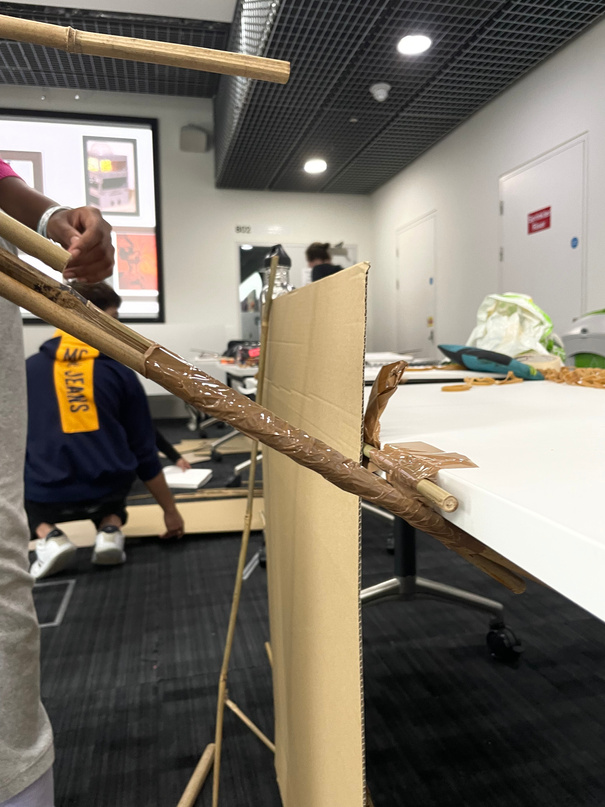
We designated the different tasks of securing the initial bamboo poles to the tables, making the bamboo poles longer for the main frame of the bridge and constructing the road boards.
When split into our groups we first started pitching initial ideas and sketching to visualise. We came up with a rough idea that everyone agreed on and decided to begin construction quickly by making the main flat boards of the bridge with bamboo supports under cardboard. However, our initial idea for the overall structural support of the bridge was abandoned pretty quickly when we decided that for stability attaching the bridge to the table using the bottom pole was quite effective.
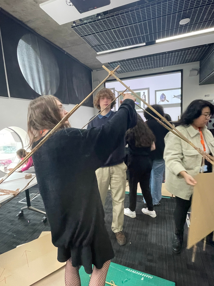
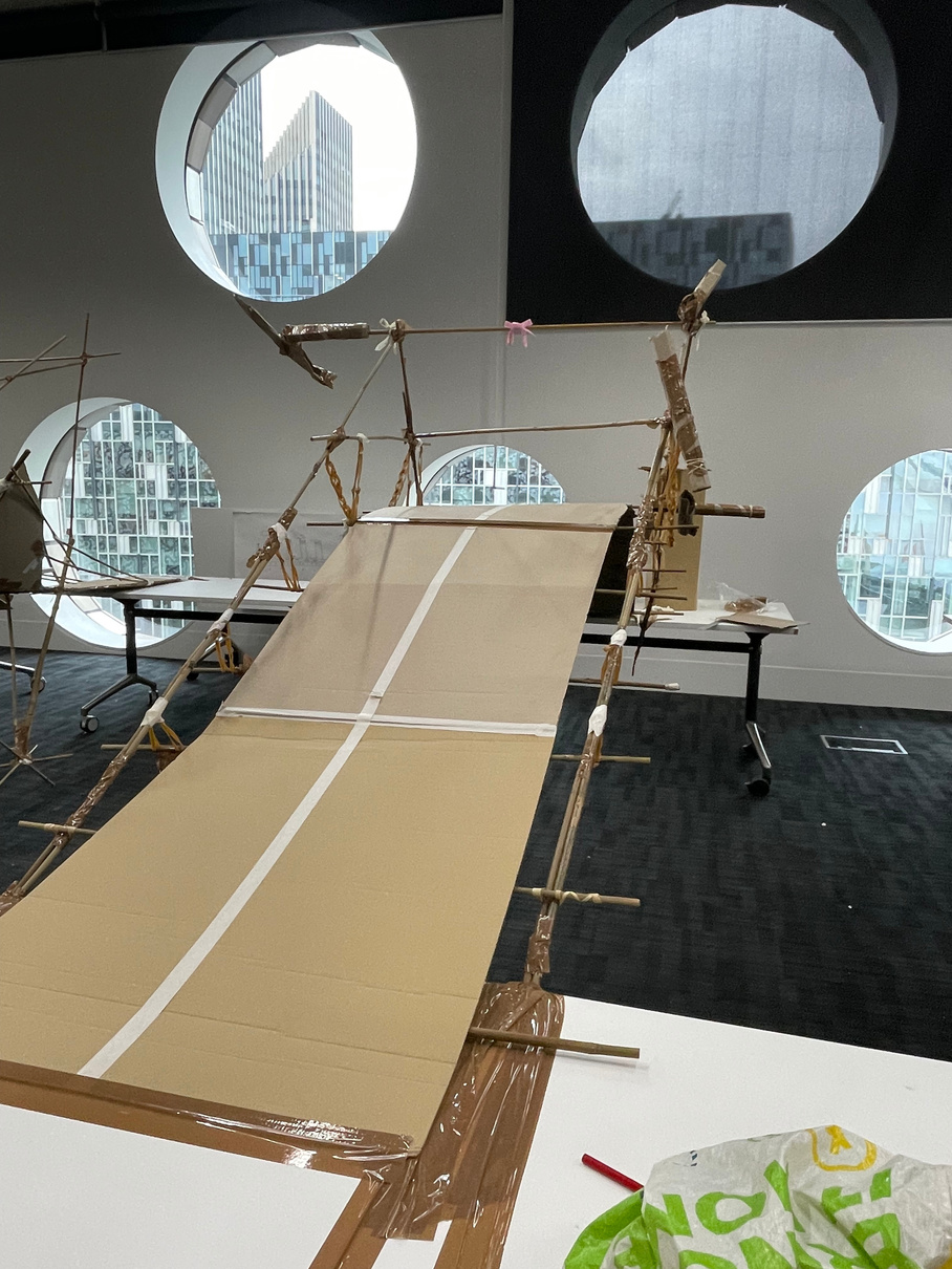
We had in mind to use two floor supports to strengthen the bridge but once the main frame (which we decided was best criss-crossed) was in place we realised that we could make the whole bridge without any floor supports and that became the challenge for our group. We had to be wary of the width of the two main supports in order for our pre-made boards to fit.
Inspiration:
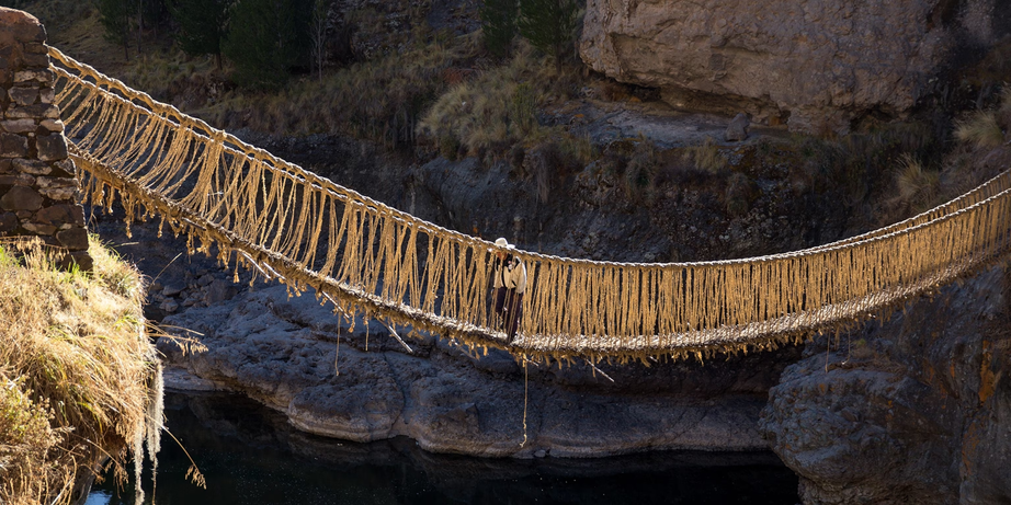
Rather superficially, the traditionally imagined sort of bamboo jungle bridge was what I imaged in terms of our move to suspension, despite these designs being suspended the opposite way, the basic principle is there.
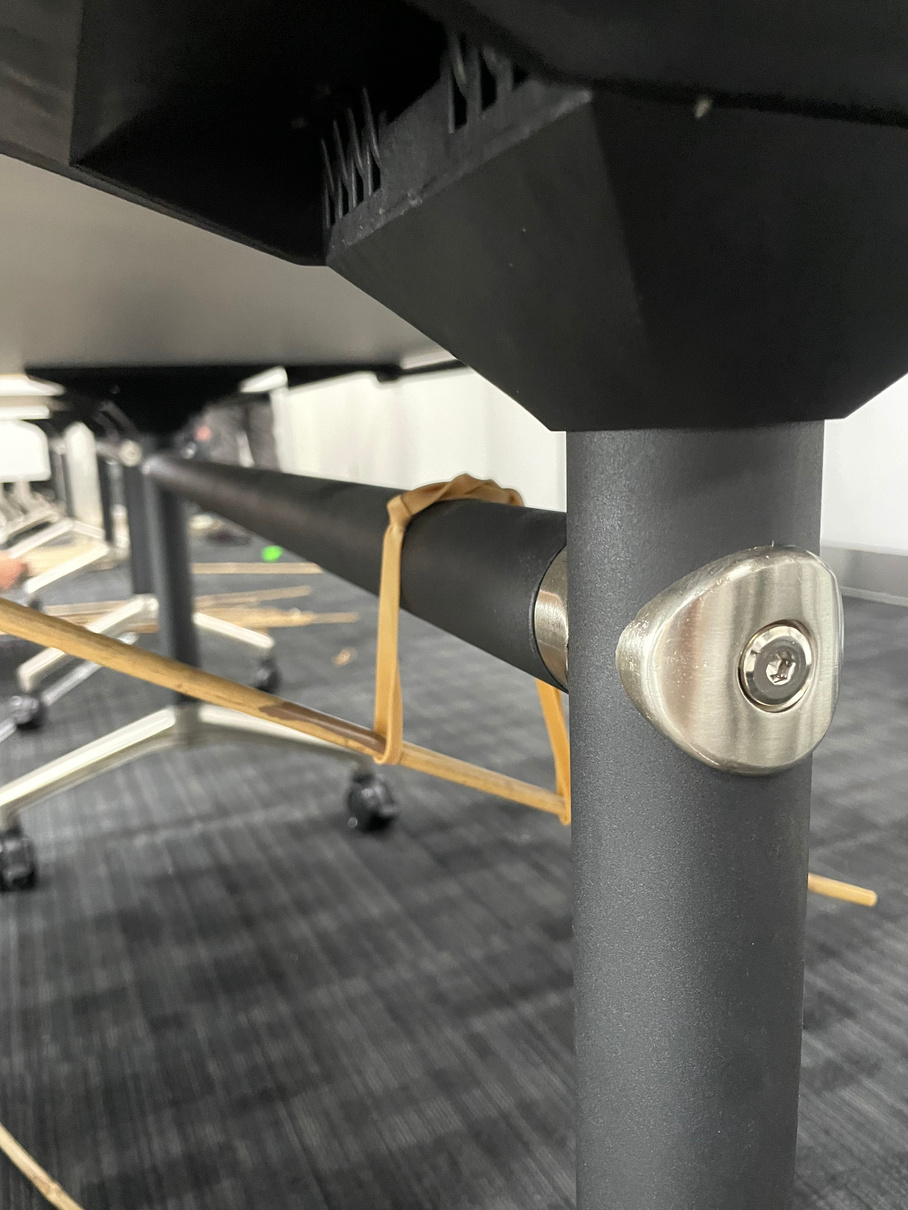
One problem we faced was the bridge leaning slightly to the side which we solved by adding an extra two beams perpendicular to the main frame of the bridge on the top which counter-acted the leaning to one side. Once the completed road boards were secured we realised that suspension could be involved (which we had spoken of at the start) by using rubber bands and hanging the bridge boards from them rather than placing them on top of the main frame.
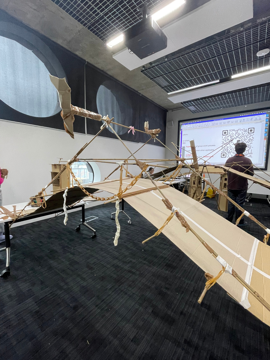
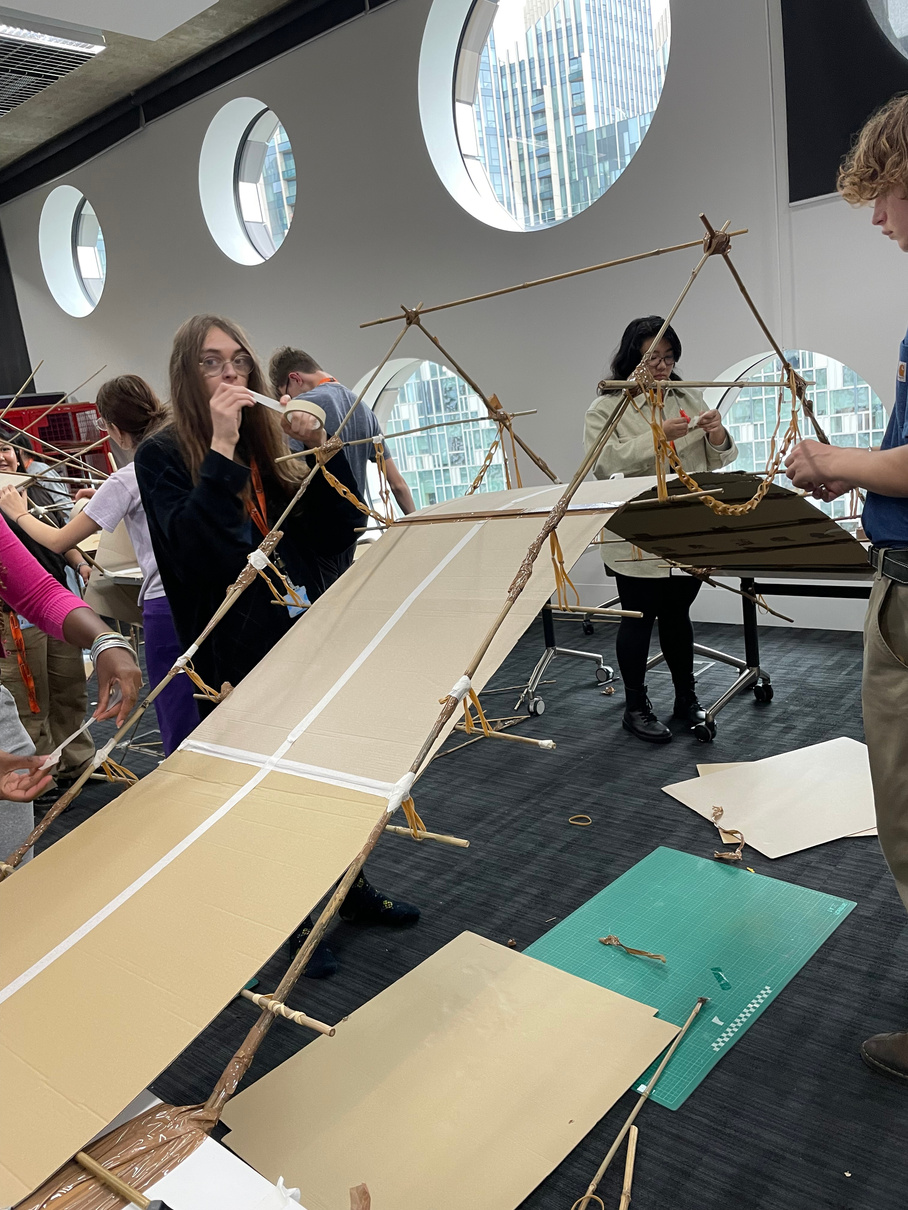
We became pretty confident that we didn’t need floor supports since the bridge stayed up without any of us holding it and we weight tested it with the faulty car. To finish we added to the overall aesthetic with tape for road lines along the boards, a bow and some rubber band chains dangling along the sides as well as a ticket box in front of the entrance to the bridge.
final structure test
Reflections:
What was interesting about this project was that the final outcome was almost entirely different to our initial sketch because we ended up with a curved and suspended bridge rather than a flat design with floor supports. It was valuable to see how an idea evolves if it is allowed to and that following a ridged plan can be limiting rather than always helpful.
What Went Well: While it may have been a mistake to jump into construction so quickly it actually benefited the design since we constantly changed the idea with the active process of construction presenting new challenges that we could respond to. For example the curve came from the fact that the bridge needed to meet a certain height and the suspension came from the realisation that without lowering the curve a little it would be too steep for the car to climb. It was also helpful to follow the leading element of our initial idea being the formation of the main boards as this anchored the rest of the design. The ability to modify an idea and adapt to challenges is a really valuable skill and definitely something that can be applied to every kind of project, creative or otherwise. In designing this bridge I definitely felt that I was able to experience that kind of adaptable process and I learnt a lot from having that sort of mentality towards design. For me specifically this task developed my more logical problem solving abilities since the brief had a lot of specific criteria and architectural design itself is a lot more function over form based.
For Next Time: More group discussion to begin with might have aligned everyone’s ideas better and made for a smoother working process. In a way our group might also have been too hung up on the criteria for the design that we didn’t have as much creative fun with our design since we were set on meeting all the criteria exactly. Other groups that tried to make more visually striking designs while sacrificing the specifics of some of the criteria might have gained more from the overall process since they were less constricted in their ideas. Literally ‘breaking the rules’ might’ve pushed our creative potential further. That being said working to a strict brief made the whole project more challenging and this produced a more satisfying result since we met the criteria and made something that we were proud of, especially since the bridge we made was the only one to have no floor supports at all.
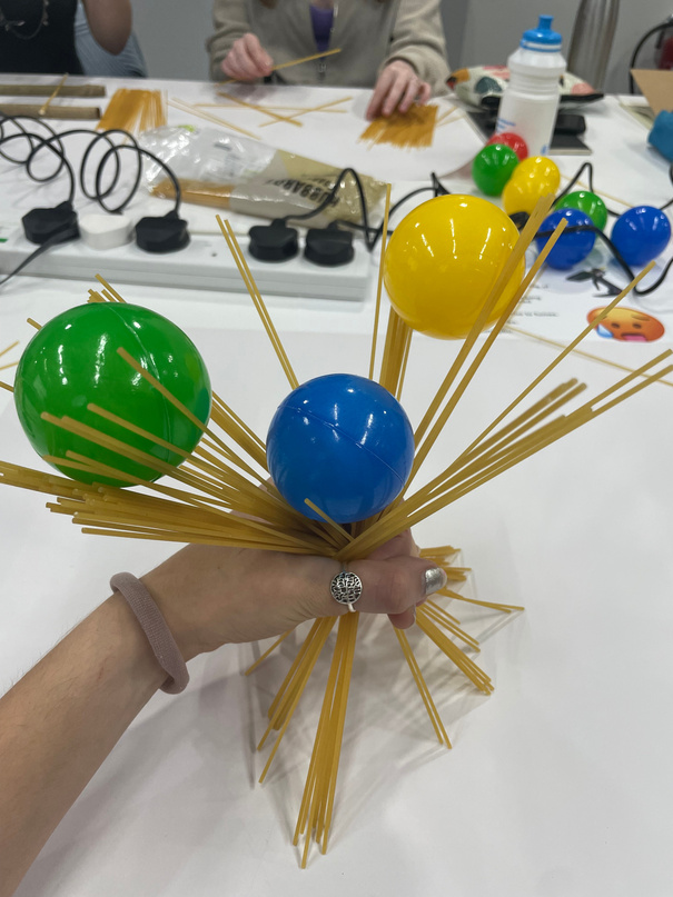
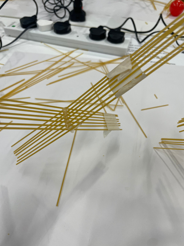
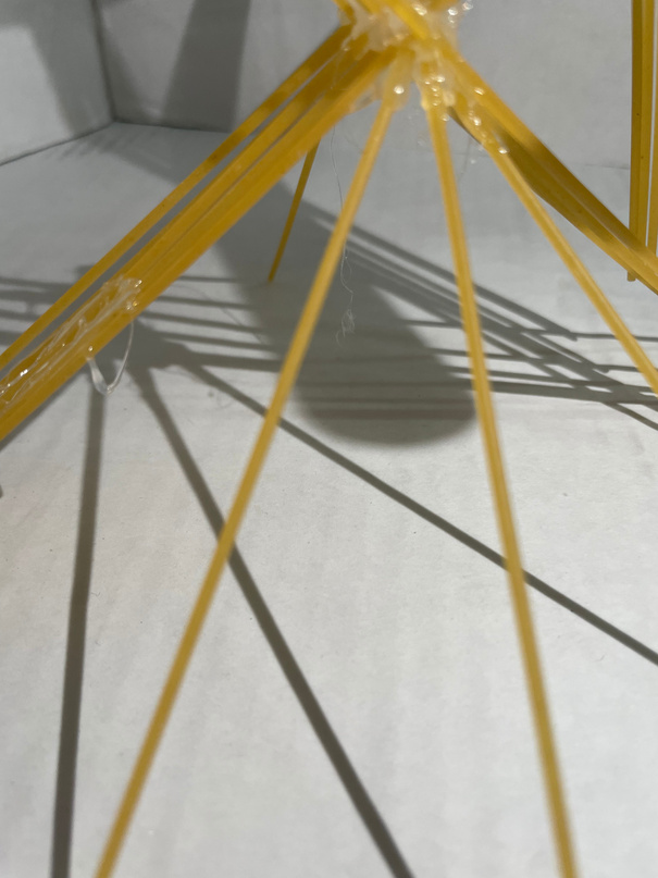
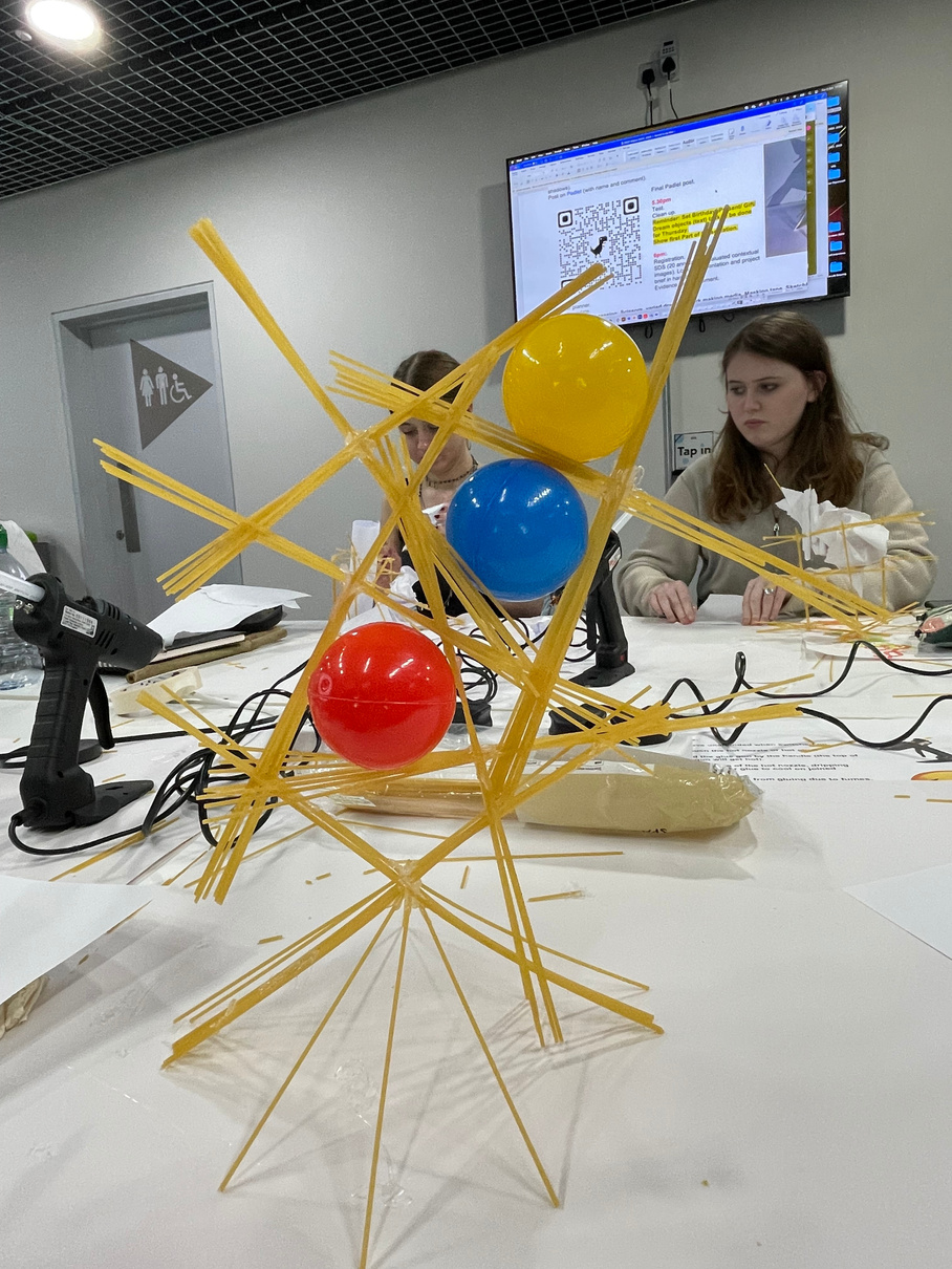
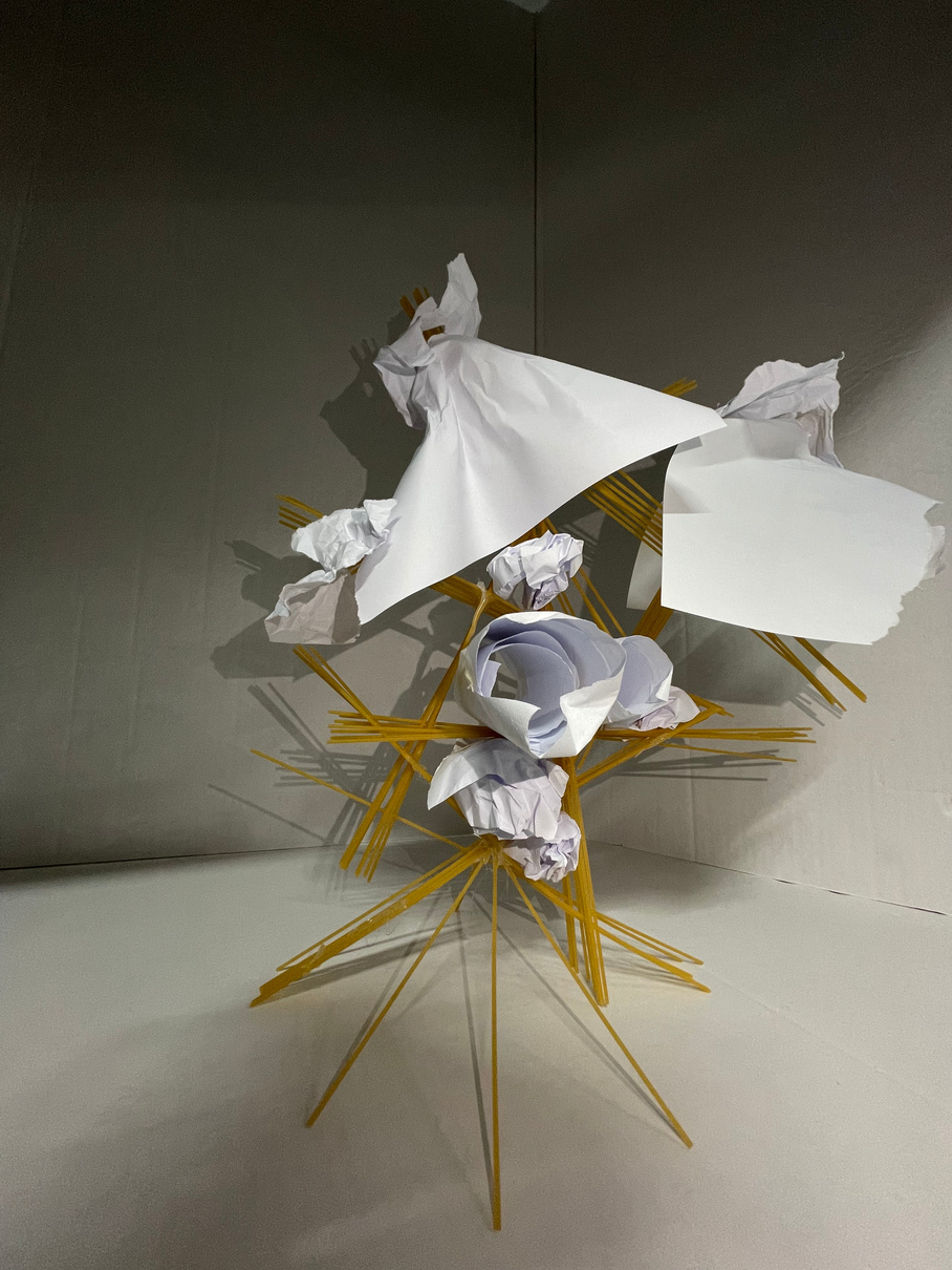
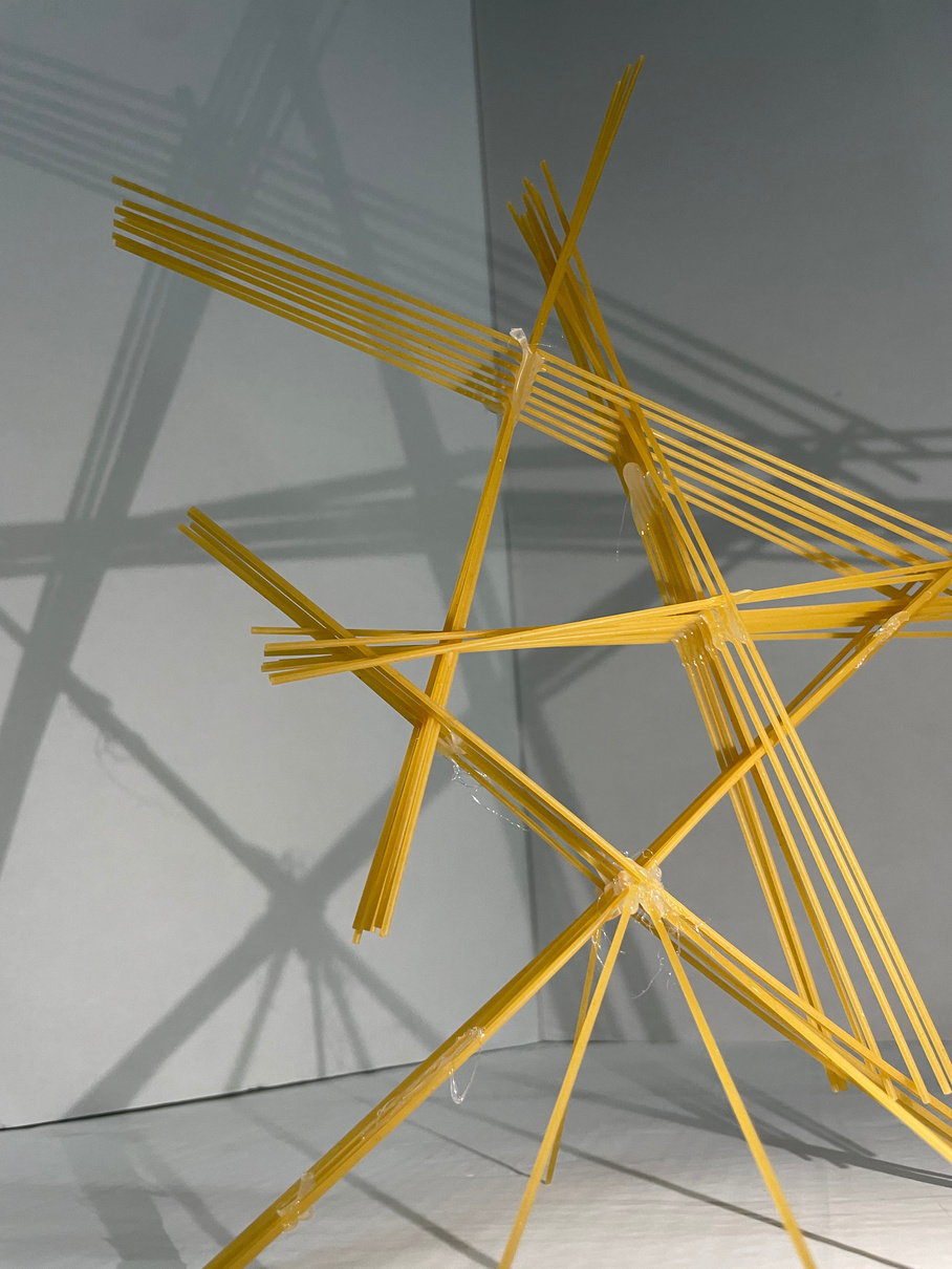
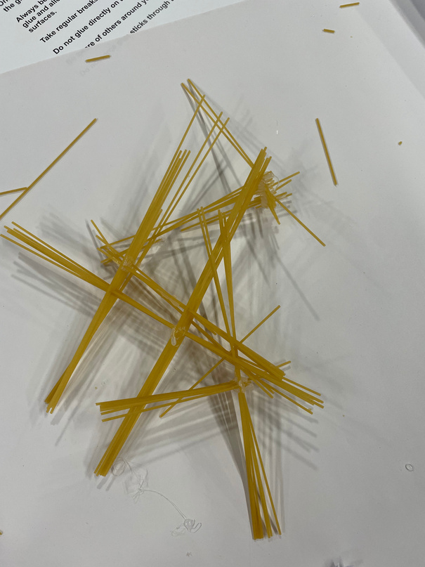
3D CREATIVE PRACTICE: Spaghetti modeling
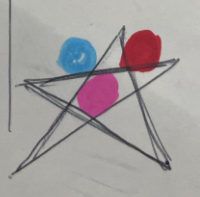
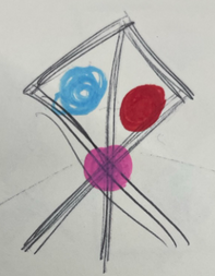
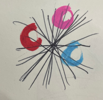
What I was most interested in to start with was the idea of a detachable structure made up separate parts that could be re-arranged while still supporting a ball each. Creating a modular design seemed like another challenge on top of the original brief and I really wanted to try it out.
The initial loose sketching process enabled us to remain open-minded about the potential in our designs- no shape or form was impossible to respond to the brief of creating a spaghetti structure supporting a minimum of three balls without any of them touching each other. I found the loose sketching tasks really helpful to creatively warm up and really consider the freedom of the task and its relation to how functional product design starts from a creative place of experimentation and literal light-bulb moments. It was also a valuable way to demonstrate that the functionality and potential of a design can really just be in the way you look at it or can be generated by looking at it open-mindedly.
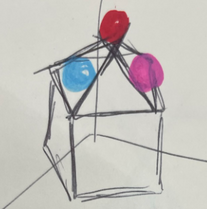
RESEARCH: architects
The modular style of many of these buildings designed by David Chipperfield was what I think initially inspired me to what to have a 3-part design. Even though the sketching tasks were helpful to generate a fluid outlook to responding to the brief I wanted to work with structured line and geometric shape from the start. After the bridge building activity part of me wanted to go into the next project with a more solid plan from the start and see if I would be able to actualise my idea more effectively by starting from a more concrete basis.
David cHIPPERFIELD
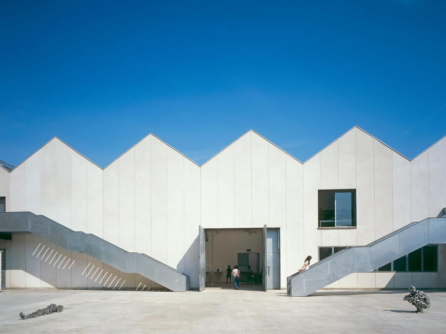
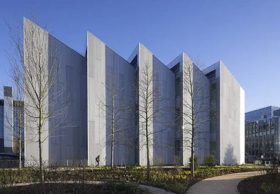
aMANDA Levett
dEVELOPMENT OF CREATIVE PRACTICE
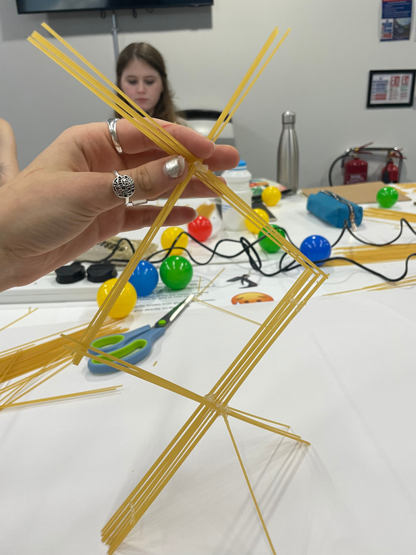
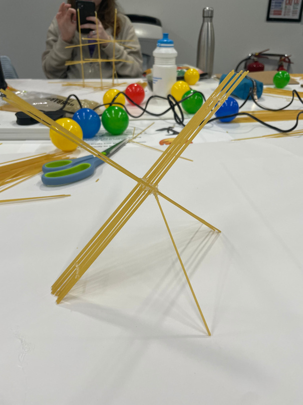
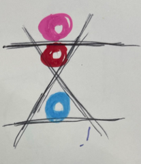
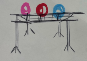
The basis I began constructing by was that I wanted to create three Xs of criss-crossed spaghetti for the balls to rest on. They could then be stacked on top of each other or laid out in a row. I began without much of a strategy and faced the problem that the Xs didn’t stand up well on their own because the pieces were too wonky. I changed my technique by using tape to fix the line of spaghetti and then interlock it with another line and hold them together while the glue went on. This technique worked much more efficiently despite the fact that I switched to it after a little while so I still didn’t have a lot of time to fine-tune my design.
Although my X structures were now more secure on their own I had to adapt the way in which they came together since the Xs didn’t balance on top of each other the way I intended them to if I wanted them to still be able to come apart.
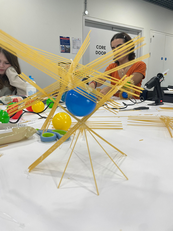
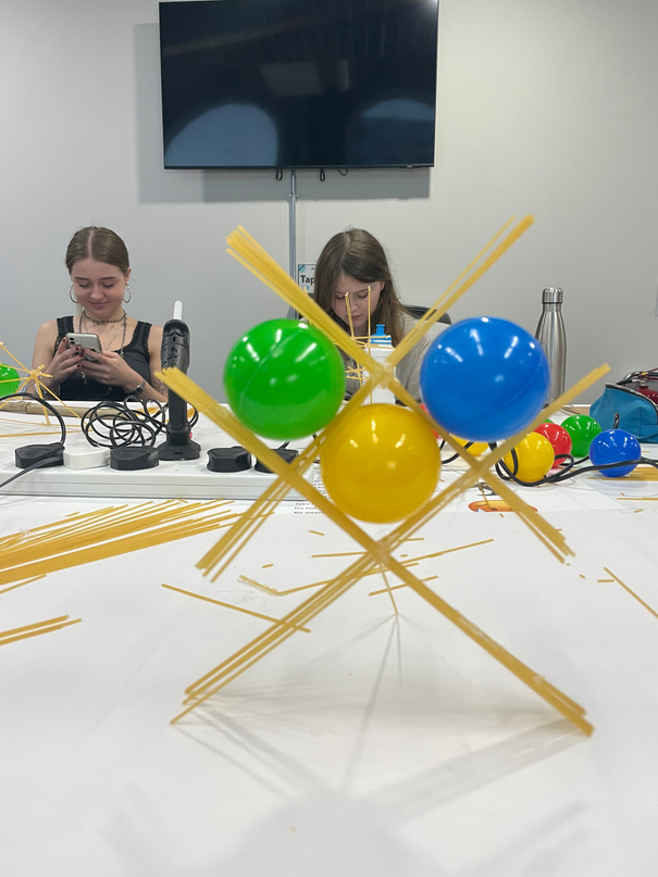
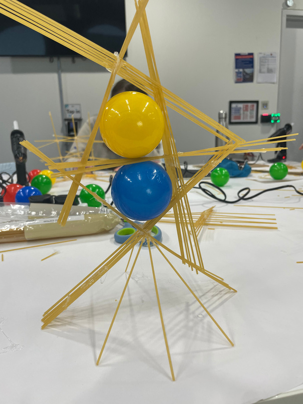
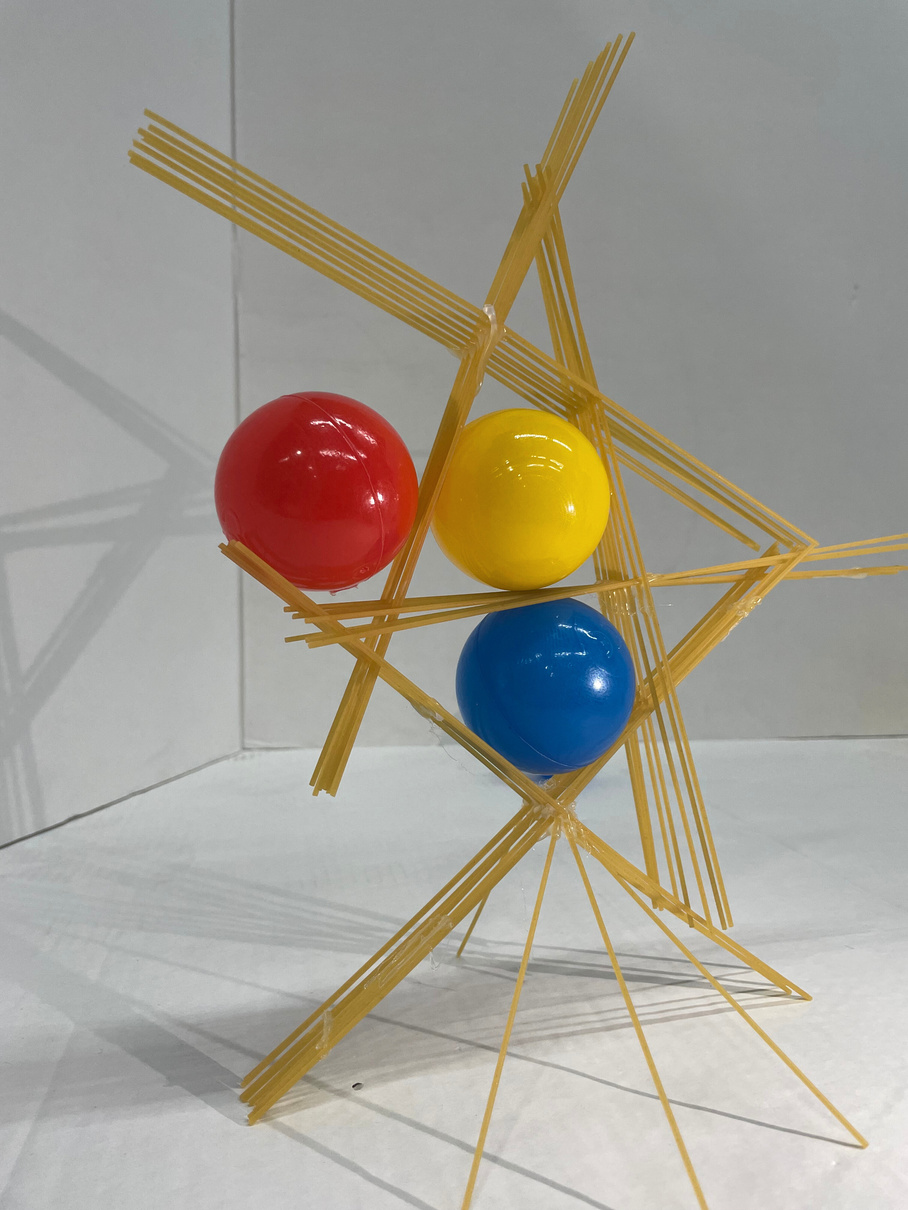
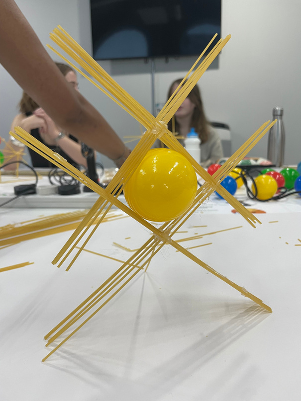
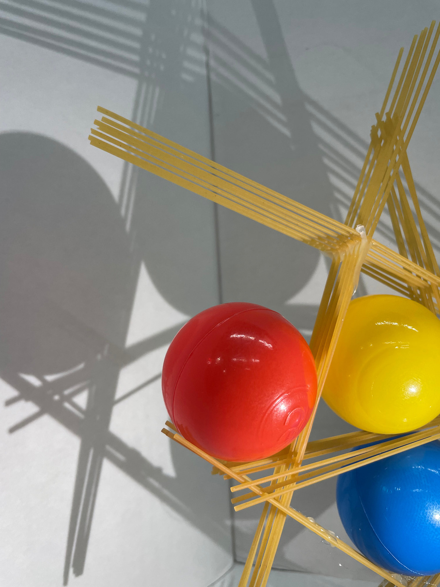
To conclude, my design involved a lot more balance than it was supposed to in the sense that the spaghetti structure only stayed up when the balls were in place within it. While this was not my intention it did make for a more dynamic looking and asymmetrical design in the end. I had to add three extra spaghetti supports to the bottom X for more stability which I actually think added to the overall visual balance of the design in addition to the way the extra supports spanned out more like legs at the bottom and this reminded me of a spider in a way.
By changing my technique and re-doing the Xs I was left with the extra components of the initial wonky Xs which I could randomly place together with the improved ones to generate more designs which was in line with my idea of a changeable structure.
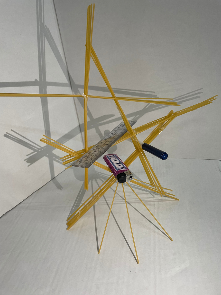
I was not very confident in my design’s overall structural integrity (given how much it relied on a balancing act) so the final challenge of making the structure more protected from a force from above wasn’t very compelling to me. If I were to redo this part of the task I would have used the paper more like a tent covering to accentuate the original shape underneath.
Reflections:
What Went Well: I was happy with the final design and my change of technique as a response to the challenge of making the X stand up evenly. I was able to find a process that was reliable despite being more time-consuming. I was happy that my finished product was far less symmetrical and even than I had intended because I think that it was more interesting to see how the separate parts were formed in a way I did not plan.
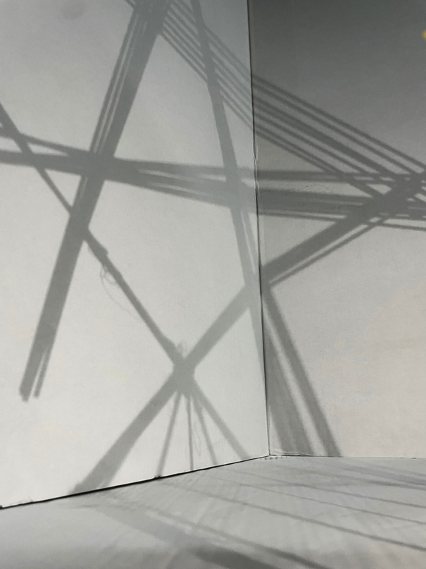
For Next Time: I was definitely too focused on the minimum 3 rule for the amount of balls we could support since this decided the number of separate parts I would make before joining them together. It could potentially have been more of a challenge to see the maximum number of balls I could support in my structure. Although I was pleased with the process I used I could have been less methodical in my creation and maybe made something more spontaneous. I also would’ve liked to get some more impactful shots using the shadows and models because I think I only grasped the idea when it was too late to get more photos.
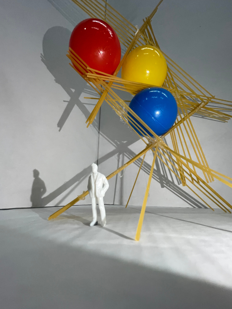
The Aftermath:
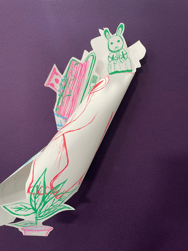
3D CREATIVE PRACTICE: Paper cut-out
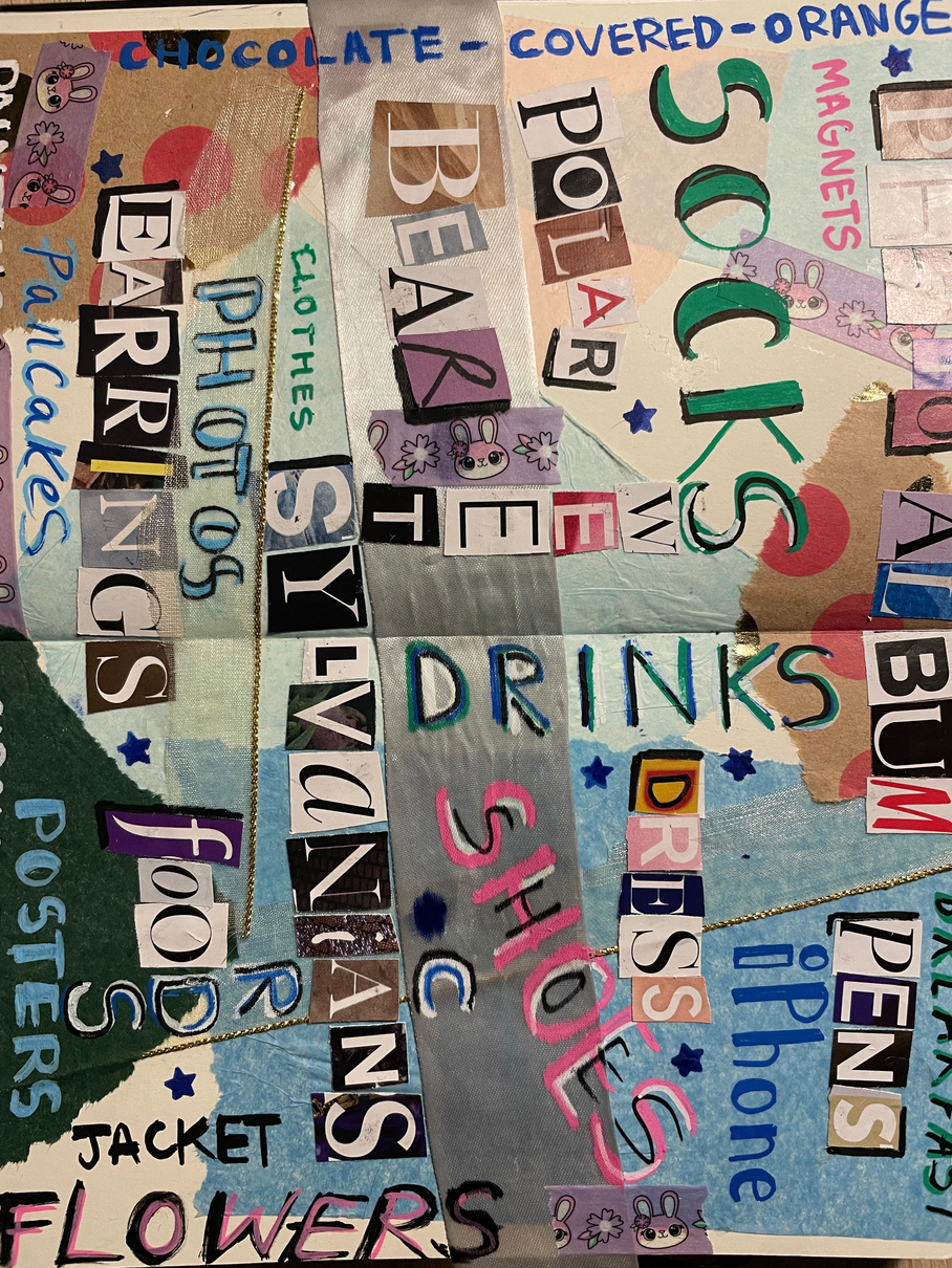
I really enjoyed making my ‘visually interesting’ collage of pervious birthday presents which primarily involved magazine type cut-outs on top of a wrapping- and tissue- paper background (to stay in line with the birthday present theme).
Going into this project I was completely unsure of what the final outcome would look like since we just began by drawing the presents we listed in our pre-task.
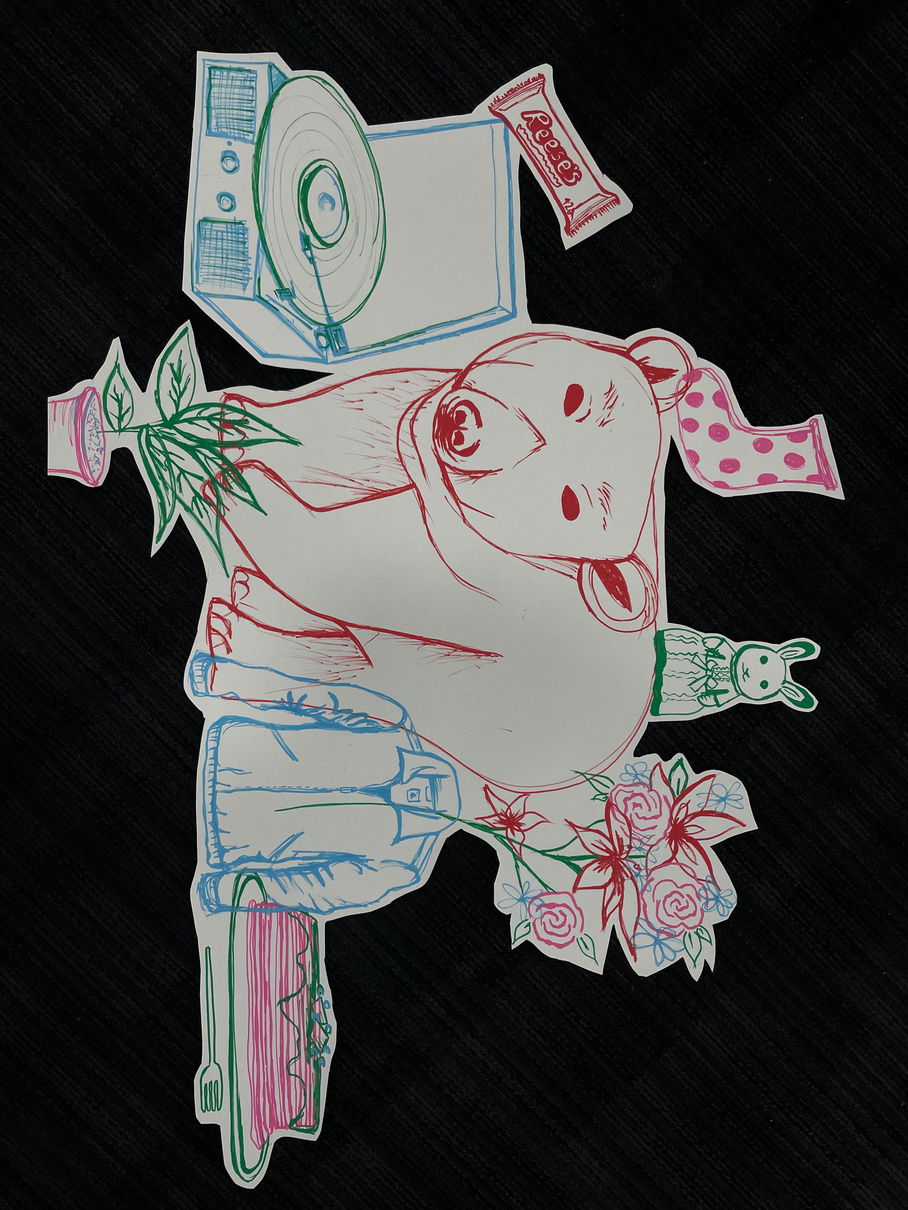
Pin-boarding our cut out drawings
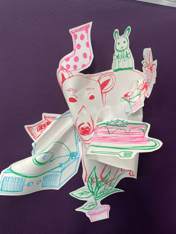
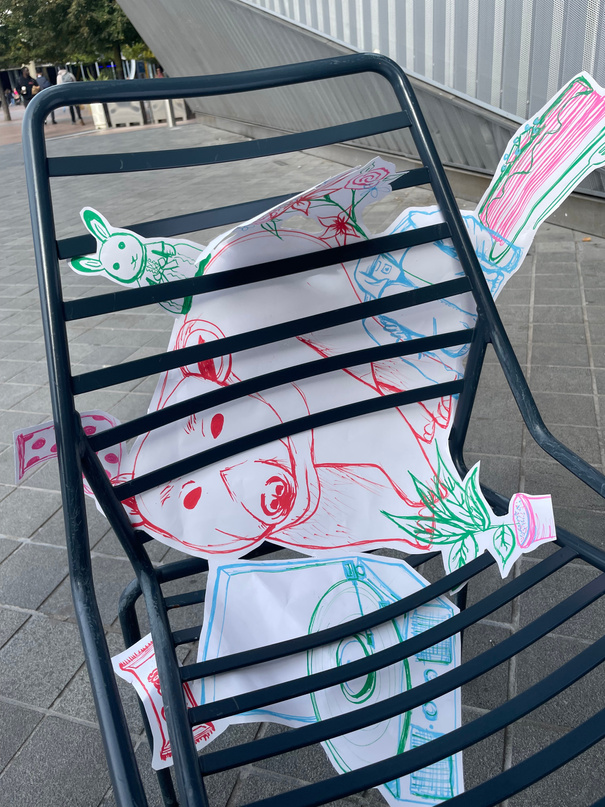
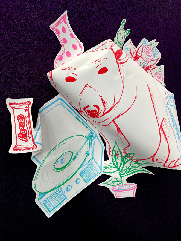
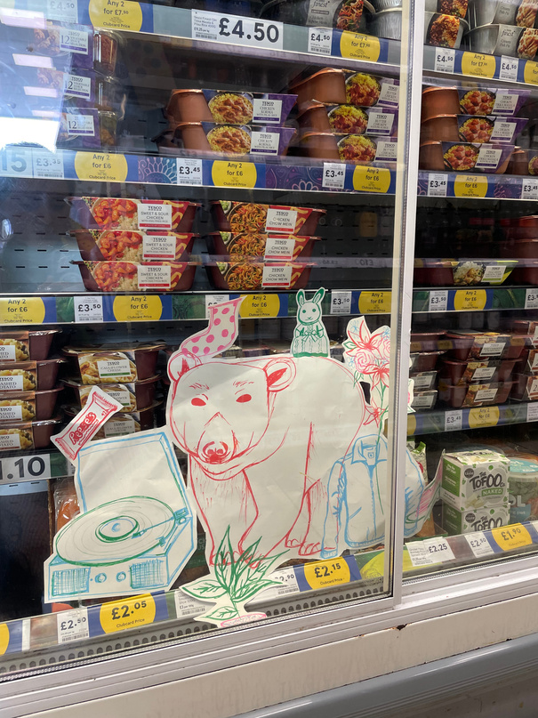
I thought it was right to take the polar bear to the freezer.
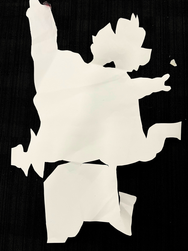
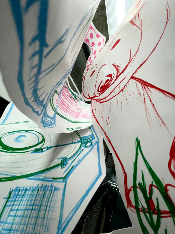
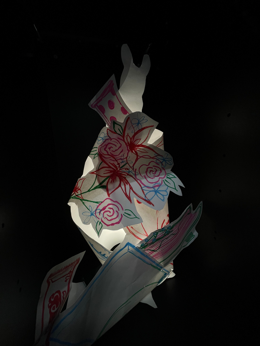
Since my initial drawings were quite close together I was worried that I would not have enough loose material to fold with but I quickly found that by not being precious with my paper I could get some interesting shapes coming off the board. I don’t think that I quite grasped the intention behind the pin-boarding activity but the totally random process of folding the paper did generate some interesting forms especially when I began to try and take the paper as far out from the board as I could to generate depth.
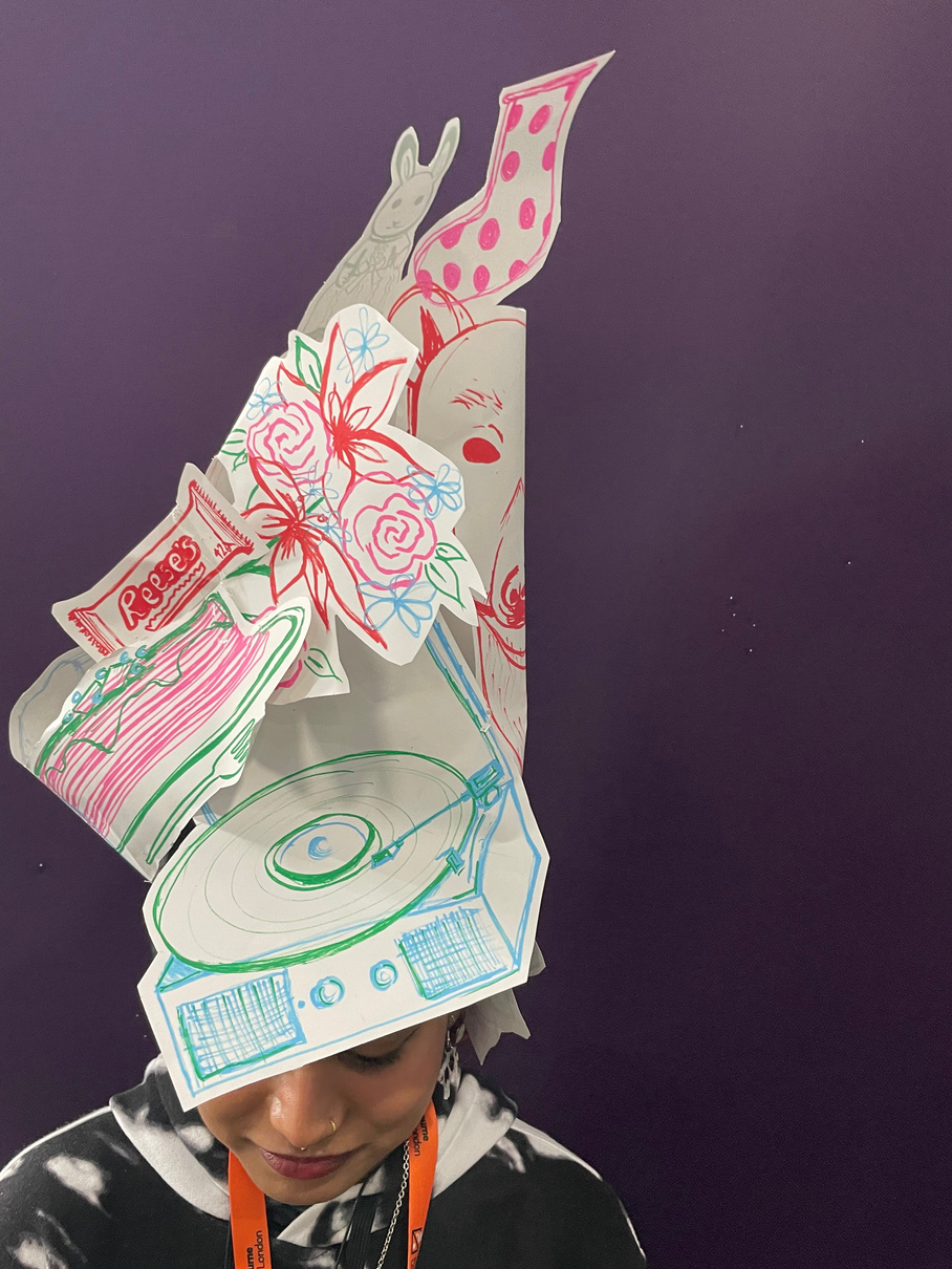
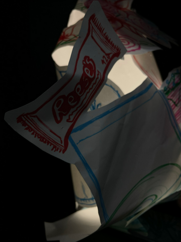
By folding the paper around itself I was able to create a standing structure which I really began to see as a lamp when photographed with a light source inside a dark locker. That same structure also became a decadent hat and I enjoyed the random process of generating these different more dynamic uses for an originally completely useless piece of paper.
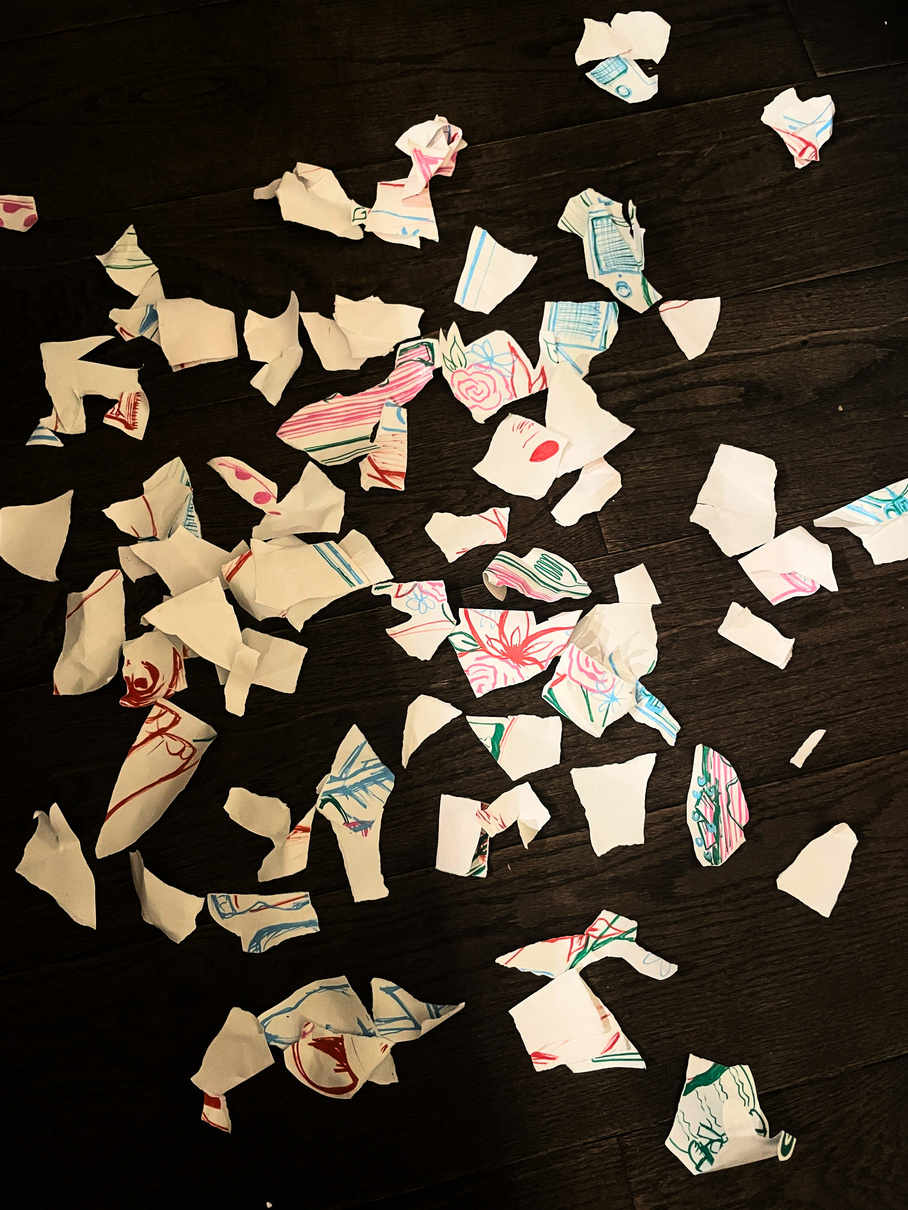
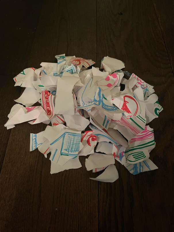
Reflections + the destruction:
What Went Well: I think that I was very open to experimentation with this project since there wasn’t really a brief to begin with and I never had a final piece in mind. I was happy with where the experimentation led me to since I could see the potential for designing a functional object like a lamp. This blind sort of process is something that could be useful for generating ideas because it is always fluid without any end point in mind.
For Next Time: If I had known what we would be doing with our paper in terms of pinning and shaping it I definitely would have drawn further apart on the paper to have more surface area to work with and more gaps to thread the paper through. That being said, having less room to manipulate the paper did mean I tried to think more out of the box and this extra sort of challenge was perhaps more stimulating.
VISUAL COMMUNICATION DESIGN
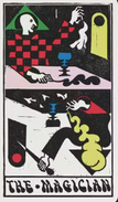
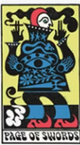
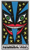
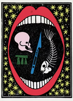
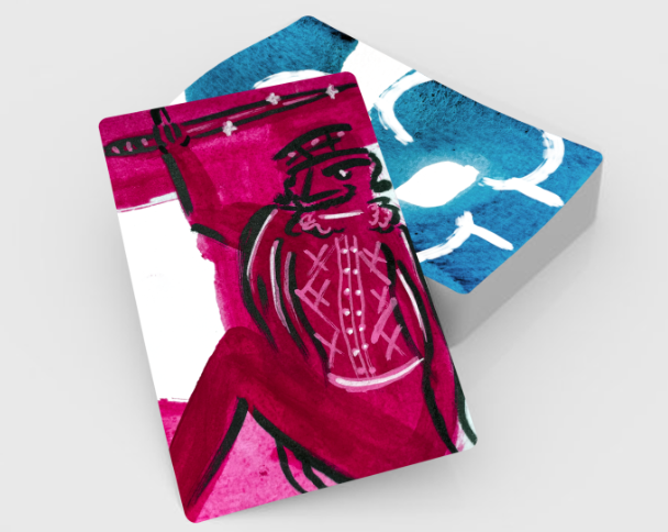
VCD: Playing cards
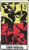
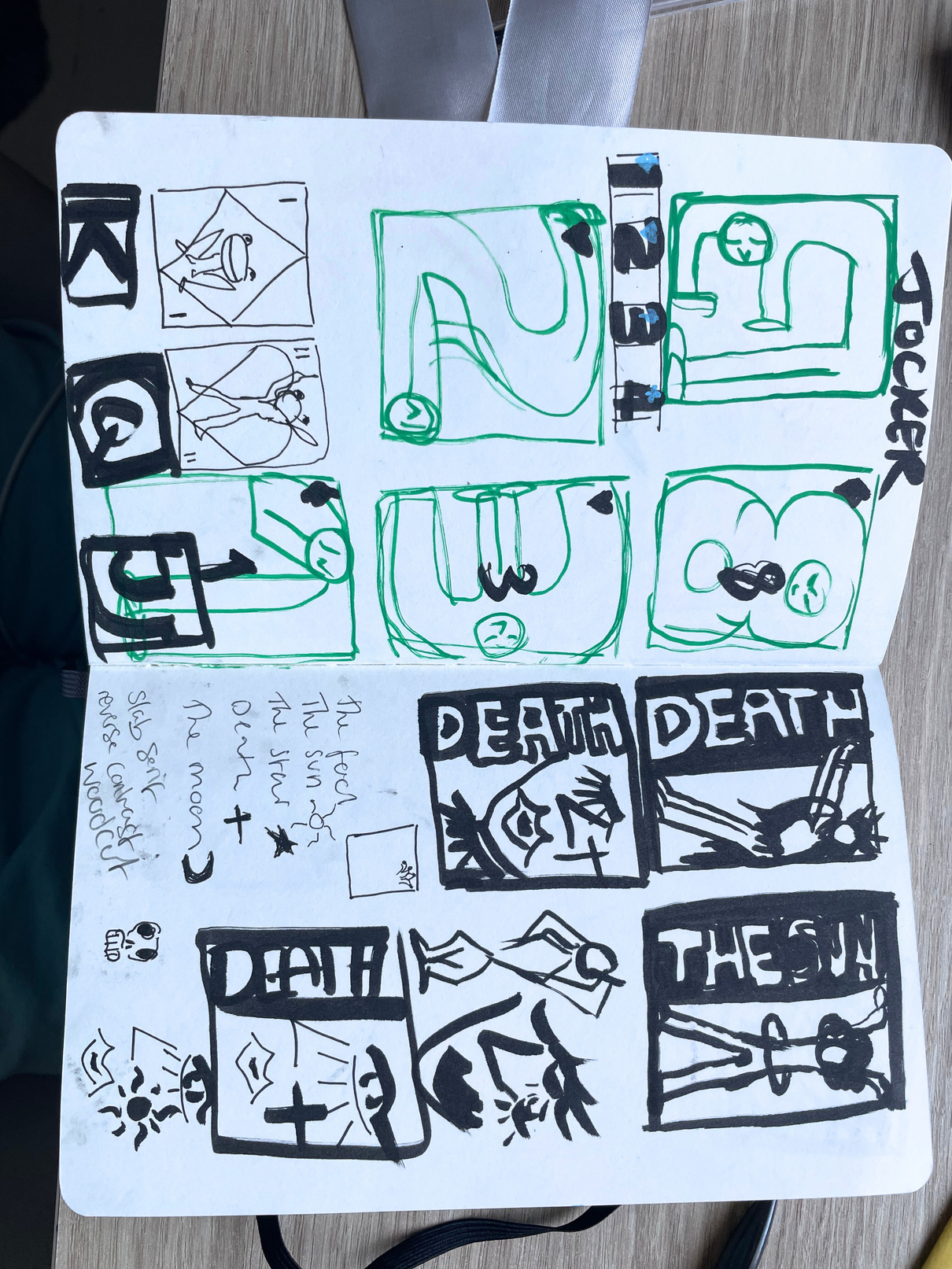
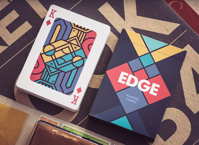
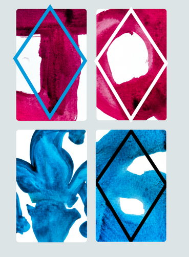
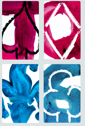
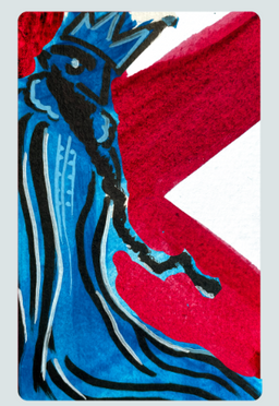
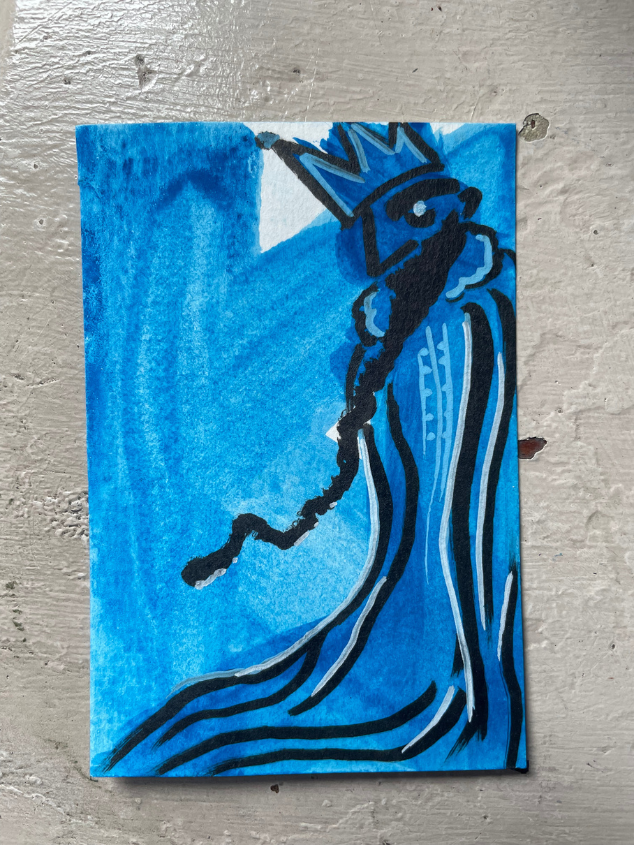
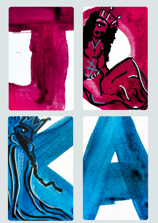
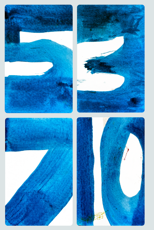
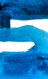
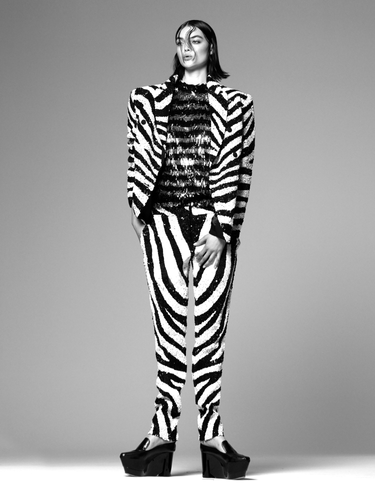
The initial brief was very broad for this project and I found the idea-generating to start quite over-whelming but exciting since we could design absolutely any sort of playing or tarot cards. I would not say that I found the ideas mind-map particularly helpful in coming up with a concept since I was just flooded with lots of ideas which I struggled to actualise or imagine in final form. I couldn’t even decide very easily if I wanted to do playing or tarot cards. I went through initial ideas involving visualising different times of day for the numbers on the cards like the activities you would be doing at those times but the 24 vs 12 hour clock concept was a little bit confusing and I didn’t know where to start visually. I didn’t really want to use a concept involving pre-existing characters because I wanted the cards to be more unique. When finalising my idea I decided that to consider the timing we had and my confidence with drawing it would be better to focus more on dynamic shape and texture in my playing card designs rather than detailed illustration which I wouldn’t be able to produce to a standard I was happy with in the time we had.

Sophy Hollington’s illustrated tarot deck
The decisive colour palette choice of primary colours with occasional green is a really effective way to create a harmonious visual identity which I definitely want for my cards.
Research
Carilla Karahan
What drew me to these event poster designs is the dynamic use of space and shape to create striking compositions with uniquely constructed figures. The fuzzy spray-paint-like texture is also an interesting aspect of the designs which give them a distinctive look. By using this texture on geometric shapes Karahan softens his images while retaining the basic structure of the original shape to make up the human forms in a friendly sort of way with softened edges. The full and centred use of space produces a confident image which combined with the vibrant colour palettes gives the posters a lively vibe.
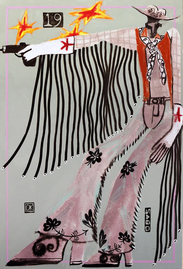
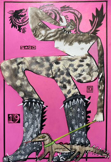
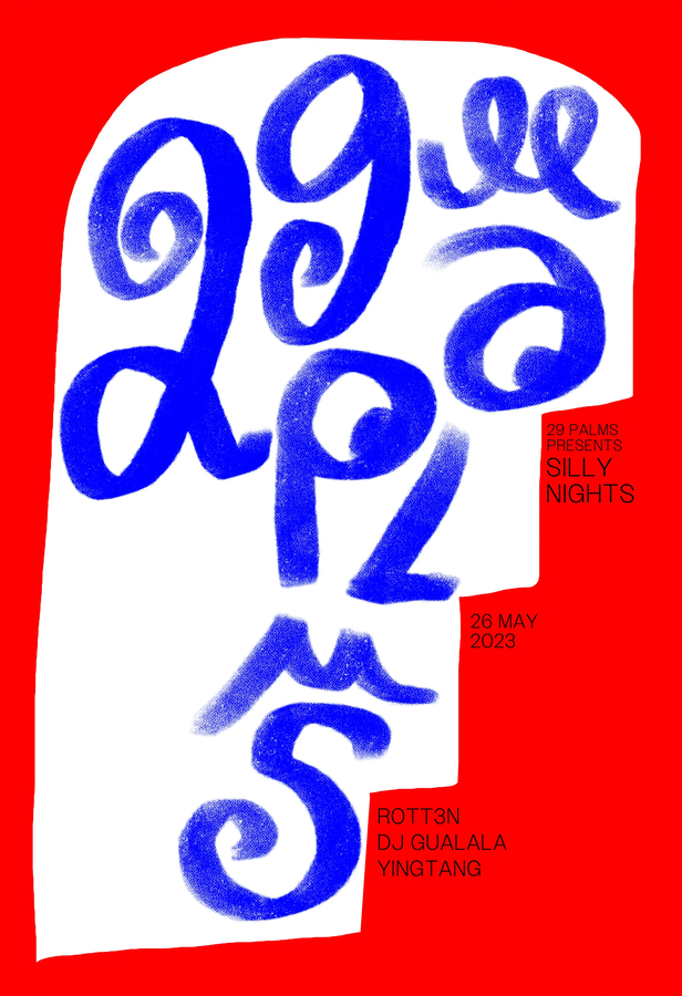
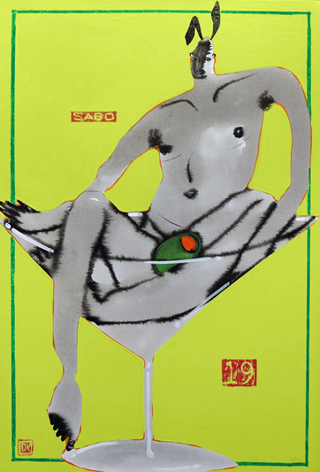
Kevin Sabo
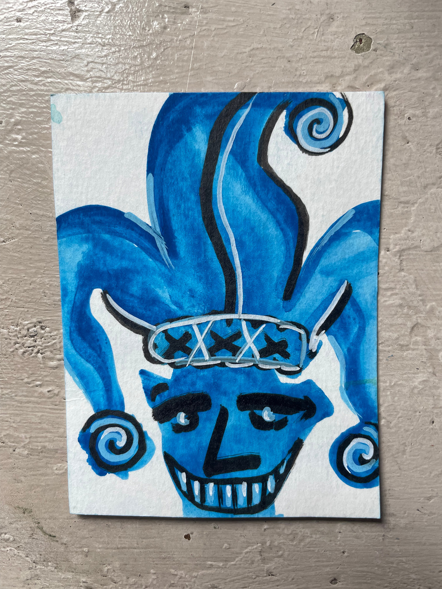
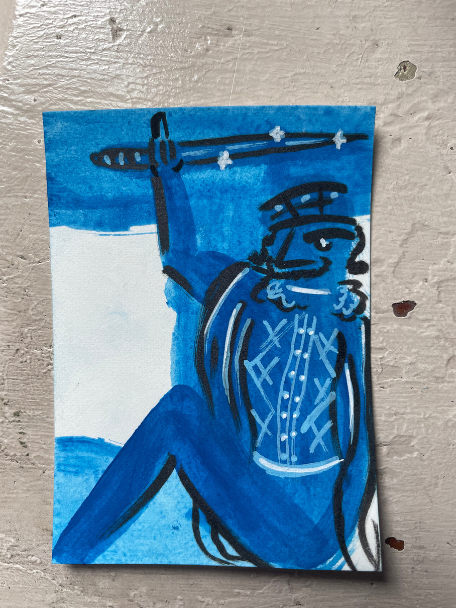
Similar to Karahan’s use of space what really struck me about Sabo’s work is his wacky placement of the figures he designs taking up the whole page in awkward poses. This is what primarily inspired my interest in distorting and enlarging the numbers on the playing cards and using the full space of the card itself as the canvas rather than keeping the design inside a border on the card. In addition to his compositions and free-flowing abstract character design I was inspired by his delicate use of ink to create texture and bring a depth to his illustrations which is really effective since this textural detail overlayed on the wobbly shapes of the figures really brings the characters to life. Since Sabo’s designs are character illustration driven in his gay pop culture inspired ‘choose your fighter’ series I was also inspired to focus more on the character cards within the set.
‘creative mints’ -Mike M
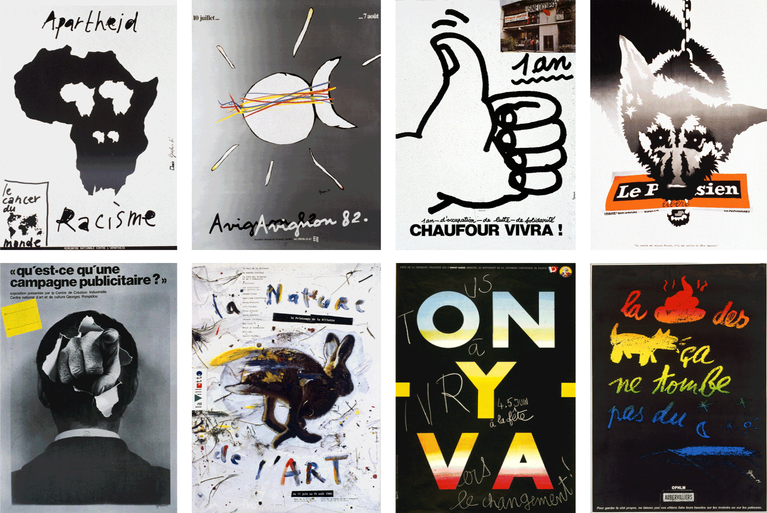
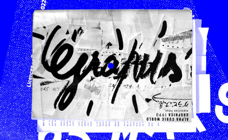
Grapus
In terms of typography the French graphic artists’ collective Grapus produces highly dynamic poster designs through deconstructed, hand-written and messy type with loose, high-spirited compositions.
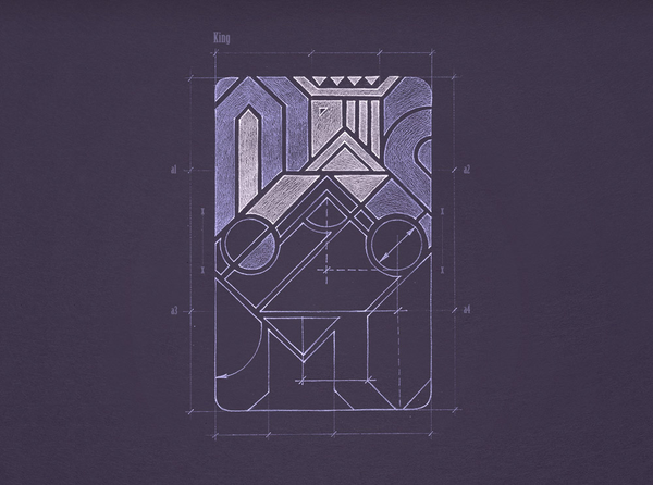
The total emphasis on geometric shape and pattern gives these playing cards a mathematical and almost architectural feel which is not what I want for my designs given that I am more inspired by Sabo’s loose and inky character designs and wacky compositions. However, the exploration of shape in these designs is something that could inform the intention of my designs since manipulating line and shape in more varied ways is what I'm interested just in a softer realm rather then straight lines and symmetry.
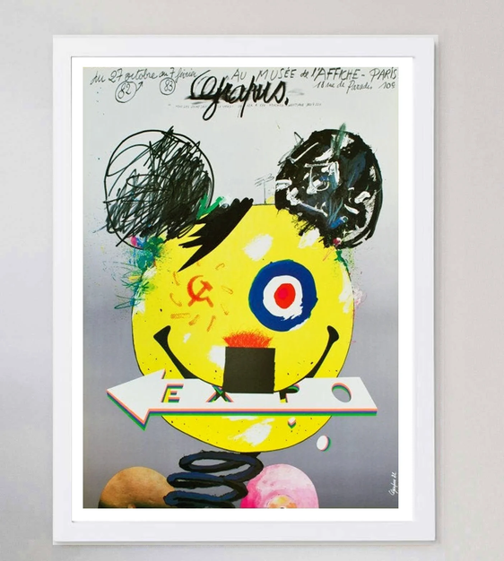
This sort of graffiti-like style could be interesting to explore for the cards’ packaging design because it would be a striking and unique visual identity for playing cards.
Development
Initial concept:
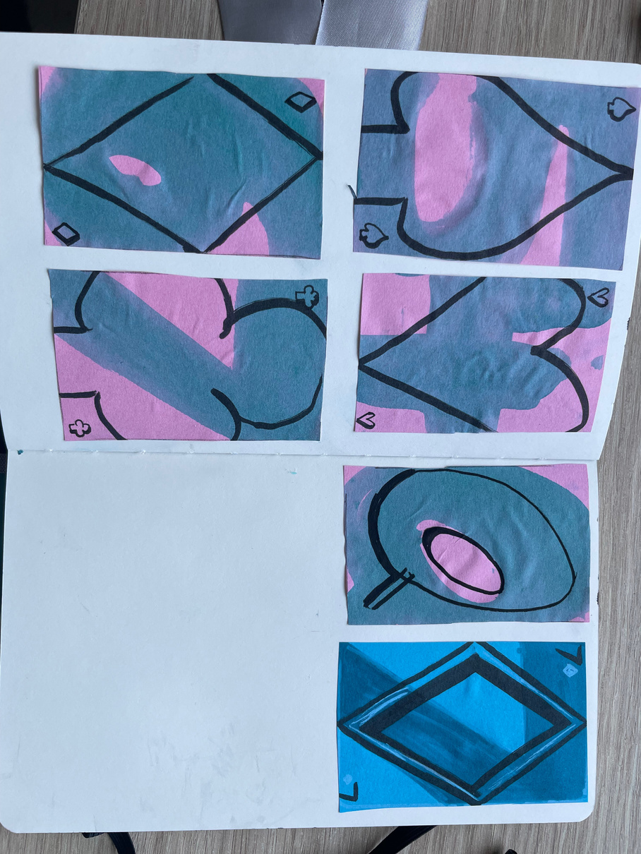
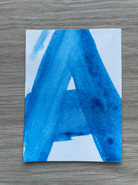
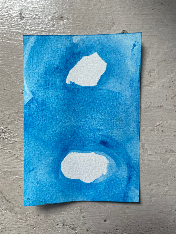
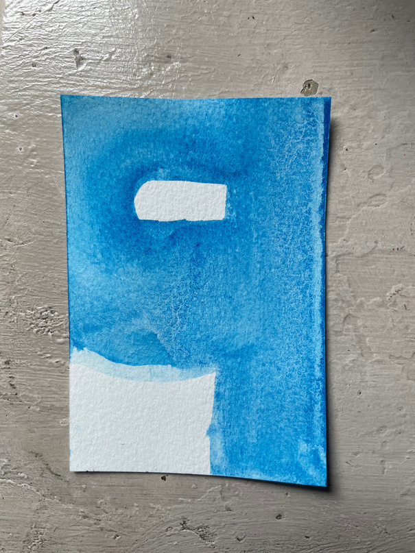
I originally planned to overlay line shapes of the suits over block forms of the numbers and I used tissue paper and watercolour to experiment with how this would look as well as complementary colours of blue and pink.
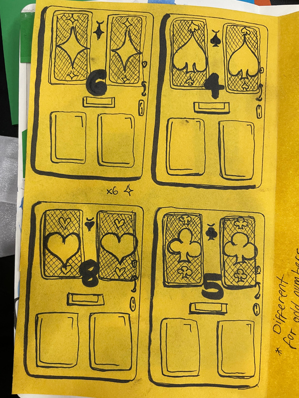
*****Side-tracked by alternative idea to do door frames with the numbers as the door numbers and suits in the stained glass window panes.
I found that for developing a richer texture using watercolour for my shapes was the most effective material.
Development
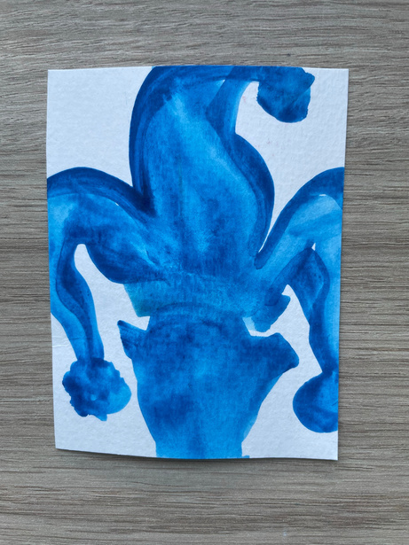
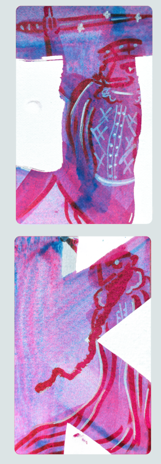
Character design inspired by Sabo’s work. I was interested in pushing the shapes of the figures to the boundary of the card and incorporating the shape of the letter background into their pose or alternatively, juxtaposing the figure with the letter’s shape.
further Development by digitisation
I used photoshop to deepen the texture and tone within the watercolour paint and to manipulate the colour palette which I decided that I wanted it to be richly jewel tone- based.
Developing character designs manually with posca pens on top of watercolour.
Back cover design:
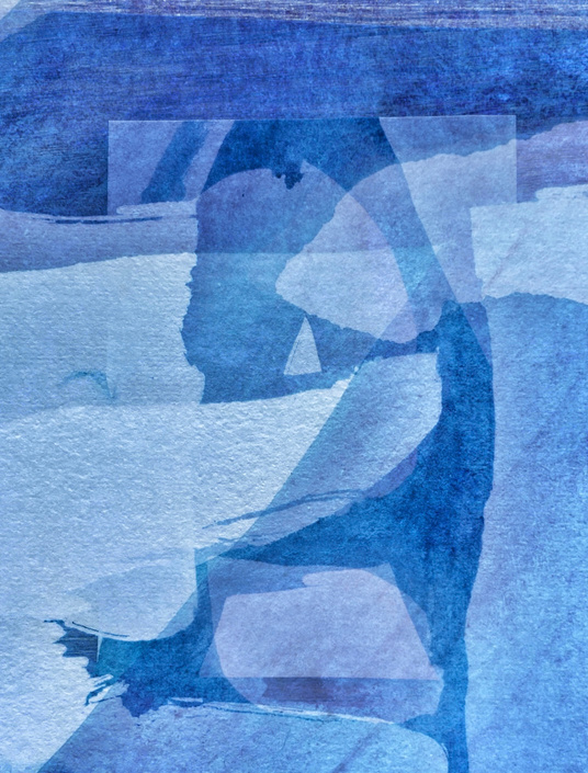
Using the app Snapseed to overlay the original watercolour number shapes and letters and experiment with opacity to create an abstract piece for the back of the cards.
Experimenting with overlay options in photoshop to manipulate the character further into the letter forms.
Reflections:
What Went Well: The emphasis on infusing our designs with our personalities through the illustrative style as well as colour choices and compositions was a very inspiring part of this project and it definitely made me consider the importance of being true to your style in order to create a confident design. I learnt more about the mood of a design in terms of what colour palette to use and what sorts of shapes to include in order to convey a personal and visual identity for example. the use of pastels when generating a youthful, playful or feminine vibe.
***My intention with the colour palette was to completely eliminate the suits and use four different colours to distinguish - cool colours for the black suits and warm colours for the red suits. Although I could potentially have embellished the number card further, the simplicity is what contributes to the more pretentious artistic rather than functional vibe I wanted these playing cards to have.
For Next Time: Don’t be afraid to go for a more ambitious idea because its better to try and fail or make mistakes then avoid something you think is too hard. Try not to be so indecisive at the beginning of a project, maybe start with an idea and just see how it evolves rather than being paralysed by choice. I definitely need to learn to stick with an idea and be decisive in my decision making process in order to actualise my ideas more successfully without distractions.
Bibliography
Itsnicethat.com. (2020). It’s Nice That. [online] Available at: https://www.itsnicethat.com/.
theinspirationgrid.com. (n.d.). Daily design inspiration for creatives | Inspiration Grid. [online] Available at: https://theinspirationgrid.com/.
Maher, D.M. (2023). Sophy Hollington’s illustrated tarot deck gets extensive update. [online] Creative Review. Available at: https://www.creativereview.co.uk/sophy-hollington-tarot-deck/ [Accessed 4 Nov. 2023].
Fashion communication
and textiles
Fashion communication: Reboot tales
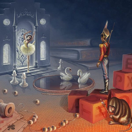
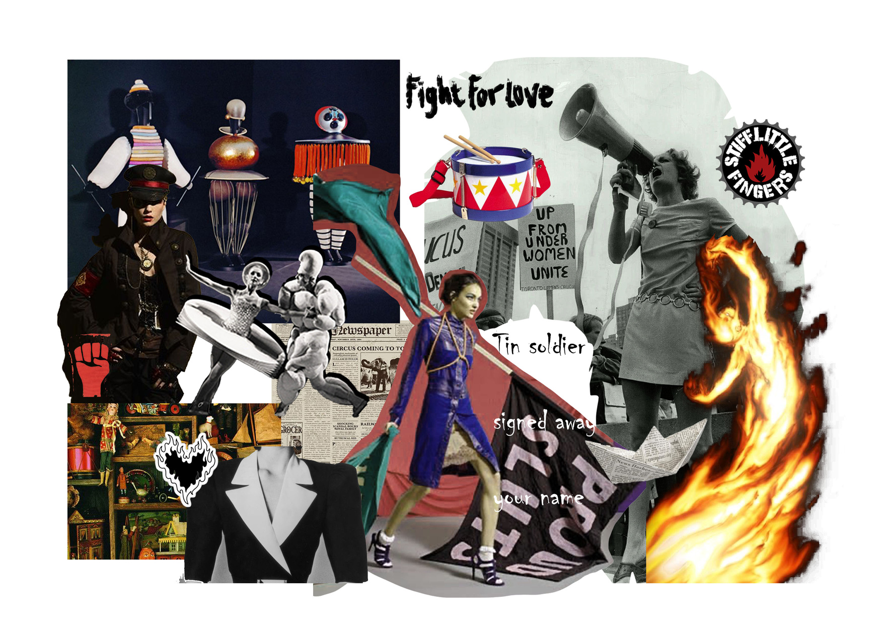
The steadfast tin soldier
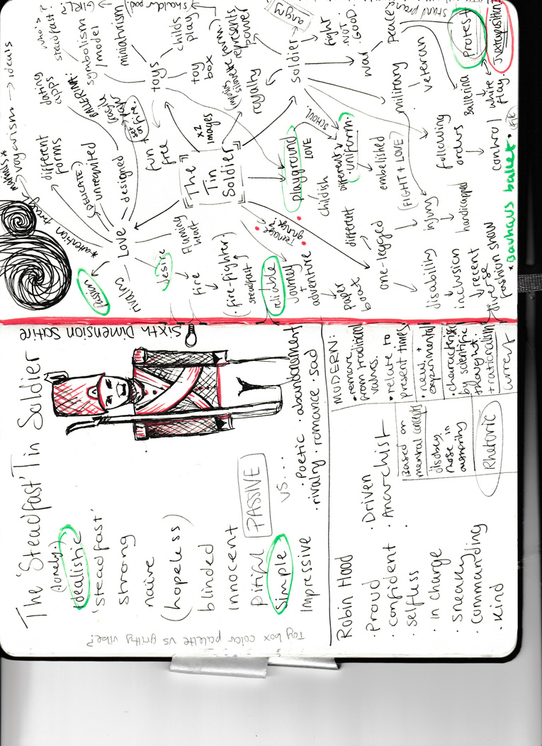
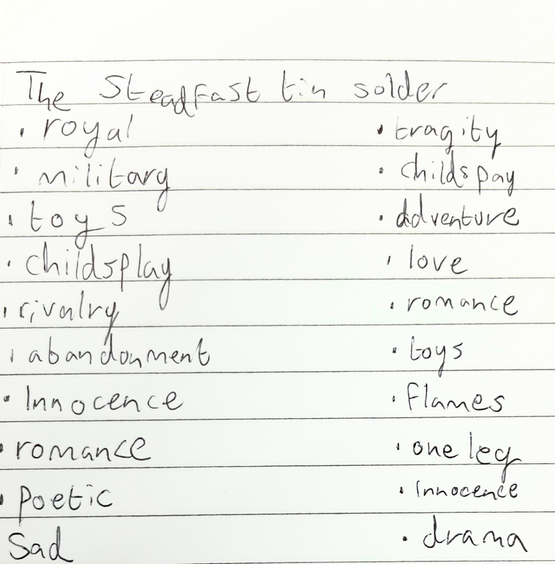
Word aSSOCIATION
The steadfast tin soldier; is a fairytale by Hans Christian Andersen I remembered from a book of his stories I read when I was younger. The story is about a tin solider made out of only enough tin for one leg who falls in love with a paper ballerina (thinking she also only has one leg). A jealous goblin/jack-in-a-box tells the solider not to look at the ballerina but he ignores him and is condemned to go on a trialling journey involving a paper boat, canal, sewer rat and fish. The soldier somehow returns to the table facing the ballerina and they both end up in the fireplace burning up into a tin heart. The moral of the story is essentially to remain steadfast in love. I am drawn to this story and character not only because it is a very classically romantic tale which could be interesting to subvert but also because it deals with the concept of fate and in a way control. The toy box aesthetic could also be really fun to play with in contrast to the somewhat tragic but confident figure of the soldier and it could be interesting to try and incorporate both the ballerina and soldier into the concept since the story itself neglects the ballerina as a character.
Fashion branding activities
What I Learnt:
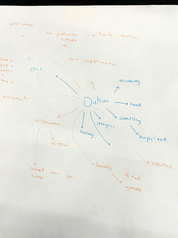
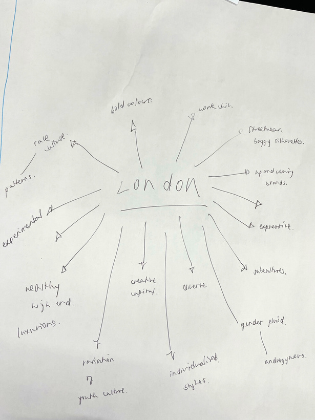
-How brands have to consider different audiences and demographics depending on location e.g., Dubai vs London fashion cultures
-How fashion branding is also influenced by the requirements within a certain culture being climate-based, religious, social or even political.
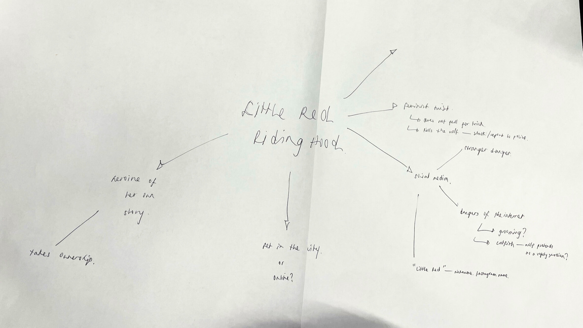
Through the modernisation of Little Red Riding Hood task our group generated a modern tech-obsessed teenage girl who is learning about online safety with the themes of online predators ‘wolves’ and catfishing ‘the wolf dressing up as Red’s grandma’. The task was a good way to practice how to fully flesh out a modernised character by considering not just their aesthetic and appearance but also their life and story which adds to the details of the styling and how fashion can tell a story.
Character Mood board
The basis of my modern re-imagining was the subversion of the soldier‘s passivity in his story since I wanted to take his virtues of solidity and strength but apply them to an active character protesting in the modern age rather than someone passive to their fate. The character was more theme-based rather than literal so gender wasn‘t important in my concept. Juxtaposition of the delicacy of love -represented in the character of the ballerina- and the passion of undying love and being steadfast in your values was something I wanted to explore. In a sense igniting the fire of love in the context of protest to bring agency to the modern figure.
research
Influenced initially by architecture, you can see how strong shape and line are important to Ishi. The models are structured and imposing with their silhouettes being exaggerated or engulfed by material.
Fashion Photographer ishi
This creates a powerful impact which is inspiriting to me in creating a more active and dominant impression in my own photoshoot in order to bring the character of the steadfast tin soldier more agency in my modern re-imagining.
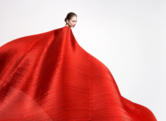
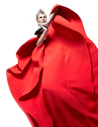
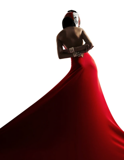
The carefully stripped back colour choices are also effective in exaggerating the forms and shapes by contrasting white on black or red on white etc. This also means that the model themselves and how striking the composition is isn’t being distracted by too many colours. Visually the use of fabrics particularly red silk could be an interesting way to evoke a sense of fiery passion.
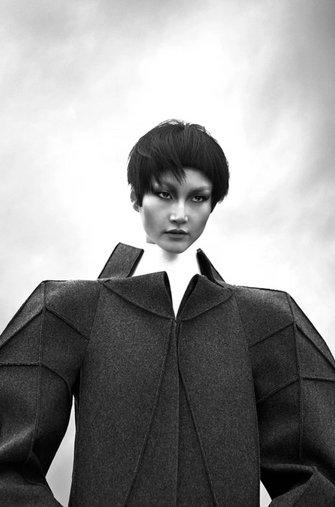
Designer Oskar Schlemmer
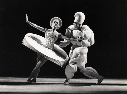
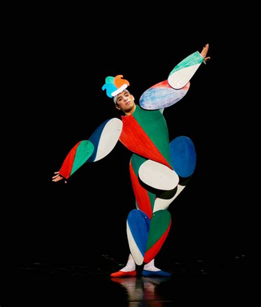
In terms of the shape and silhouette of the styled looks themselves, the work of Oskar Schlemmer with Bauhaus ballet is not only inspiring vibe-wise (in terms of the theatrical, toy-box, story-telling aesthetic) but also in terms of the construction of an interesting silhouette. The unusual shapes de-humanise the performer and their exaggerated forms could be applied to my design in order to represent the themes of solidity but also delicacy through shape which would come through in the character of the ballerina (which also of course aligns with Bauhaus ballet).
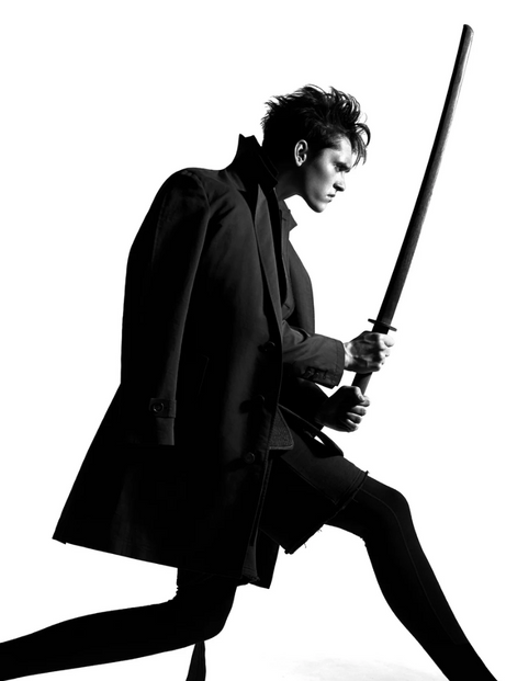
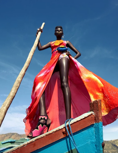
Fashion Photographer Andrew Tarnawczyk
The striking low camera angle makes this shot really powerful and definitely presents the model with lots of dominance and assertiveness which I want to evoke in my own shoot. Similar to photographer Ishi’s use of colour, Tarnawczyk red series makes rich use of the colour which decisively takes control of the mood of the shot.
The use of wide low angles combined with dominant characters creates an almost dream-like aesthetic since the work is described as to be “full of symbols and often tells a story”.
stylist Zeina Esmail
The eccentric application of layering that Esmail tends to use creates simultaneously messy yet coherent looks which are characterised by an exaggerated silhouette while being unified by harmonious colour palettes and complementary textures. It is interesting how un-sexy and shapeless -in terms of bodily forms- these stylings are since they are in a way quite chaotically distracting the viewer from the clothes themselves while maintaining a structured air. The lack of tight-fitting form on the models definitively gives them a more imposing presence since their figures are literally enlarged by broader shoulders for example, but they also seem more free to pose and move within their styles since the forms are messy to begin with.
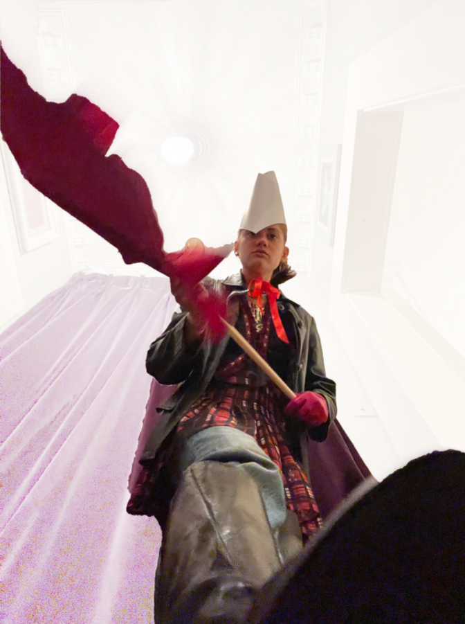
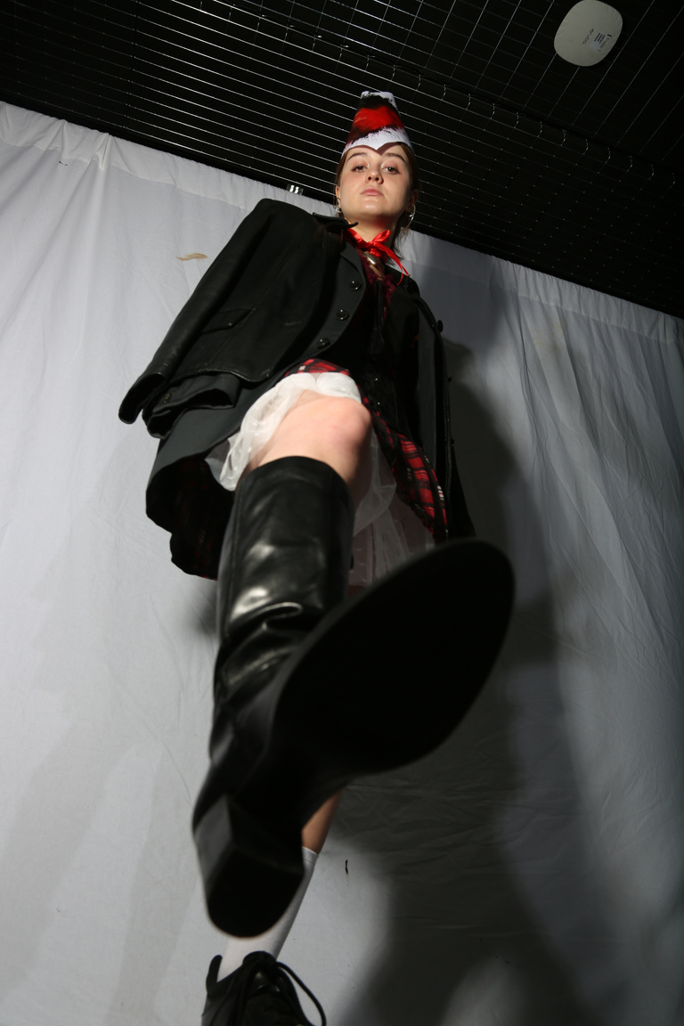
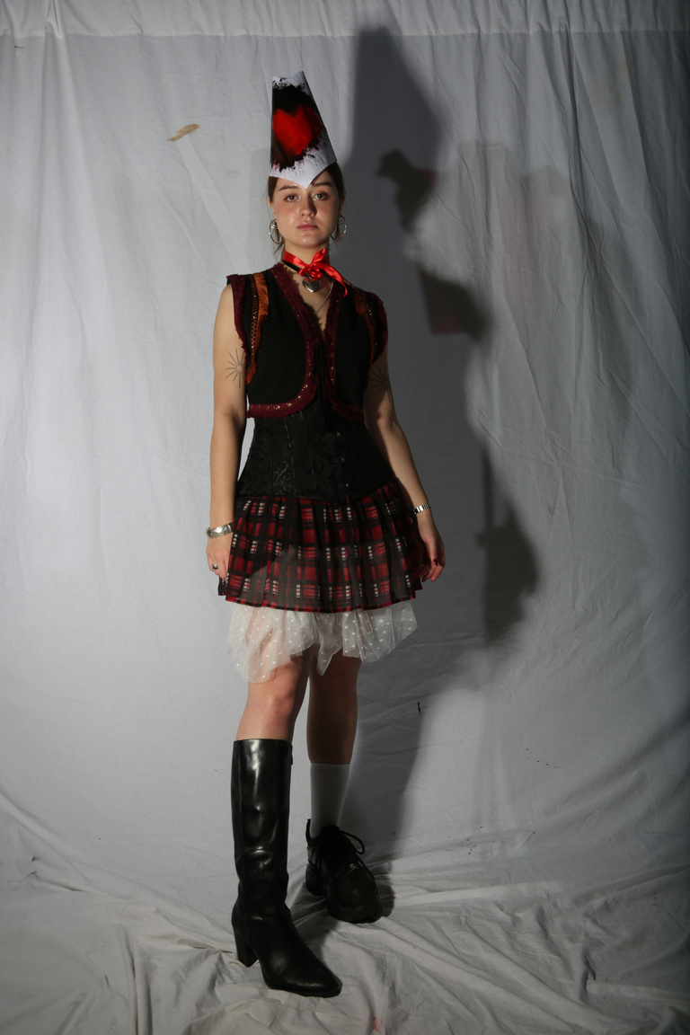
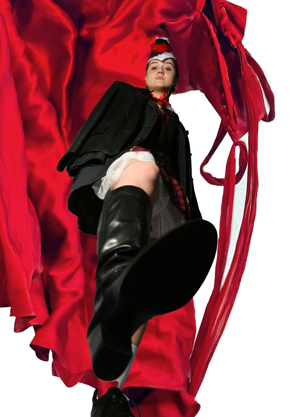
This low angle shot was mainly inspired by my fashion photographer research and my desire to present the modern character with dominance and assertiveness.
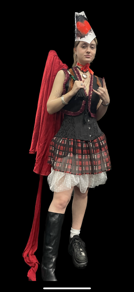
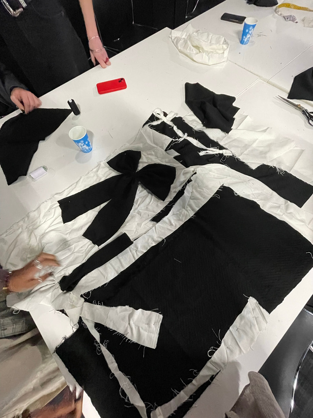
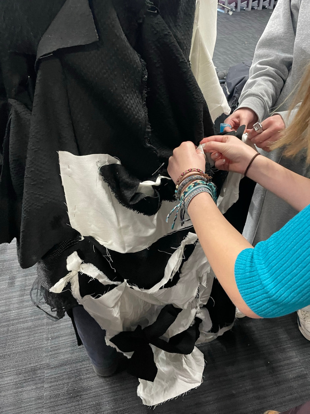
In order to make the silhouette more visually impactful and keep on theme, I made a paper soldier’s hat inspired more by Oskar Schlemmer’s bauhaus costuming.
INitial styling + testing angles
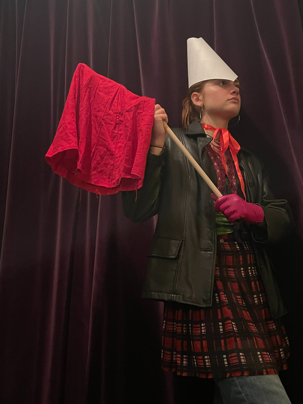
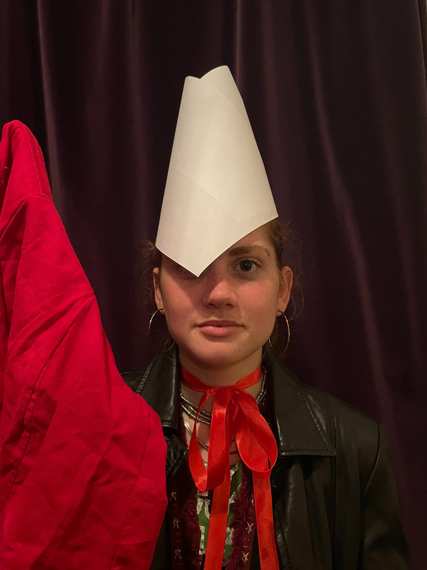
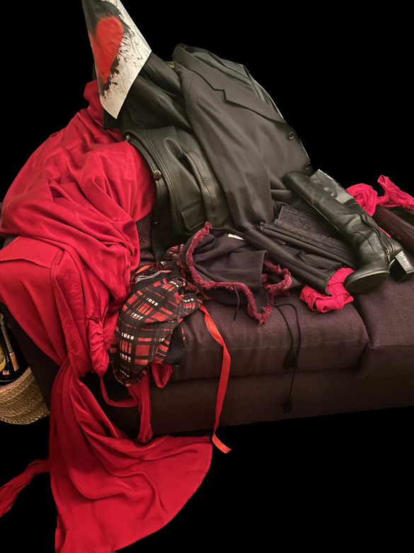
I wanted to clearly evoke the marching-band vibe of a soldier’s uniform using more timeless fashionable pieces like leather boots and jacket. I definitely wanted to keep the colour palette minimal with black, red and white being the primary components.
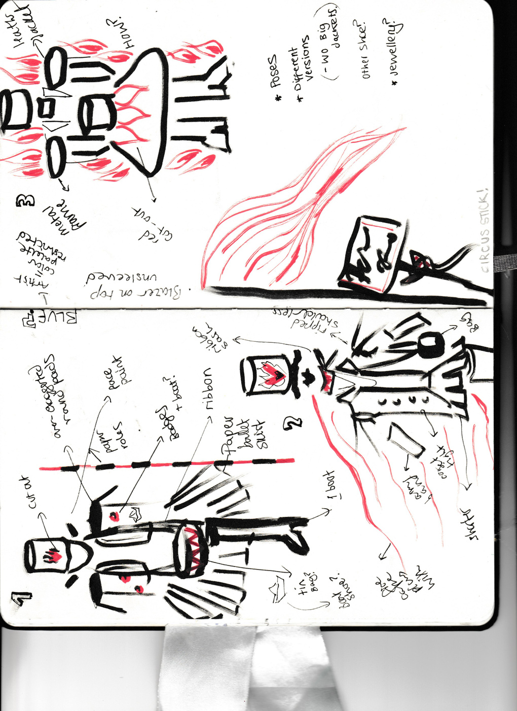
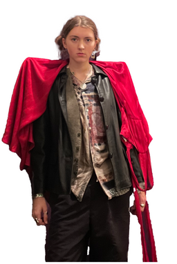
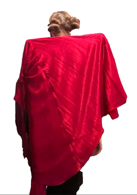
Further material styling + development
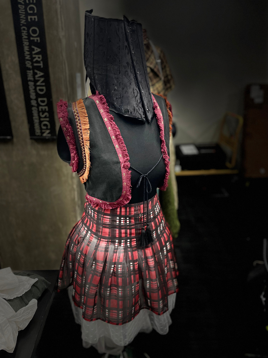
I decided that to represent my symbiosis of the soldier and ballerina characters an extra layering of white tule skirt would add a bit of femininity to the harder masculine silhouette.
I also developed the hat’s design with spray paint to add a more grungy modern aesthetic.
villian: the Jack-in-the-box
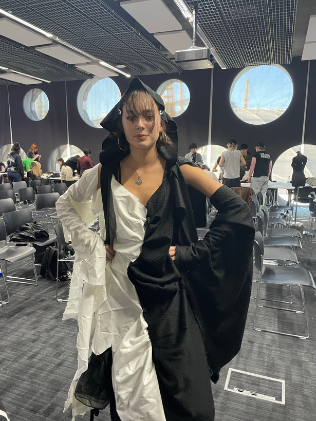
Final look
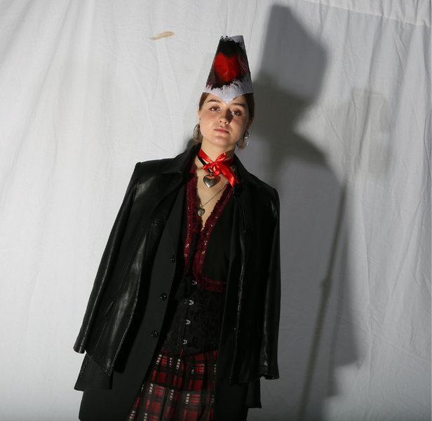
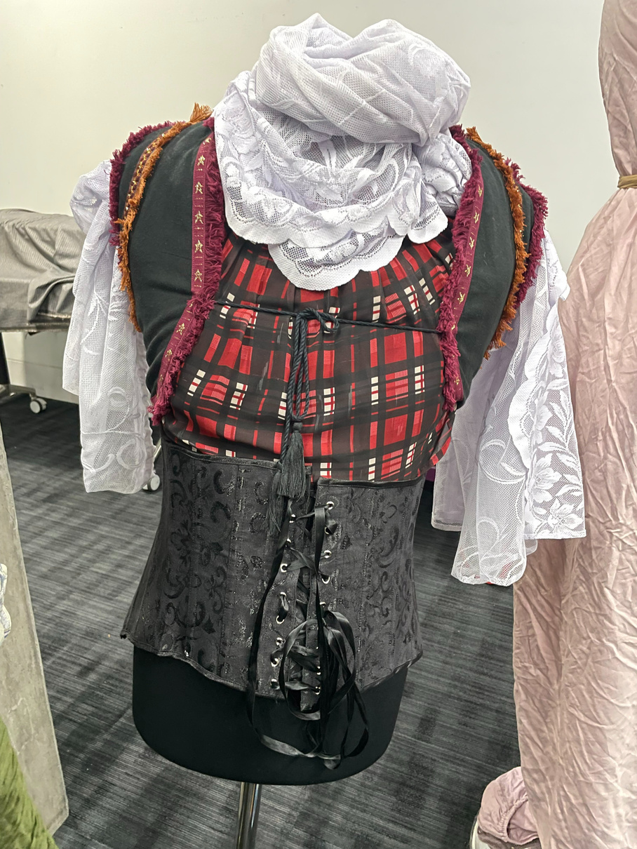
A lot of minor symbolism went into the final design including the singular boot to represent the soldier’s one leg, a red ribbon around the neck to represent the ballerina’s sash and the repetition of the heart theme in the hat and necklace to highlight the theme of love, passion and desire. In order to develop the structural impact of the look I used the corset around the waist as well as tucking bits of the white tule skirt up around the lower hip line to produce more expanded hips inspired by Schlemmer’s manipulation of bodily forms with unusual shapes.
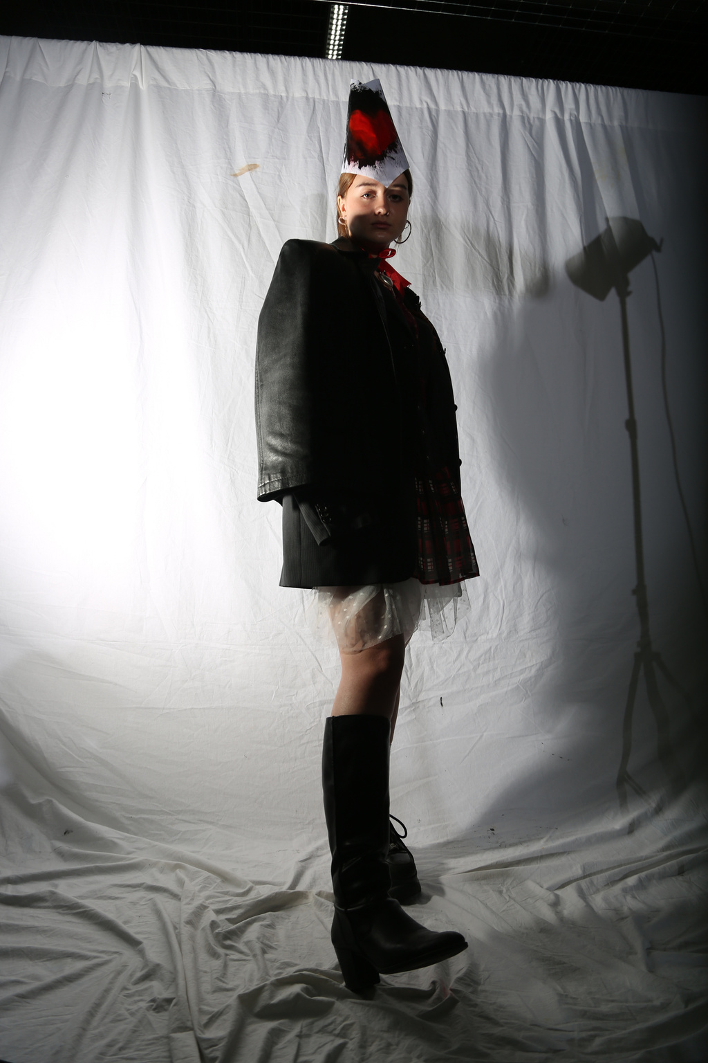
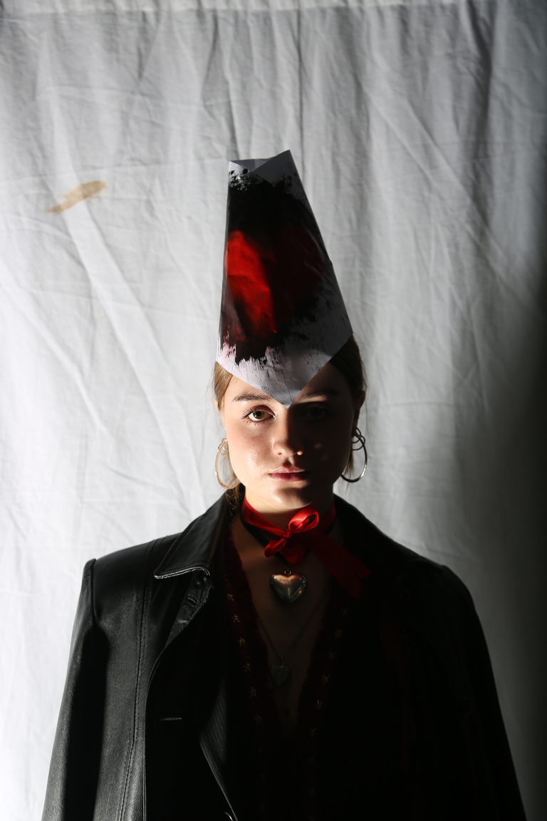
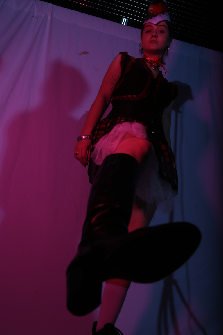
I used a white background for the black of the clothes to pop against as well as an almost spot-light as the lighting which I experimented with using a red tint. I was really happy with the shadow effect from the side-lighting as it really captured the silhouette of my soldier.
What Went Well:
I was really happy with my final look and photos because combined with the red fabric editing to represent fire I think I managed to convey my and dominant protestor character.
For Next Time:
I would’ve loved to try out more styling from scratch using more varied materials instead of different pieces layered together. For example using more paper or cardboard to block a silhouette out of firm shapes instead of just making the hat out of paper would not only have created an even more striking and unique silhouette but would also have been thematically relevant since the ballerina in the story is made of paper. I also lost time on my shoot since the camera was malfunctioning so I would’ve liked more time to experiment with different poses.
Peer Feedback:
Nice use of pose but it would’ve been interesting to use top angle shots in order to highlight the homemade hat more since they liked its design.
Reflections:
Fashion Textiles: illustration
MARK MAKING
Home object mark making
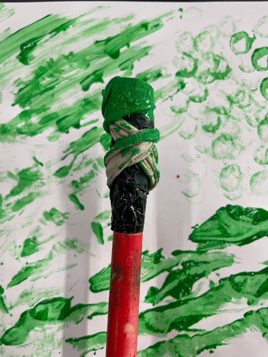
I used a stick for the first round of mark-making then tied duck tape and a hairband around the end for the second lot. It was an entertaining process and I was able to get a decent amount of different textures and patterns from the one object and its combination with the softer material of the hairband. It definitively got me thinking about potential clothing pattern designs.
Continous line
fashion illustration
My favourite task was definitely the ‘exaggerating one feature’ one (to the left) because I was able to experiment with proportion more. I also found the blind drawing very entertaining and I was quite happy with my wacky outcome.
^BLIND drawing
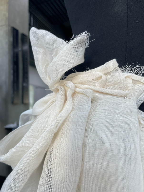
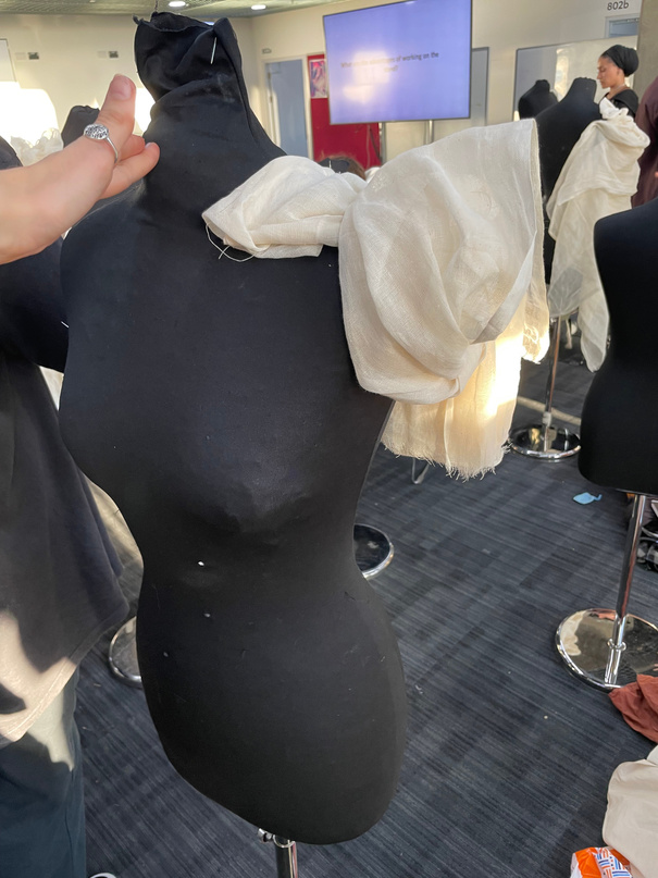
Fashion Textiles: DRAPING
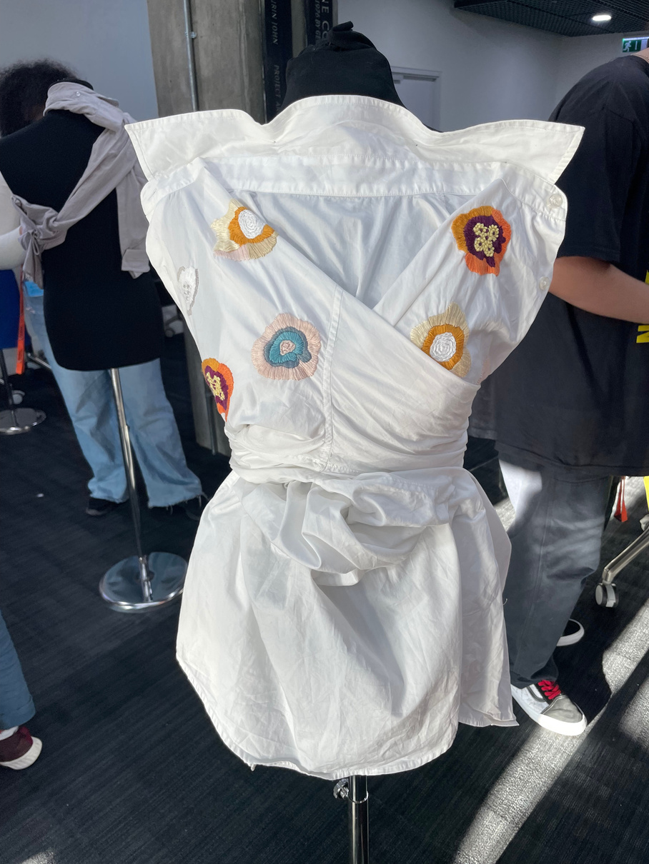
^Home shirt
^Home object pair
^Back draping
^side draping
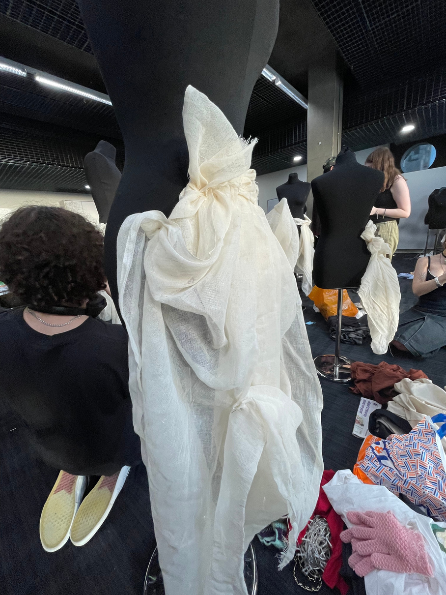
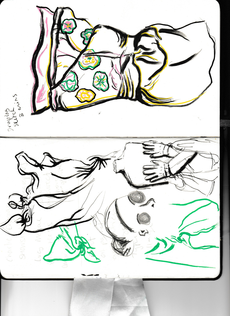
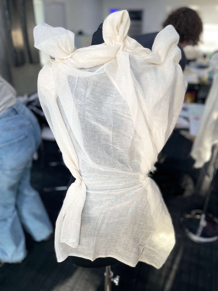
The quick-fire rounds of draping did not leave any time to over-think the designs and this allowed the process to be very fluid and aesthetic- based since I was really just working off what looked good and felt right while pinning the fabric. I think that I often wanted to generate a lot of volume in my drapes and this left a lot of the finished looks much more solid and structured rather than loose and flowing which I think I would’ve liked to try out more if I did this task again. My favourite drape was probably the collar look from the front.
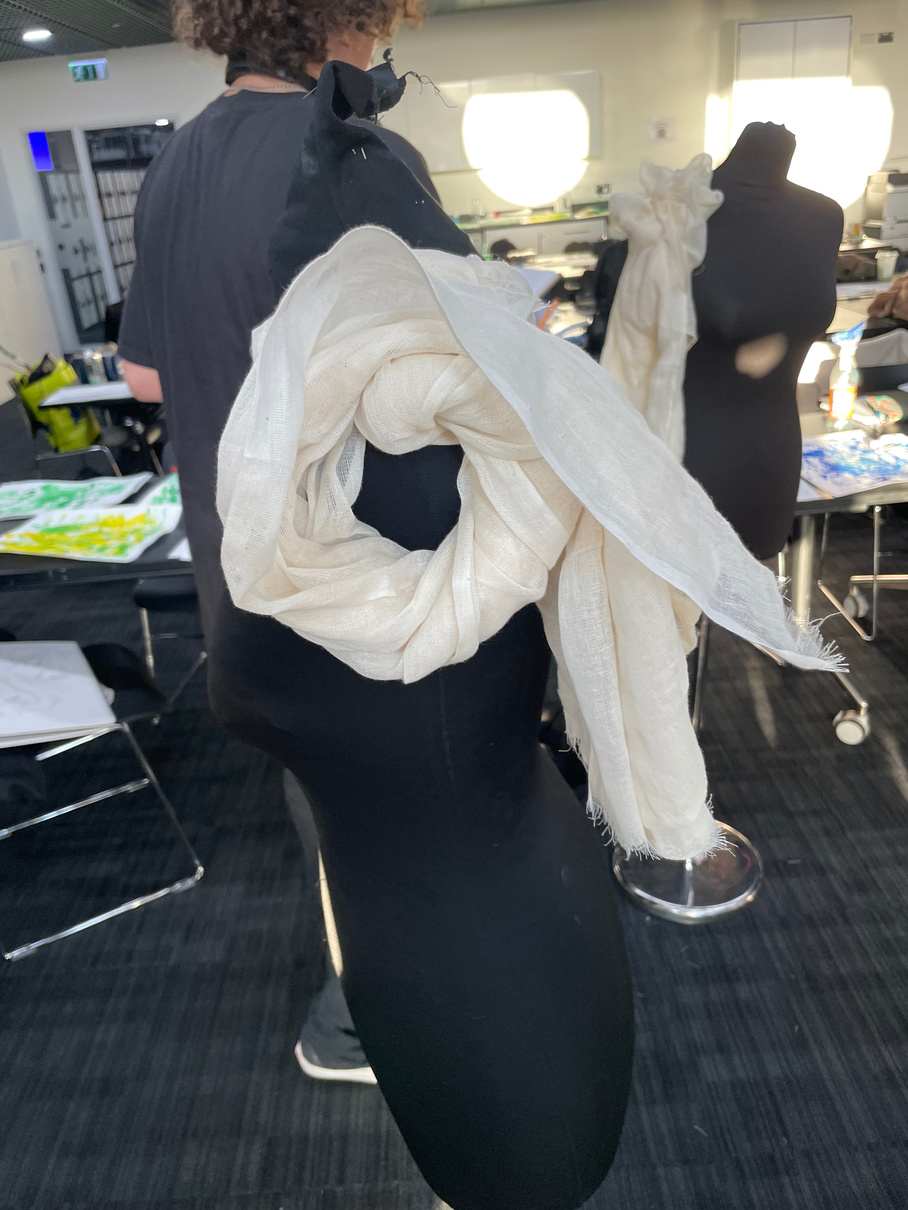
^Sleeve draping
^Collar drape
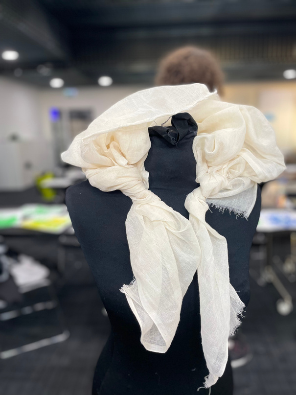
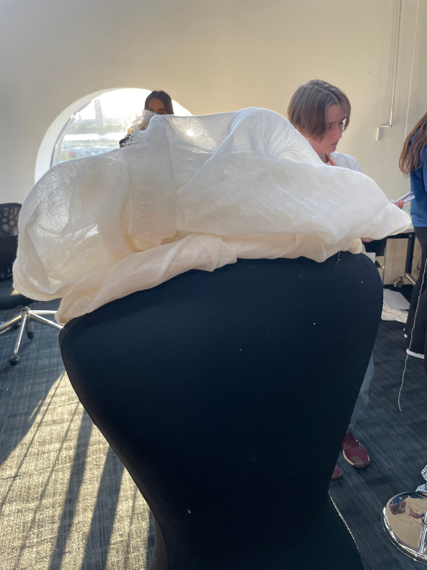
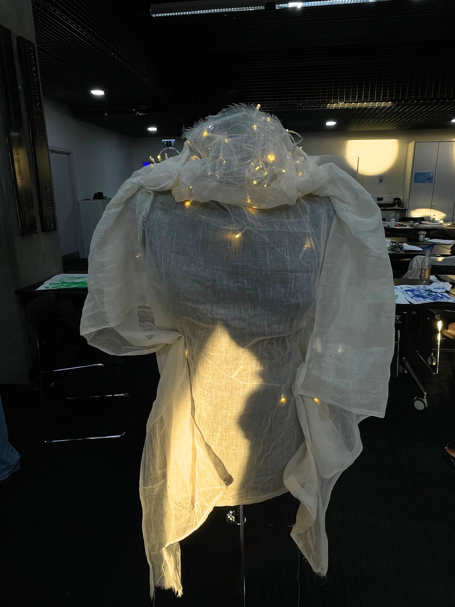
I was probably more carried away by the use of lights in this drape rather than the shape and form of the actual fabric but I was still amused by my final outcome.
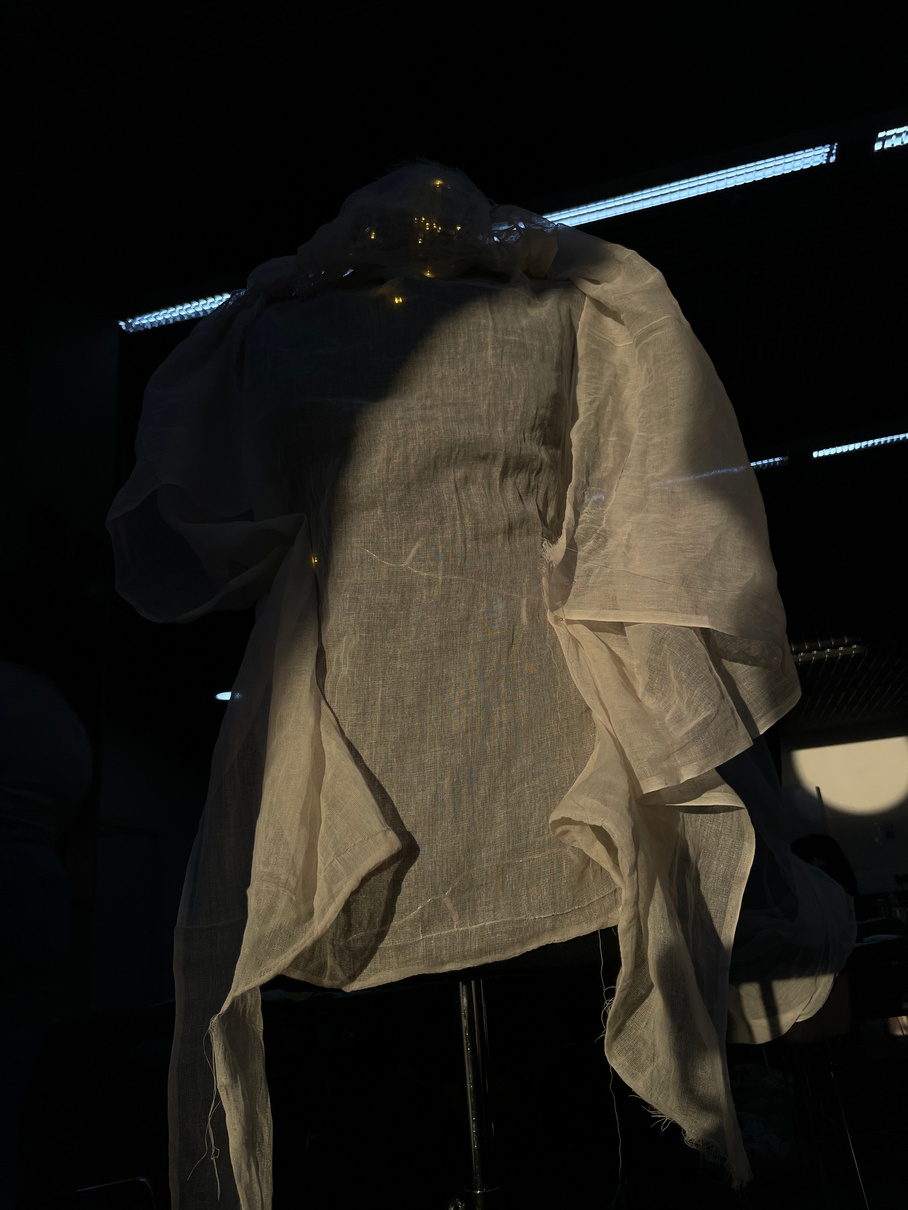
^Freestyle drape
Bibliography
www.p1m.ca. (n.d.). P1M - ZEINA ESMAIL. [online] Available at: http://www.p1m.ca/artists/style-fashion-direction/22-zeina-esmail/ [Accessed 30 Oct. 2023].
theinspirationgrid.com. (n.d.). Daily design inspiration for creatives | Inspiration Grid. [online] Available at: https://theinspirationgrid.com/.
Pinterest (2023). Pinterest (United Kingdom). [online] Pinterest. Available at: https://www.pinterest.co.uk/.
andersen.sdu.dk. (n.d.). Hans Christian Andersen : The Steadfast Tin Soldier. [online] Available at: https://andersen.sdu.dk/vaerk/hersholt/TheSteadfastTinSoldier_e.html.
Mission (2017). The Steadfast Tin Soldier. [online] Mission.org. Available at: https://medium.com/the-mission/the-steadfast-tin-soldier-28a14750fbbf [Accessed 5 Nov. 2023].
Fashion mASTERCLASS: Olubiyi Thomas
What I found most interesting about Thomas’ practice was his use of highlander-inspired narrative film structure to advertise and portray his clothing line. The way in which fashion design and film making intersected in this way seemed quite creative and more characterful than a traditional runway. His equation of research and mood to create clothes explained the way in which he can identify themes in his designs while considering aesthetic values. It was interesting to learn about how a fashion designer’s brand heavily includes themself as part of the product in the sense that “what you sell is what you live”. The way in which fashion is inspired by fine art through allocating mood, texture, palette etc to the clothing from certain fine art inspirations was also illuminating on the process of design and how inspiration is fluid.

The quick-fire design task with scraps of his materials was a fun way to spontaneously collaborate with a group and come up with something creative and stylish. The activity illustrated the potential in using ‘waste’ fabric which is an especially valuable lesson in an environmentally-conscious age.
mEDIA pRODUCTIon
mEDIA pRODUCTION: Journey
“What is put in a scene” meaning the features that make up a scene including; composition, sets, props, actors, costumes, and lighting.
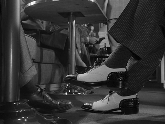
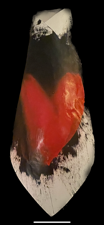
By watching movie clips with Mise-en-scène in mind and an analytical viewpoint one of the things I noticed was the power behind careful sound control within a scene/short film. The sudden switch between silence and then heavy breathing in the first film we watched created a tense and isolating atmosphere which was supported by the ambiguous lack of focus on the protagonist’s face- which we understood to be because the character is dreaming. The second clip being the opening to Hitchcock’s Strangers On A Train also used ambiguously limited shots of just feet travelling to keep the characters strangers to the viewer just as they are to each other. I was also able to see how impactful costuming is by the contrasting colour choices of the shoes for the two men and their different suits- the one with the white shoes being more decadent. The use of the personal name-tagged tie also suggests that the character wants to be over-friendly in order to gain trust. By visually contrasting the two men we immediately wonder where their interaction will lead and who is coming out as the good or bad stranger- with visual hints making us suspicious yet unsure from the start.
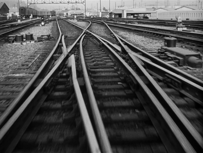
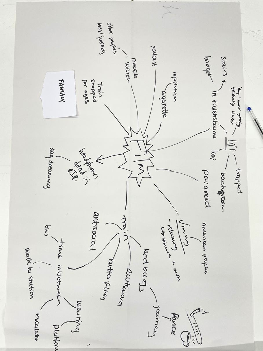
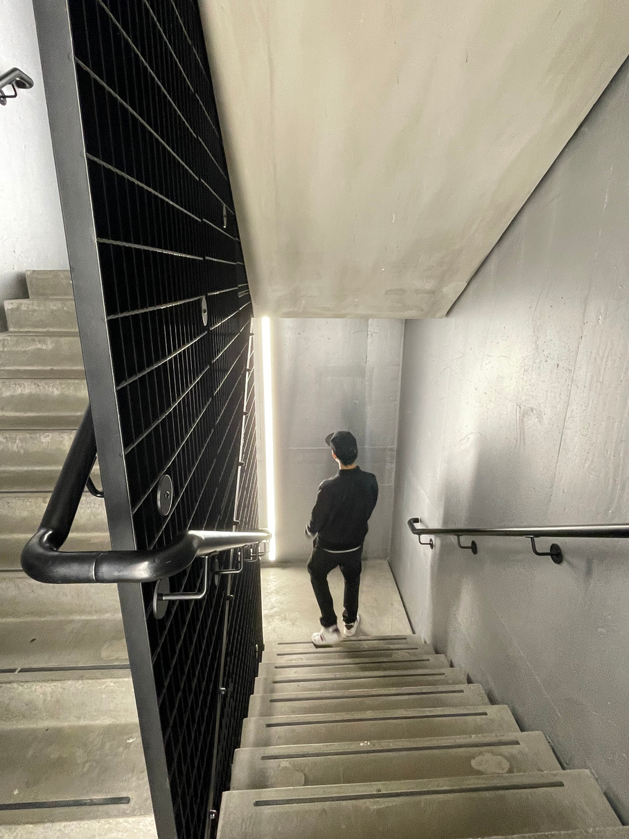
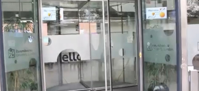
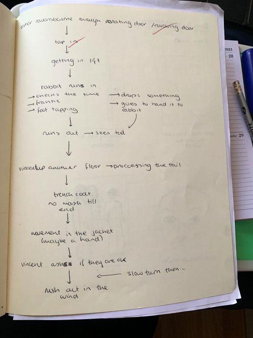
When considering journey through our journey to school as the starting point for our narrative we naturally thought about the main feature being tube travel for most of us. We thought about the varied speeds based on delays or interruptions as well as our states of mind while travelling- relaxed or nervous or tired etc. We considered what we would be doing while travelling like listening to a podcast or people watching. To move away from being stuck on the tube we considered the different parts of our journey, one of them being the journey to our classroom from entering the building. This lead us to the concept of the part of our journey using the lifts at Ravensbourne from when we tap through the barriers to when we tap into class.
Research / Inspiration
When presented with the genre of fantasy we changed our initial idea of a purely psychological and anxiety-based nightmare film of getting lost and trapped in the lifts system without reaching you destination. We focused in on one of the main components of fantasy films being the fanciful character and costuming designs and decided to introduce surrealist and fanciful nightmare characters into the lift journey as the catalyst for the confusion- since our lost protagonist would now be entering a fantasy world dominated by these characters.
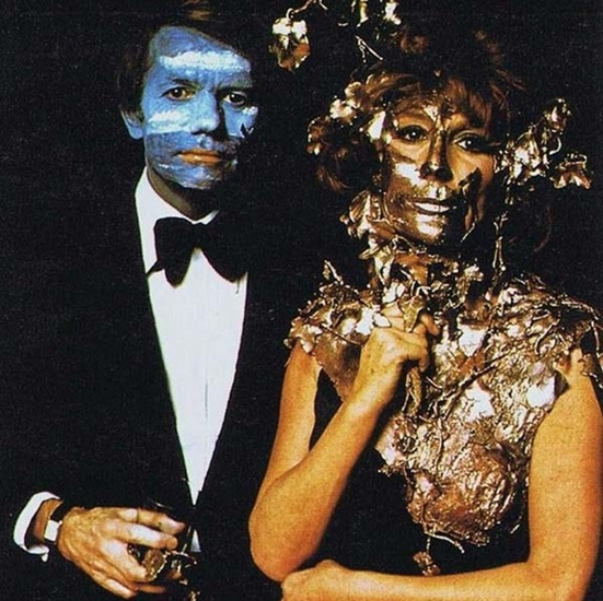
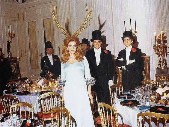
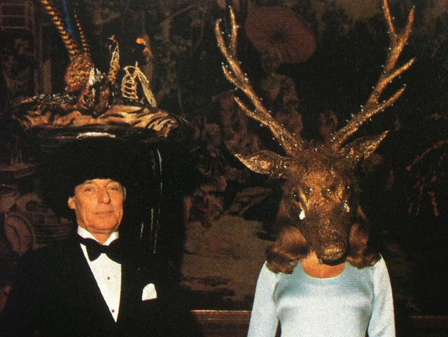
The rothschild Family
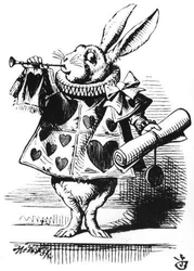
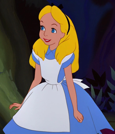
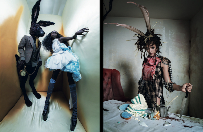
Our initial visual and tonal inspiration for our fantasy characters came from the realisation that between our group members we had two high-quality animal/ creature masks that we could use and this reminded us of the visual identity of the surrealist animal party hosted by the wealthy Rothschild family. While not being explicitly horrifying, the costuming and overall uncanny atmosphere generated in the photos of this event contributed to our costuming and characterisation ideas of juxtaposing everyday clothing with wacky and creepy animal and creature masks. This sort of disturbing aesthetic combined with the theme of fantasy journey also lead us to the story of Alice In Wonderland as a focal source of inspiration. Our protagonist’s ‘falling down the rabbit hole’ moment would be their entry into the world of the fantasy lift and like Alice meeting various wacky characters along her journey, our protagonist would come in contact with our more outwardly unfriendly and creepy characters.
Photographer Tim Walker
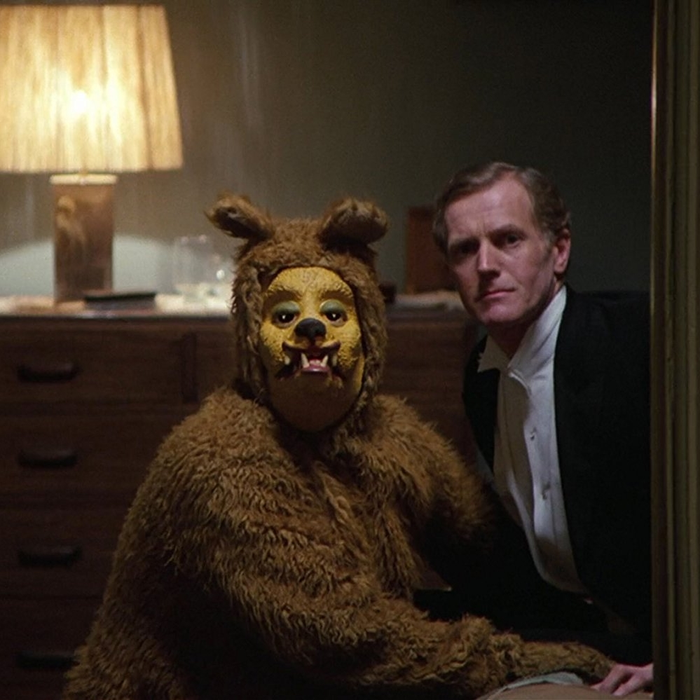
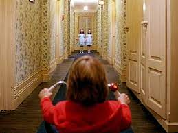
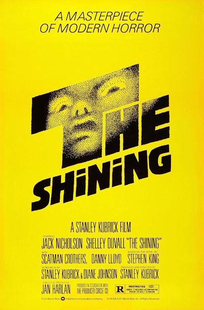
the shining: stanley kubrick
The horror film/ psychological thriller The Shining was also a major source of tonal inspiration in terms of framing our fantasy characters with more overall consideration of Mise-en-scene. More specifically, I really remembered the unique characterisation of the ghosts appearing during the film’s more climactic moments near the end. Rather than being antagonistic or actively threatening, the ghosts are more stand-offish and passively threatening/ menacing since they tend not to approach the camera and their manner is almost more inquisitive than violent. This sort of uncanny characterisation by still and wide angle shots was something I wanted to mimic.
Time Walker’s explicitly Alice in Wonderland- inspired fashion photography really captures the surrealist potential in the fantasy genre through exaggerated styling/costuming as well as shots and camera angles creating a very theatrical and almost menacing overall impression. ***Retrospectively I would say that Walker’s photographic identity in terms of camera angles specifically is what inspired our zebra shot from inside the lift.
shot testing, ideas DEVELOPMENT and problem solving
Since the plan for our film was to be almost entirely located in and around lifts we had to make sure that we could practically and efficiently use the lifts to shoot without getting in the way of too many people. We decided that using the lifts in the printing building would be a smarter move and once we got consent to film there we faced the next problem being that that lift has a mirror directly opposite the door. This meant that the camera person would be visible in most shots we originally planned for so we had to sacrifice symmetrical front facing shots of the lift’s doors for more angled shots from the side.
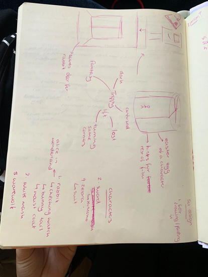
In addition to technical issues we had to sacrifice some of our styling ideas given that we couldn’t bring in certain props that we wanted to like a fake sword. We also had to consider the length of our film since we were originally ambitious with the amount of characters we would include in filming.
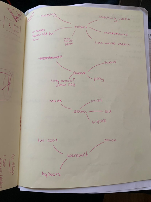
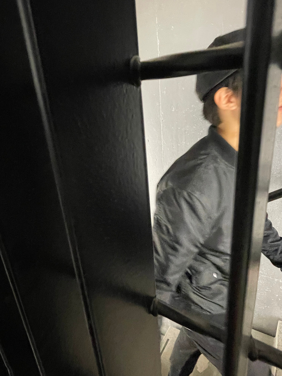
Character designs
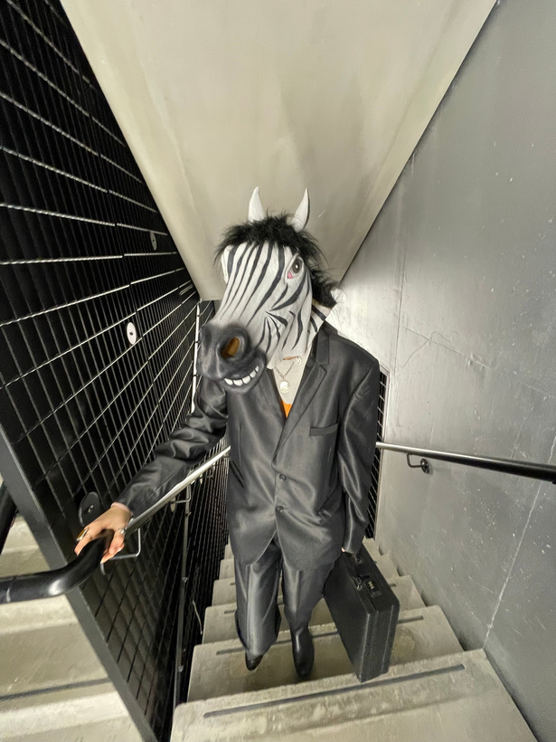
Zebra mask, suit, briefcase, boots
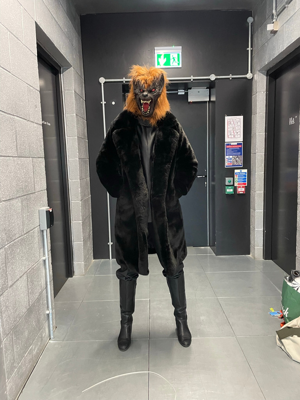
Werewolf mask, fur coat, boots
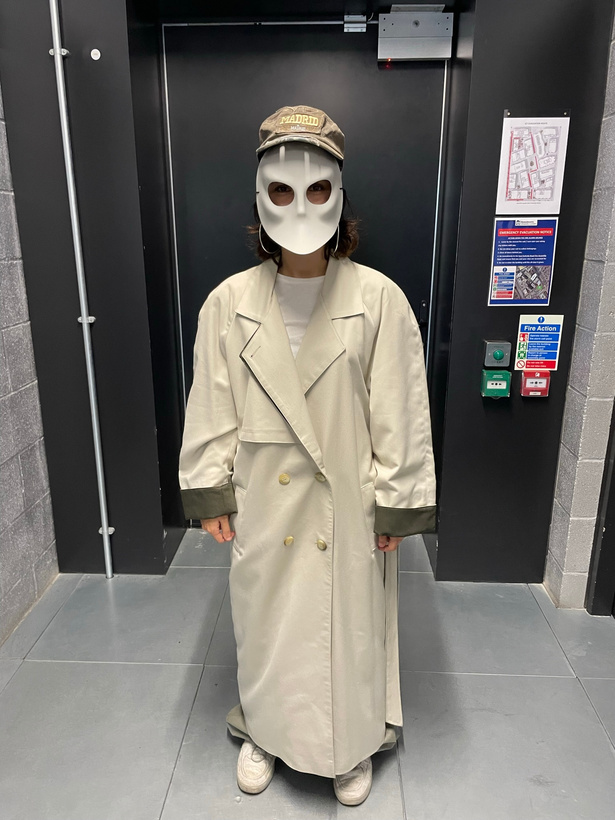
Trenchcoat, ‘faceless’ mask, hat
The rabbit: who is late for a very important date
*My favourite shot:
Animation Tutorial:
Timeline plan:
We probably would’ve done better with a more fleshed out story board but
The film: ‘ Trippy lift’
Isa Fernandez, anjana ehamparam, vincent M K, fatemah alibhai, daisy campbell
Reflections:
What Went Well:
Our group definitely worked well as a team and we were able to break down the filming process between us quite effectively by designating roles to each one of us while constantly discussing our ideas together and sharing our opinions. Although we had a lot of still shots I was happy with the addition of the active stair running shots because I think they added a level of variation which made for a more dynamic viewing experience. If we had had more time we would’ve liked to do more with animating of fantasy realms appearing with the opening of the lift’s doors but apart from missing that, I think we did capture a consistent mood in terms of character design and characterisation through mise-en-scene. Although the audio file for the edited background music was misplaced the original idea of morphing normal lift music into creepy static sound did flow nicely with the tension build-up and pacing of the film.
For Next Time:
Aside from the fact that we completely ran out of time to get all the shots we wanted/needed and to really coherently edit all the footage together, one of the main areas for improvement would probably be variation in the usage of the camera. Although we had both still and moving shots the overall viewing experience can definitely feel quite static at times. We probably could’ve also explored the genre of fantasy a little further because the piece does feel more like a horror/ thriller film at times.
Bibliography
therake.com. (n.d.). Party Animals: The Rothschild Surrealist Ball. [online] Available at: https://therake.com/stories/party-animals-the-rothschild-surrealist-ball [Accessed 5 Nov. 2023].
Contextual studies Project
Bibliography
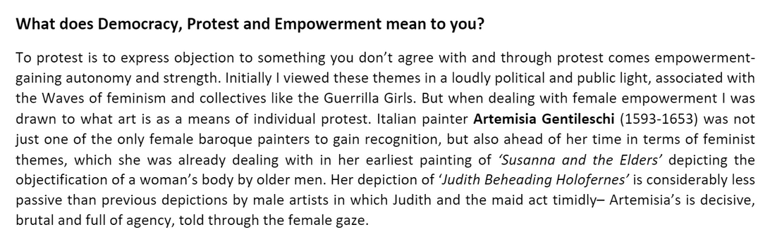
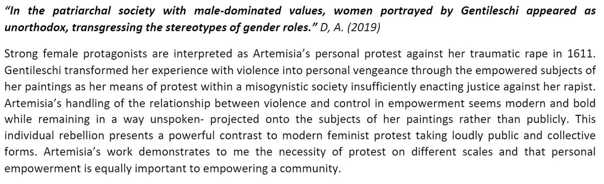
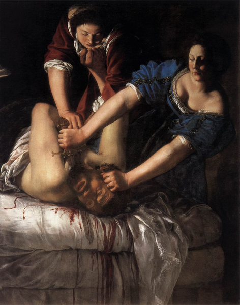
D, A. (2019). Artemisia Gentileschi - From Facts and Fiction to Feminist Inspiration | Widewalls. [online] www.widewalls.ch. Available at: https://www.widewalls.ch/magazine/artemisia-gentileschi-facts-fiction-feminist-inspiration.
www.youtube.com. (n.d.). Artemisia Gentileschi: The woman behind the paintings - Allison Leigh. [online] Available at: https://www.youtube.com/watch?v=v7Xl6a4J7Wk
The National Gallery, London (2018). Artemisia Gentileschi (1593 - 1654 or later) | National Gallery, London. [online] Nationalgallery.org.uk. Available at: https://www.nationalgallery.org.uk/artists/artemisia-gentileschi.
Authenticity statement
I confirm that the published work for the Unit 1 assessment of UAL Foundation Diploma is all my own work and does not include any work completed by anyone other than myself (except where credited) and sources have been appropriately referenced. Daisy Campbell 05/11/2023